label
The <label> component defines labels for the <input>, <button>, and <textarea> components. When a label is clicked, the click effect of the component associated with the label will be triggered.
Required Permissions
None
Child Component
Not supported
Attributes
In addition to the attributes in Universal Attributes, the following attributes are supported.
Styles
In addition to the styles in Universal Styles, the following styles are supported.
Whether the text size changes with the system's font size settings. |
||||
Font style. Available values are as follows: |
||||
Font width. For the number type, the value ranges from 100 to 900. The default value is 400. A larger value indicates a larger font width. The value of the string type can be lighter, normal, bold, or bolder. |
||||
Text decoration. Available values are as follows: |
||||
Text alignment mode. Available values are as follows: |
||||
Text line height. When this parameter is set to 0px, the text line height is not limited and the font size is adaptive. |
||||
Takes effect when the maximum number of lines is specified. Available values are as follows: |
||||
Font family, in which fonts are separated by commas (,). Each font is set using a font name or font family name. The first font that exists in the system or the font specified by Custom Font Styles in the family is selected as the font for the text. |
||||
Minimum font size in the text. This style must be used together with max-font-size. The font size can be changed dynamically. After the maximum and minimum font sizes are set, font-size does not take effect. |
||||
Maximum font size in the text. This style must be used together with min-font-size. The font size can be changed dynamically. After the maximum and minimum font sizes are set, font-size does not take effect. |
||||
Step for dynamically adjusting the font size in the text. The minimum and maximum font sizes must be set. |
||||
Preset preferred font sizes. For dynamic font size adjustment, the preset sizes are used to match the maximum number of lines in the text. If the preferred font sizes were not set, the font size will be adjusted based on the maximum and minimum font sizes and the step you have set. If the maximum number of lines in the text cannot be met, text-overflow is used to truncate the text. If this parameter is set, font-size, max-font-size, min-font-size, and font-size-step do not take effect. |
Events
Not supported
Methods
Not supported
Example Code
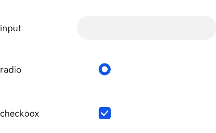
<!--xxx.hml -->
<div class="container">
  <div class="row">
    <label class="label" target="textId">input</label>
    <input class="input" id="textId" type="text"></input>
  </div>
  <div class="row">
    <label class="label" target="radioId">radio</label>
    <input class="input" id="radioId" type="radio" name="group" value="group"></input>
  </div>
  <div class="row">
    <label class="label" target="checkboxId">checkbox</label>
    <input class="input" id="checkboxId" type="checkbox"></input>
  </div>
</div>
/*xxx.css */
.container {
  flex-direction: column;
  align-items: center;
}
.row {
  flex-direction: row;
}
.label {
  width: 200px;
  margin-top: 50px;
}
.input {
  margin-left: 100px;
  margin-top: 50px;
}