Animation Styles
Components support dynamic rotation, translation, and scaling effects. These effects can be set in the style attribute or CSS files.
string6+ | <percentage> | <length> string6+ | <percentage> | <length> |
Origin position of the transformed element. The unit can be px or a percentage (relative to the animation target component). If only one value is specified, the other one is 50%. The available values for the first string are left, center, and right. The available values for the second string are top, center, and bottom. |
||
Translation, rotation, and scaling attributes. For details, see Table 1. |
|||
Animation attributes in the format of duration | timing-function | delay | iteration-count | direction | fill-mode | play-state | name. The order of the parameters is not specified, but the duration and delay parameters are parsed based on where they are placed. |
|||
@keyframes rule. For details, see Table 2. |
|||
Delay for playing the animation, in ms or s, for example, 1000 ms or 1s. The default unit is ms. |
|||
Animation duration, in ms or s, for example, 1000 ms or 1s. The default unit is ms. |
|||
Number of times that an animation is played. The animation is played once by default. You can set the value to infinite to play the animation infinitely. |
|||
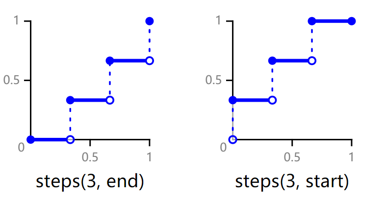
Speed curve of an animation, which makes the animation more fluent. Available values are as follows:
|
|||
Mode of playing the animation.
|
|||
Start and end styles of the animation
|
|||
Current state of the animation. |
|||
Transition effect when the component status is switched. The following four attributes can be set through the transition attribute:
|
Table 1 Methods of the transform attribute
Table 2 Attributes available for the @keyframes rule
Background color applied to the component after the animation is played. |
|||
Opacity value applied to the component after the animation is played. The value ranges from 0 to 1. The default value is 1. |
|||
Width value applied to the component after the animation is played. |
|||
Height value applied to the component after the animation is played. |
|||
Transformation type applied to a component. For details, see Table 1. |
|||
string | <percentage> | <length> string | <percentage> | <length> |
Set the background image for a window. The unit can be percentage or px. The first value indicates the horizontal position, and the second value indicates the vertical position. If only one value is specified, the other one is 50%. The available values for the first string are left, center, and right. The available values for the second string are top, center, and bottom.
|
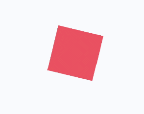
If there is no default value for when an animation will start or end, use from and to to specify the start and end of the display. You can use a percentage value to specify an intermediate state of the animation.6+ The following is an example:
<div class="container">
  <div class="rect">
  </div>
</div>
.container {
  display: flex;
  justify-content: center;
  align-items: center;
}
.rect{
  width: 200px;
  height: 200px;
  background-color: #f76160;
  animation: Go 3s infinite;
}
@keyframes Go
{
  from {
    background-color: #f76160;
    transform:translate(100px) rotate(0deg) scale(1.0);
  }
  /* Specify the intermediate state of the animation by a percentage value.6+ */
  50% {
    background-color: #f76160;
    transform:translate(100px) rotate(60deg) scale(1.3);
  }
  to {
    background-color: #09ba07;
    transform:translate(100px) rotate(180deg) scale(2.0);
  }
}
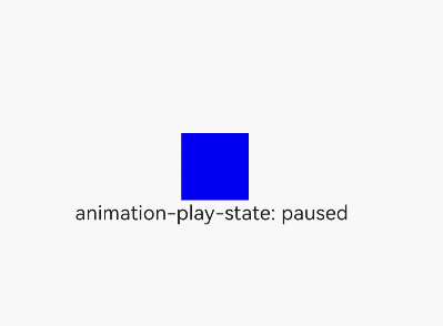
<!-- xxx.hml -->
<div class="container">
  <div class="simpleAnimation simpleSize" style="animation-play-state: {{playState}}"></div>
  <text onclick="toggleState">animation-play-state: {{playState}}</text>
</div>
/* xxx.css */
.container {
  flex-direction: column;
  justify-content: center;
  align-items: center;
}
.simpleSize {
  background-color: blue;
  width: 100px;
  height: 100px;
}
.simpleAnimation {
  animation: simpleFrames 9s;
}
@keyframes simpleFrames {
  from { transform: translateX(0px); }
  to { transform: translateX(100px); }
}
// xxx.js
export default {
  data: {
    title: "",
    playState: "running"
  },
  toggleState() {
    if (this.playState ===  "running") {
      this.playState = "paused";
    } else {
      this.playState = "running";
    }
  }
}
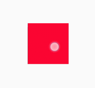
<!-- xxx.hml -->
<div id='img' class="img"></div>
/* xxx.css */
.img {
  width: 294px;
  height: 233px;
  background-image: url('common/heartBeat.jpg');
  background-repeat: no-repeat;
  background-position: 0% 0%;
  background-size: 900%;
  animation-name: heartBeating;
  animation-duration: 1s;
  animation-delay: 0s;
  animation-fill-mode: forwards;
  animation-iteration-count: -1;
  animation-timing-function: steps(8, end);
}

@keyframes heartBeating {
  from { background-position: 0% 0%;}
  to { background-position: 100% 0%;}
}
<!-- xxx.hml -->
<div class="container">
  <div class="content"></div>
</div>
/* xxx.css */
.container {
    flex-direction: column;
    justify-content: center;
    align-items: center;
}
.content { /* Component state 1 */
    height: 200px;
    width: 200px;
    background-color: red;
    transition: all 5s ease 0s;
}
.content:active { /* Component state 2 */
    height: 400px;
    width: 400px;
    background-color: blue;
    transition: all 5s linear 0s;
}
NOTE: The @keyframes rule with from and to defined cannot be dynamically bound to an element. The following figure shows the meanings of end and start in the steps function.