文本样式设置
说明: 从API Version 7开始支持。后续版本如有新增内容,则采用上角标单独标记该内容的起始版本。
针对包含文本元素的组件,设置文本样式。
权限列表
无
属性
| 名称 | 参数类型 | 默认值 | 描述 |
|---|---|---|---|
| fontColor | Color | - | 设置文本颜色。 |
| fontSize | Length | - | 设置文本尺寸,Length为number类型时,使用fp单位。 |
| fontStyle | FontStyle | FontStyle.Normal | 设置文本的字体样式。 |
| fontWeight | number |FontWeight | FontWeight.FontWeightNormal | 设置文本的字体粗细,number类型取值[100, 900],取值间隔为100,默认为400,取值越大,字体越粗。 提供常用枚举值,参考:FontWeight枚举说明。 |
| fontFamily | string | - | 设置文本的字体列表。使用多个字体,使用','进行分割,优先级按顺序生效。例如:'Arial, sans-serif'。 |
- FontStyle枚举说明
| 名称 | 描述 |
|---|---|
| Normal | 标准的字体样式。 |
| Italic | 斜体的字体样式。 |
- FontWeight枚举说明
| 名称 | 描述 |
|---|---|
| Lighter | 字体较细。 |
| Normal | 字体粗细正常。 |
| Regular | 字体粗细正常。 |
| Medium | 字体粗细适中。 |
| Bold | 字体较粗。 |
| Bolder | 字体非常粗。 |
示例
@Entry
@Component
struct TextStyleExample {
build() {
Column({ space: 5 }) {
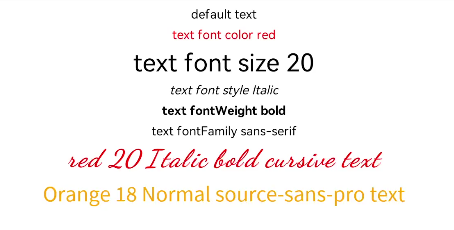
Text('default text')
Text('text font color red')
.fontColor(Color.Red)
Text('text font size 20')
.fontSize(20)
Text('text font style Italic')
.fontStyle(FontStyle.Italic)
Text('text fontWeight bold')
.fontWeight(700)
Text('text fontFamily sans-serif')
.fontFamily('sans-serif')
Text('red 20 Italic bold cursive text')
.fontColor(Color.Red)
.fontSize(20)
.fontStyle(FontStyle.Italic)
.fontWeight(700)
.fontFamily('cursive')
.textAlign(TextAlign.Center)
.width('90%')
Text('Orange 18 Normal source-sans-pro text')
.fontColor(Color.Orange)
.fontSize(18)
.fontStyle(FontStyle.Normal)
.fontWeight(400)
.fontFamily('source-sans-pro,cursive,sans-serif')
}.width('100%')
}
}