Slider
NOTE This component is supported since API version 7. Updates will be marked with a superscript to indicate their earliest API version.
The <Slider> component is used to quickly adjust settings, such as the volume and brightness.
Required Permissions
None
Child Components
None
APIs
Slider(value:{value?: number, min?: number, max?: number, step?: number, style?: SliderStyle, direction?: Axis})
- Parameters
| Name | Type | Mandatory | Default Value | Description |
|---|---|---|---|---|
| value | number | No | 0 | Current progress. |
| min | number | No | 0 | Minimum value. |
| max | number | No | 100 | Maximum value. |
| step | number | No | 1 | Step of the slider. When the corresponding step is set, the slider slides intermittently. |
| style | SliderStyle | No | SliderStyle.OutSet | Style of the slider. |
| direction8+ | Axis | No | Axis.Horizontal | Whether the slider moves horizontally or vertically. |
| reverse8+ | boolean | No | false | Whether the slider values are reversed. |
- SliderStyle enums
| Name | Description |
|---|---|
| OutSet | The slider is on the slider rail. |
| InSet | The slider is in the slider rail. |
Attributes
Touch target configuration is not supported.
| Name | Type | Default Value | Description |
|---|---|---|---|
| blockColor | Color | - | Color of the slider. |
| trackColor | Color | - | Background color of the slider. |
| selectedColor | Color | - | Color of the slider rail that has been slid. |
| showSteps | boolean | false | Whether to display the current step. |
| showTips | boolean | false | Whether to display a bubble to indicate the percentage when sliding. |
Events
Among all the universal events, only OnAppear and OnDisAppear are supported.
| Name | Description |
|---|---|
| onChange(callback: (value: number, mode: SliderChangeMode) => void) | Callback invoked when the slider slides. value: current progress. mode: dragging state. |
- SliderChangeMode enums
| Name | Description |
|---|---|
| Begin | The user starts to drag the slider. |
| Moving | The user is dragging the slider. |
| End | The user stops dragging the slider. |
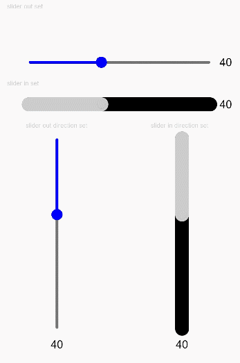
Example
@Entry
@Component
struct SliderExample {
  @State outSetValue: number = 40
  @State inSetValue: number = 40
  @State outVerticalSetValue: number = 40
  @State inVerticalSetValue: number = 40

  build() {
    Column({ space: 5 }) {
      Text('slider out set').fontSize(9).fontColor(0xCCCCCC).width('90%')
      Row() {
        Slider({
          value: this.outSetValue,
          min: 0,
          max: 100,
          step: 1,
          style: SliderStyle.OutSet
        })
        .blockColor(Color.Blue)
        .trackColor(Color.Gray)
        .selectedColor(Color.Blue)
        .showSteps(true)
        .showTips(true)
        .onChange((value: number, mode: SliderChangeMode) => {
          this.outSetValue = value
          console.info('value:' + value + 'mode:' + mode.toString())
        })
        Text(this.outSetValue.toFixed(0)).fontSize(16)
      }
      .padding({ top: 50 })
      .width('80%')

      Text('slider in set').fontSize(9).fontColor(0xCCCCCC).width('90%')
      Row() {
        Slider({
          value: this.inSetValue,
          min: 0,
          max: 100,
          step: 1,
          style: SliderStyle.InSet
        })
        .blockColor(0xCCCCCC)
        .trackColor(Color.Black)
        .selectedColor(0xCCCCCC)
        .showSteps(false)
        .showTips(false)
        .onChange((value: number, mode: SliderChangeMode) => {
          this.inSetValue = value
          console.info('value:' + value + 'mode:' + mode.toString())
        })
        Text(this.inSetValue.toFixed(0)).fontSize(16)
      }
      .width('80%')

      Row() {
        Column() {
          Text('slider out direction set').fontSize(9).fontColor(0xCCCCCC).width('50%')
          Slider({
            value: this.outVerticalSetValue,
            min: 0,
            max: 100,
            step: 1,
            style: SliderStyle.OutSet,
            direction: Axis.Vertical
          })
          .blockColor(Color.Blue)
          .trackColor(Color.Gray)
          .selectedColor(Color.Blue)
          .showSteps(true)
          .showTips(true)
          .onChange((value: number, mode: SliderChangeMode) => {
            this.outVerticalSetValue = value
            console.info('value:' + value + 'mode:' + mode.toString())
          })
          Text(this.outVerticalSetValue.toFixed(0)).fontSize(16)
        }.width('50%').height(300)

        Column() {
          Text('slider in direction set').fontSize(9).fontColor(0xCCCCCC).width('50%')
          Slider({
            value: this.inVerticalSetValue,
            min: 0,
            max: 100,
            step: 1,
            style: SliderStyle.InSet,
            direction: Axis.Vertical
          })
          .blockColor(0xCCCCCC)
          .trackColor(Color.Black)
          .selectedColor(0xCCCCCC)
          .showSteps(false)
          .showTips(false)
          .onChange((value: number, mode: SliderChangeMode) => {
            this.inVerticalSetValue = value
            console.info('value:' + value + 'mode:' + mode.toString())
          })
          Text(this.inVerticalSetValue.toFixed(0)).fontSize(16)
        }.width('50%').height(300)
      }

    }.width('100%').margin({ top: 5 })
  }
}