Checkbox
NOTE This component is supported since API version 8. Updates will be marked with a superscript to indicate their earliest API version.
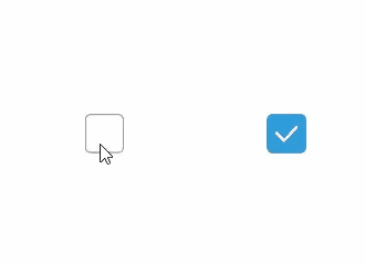
The <Checkbox> component is used to enable or disable an option.
Required Permissions
None
Child Components
None
APIs
Checkbox( name?: string, group?: string )
- Parameters
| Name | Type | Mandatory | Default Value | Description |
|---|---|---|---|---|
| name | string | No | - | Name of the check box. |
| group | string | No | - | Group name of the check box. |
Attributes
| Name | Type | Default Value | Description |
|---|---|---|---|
| select | bool | false | Whether the check box is selected. |
| selectedColor | Color | - | Color of the check box when it is selected. |
Events
| Name | Description |
|---|---|
| onChange(callback: (value: boolean) => void) | Triggered when the selection status of the check box changes. - The value true means that the check box is selected. - The value false means that the check box is not selected. |
Example
@Entry
@Component
struct CheckboxExample {

  build() {
    Row() {
      Checkbox({name: 'checkbox1',  group: 'checkboxGroup'})
        .select(true)
        .selectedColor(0xed6f21)
        .onChange((value: boolean) => {
          console.info('Checkbox1 change is'+ value)
        })
      Checkbox({name: 'checkbox2',  group: 'checkboxGroup'})
        .select(false)
        .selectedColor(0x39a2db)
        .onChange((value: boolean) => {
          console.info('Checkbox2 change is'+ value)
        })
    }
  }
}