Transition of Shared Elements
NOTE This animationis supported since API version 7. Updates will be marked with a superscript to indicate their earliest API version.
Shared element transition can be used for transition between pages, for example, transition from an image on the current page to the next page.
Type
| Name | Type | Default Value | Description |
|---|---|---|---|
| sharedTransition | id: string, options?: Object |
- | If the same ID is configured for a component on the two pages, this shared component is transited. If this parameter is set to an empty string, no shared elements are transited. |
- options parameters
| Name | Type | Default Value | Mandatory | Description |
|---|---|---|---|---|
| duration | number | 1000 | No | Animation duration, in ms. The default duration is 1000 ms. |
| curve | Curve | Curves | Linear | No | The default curve is linear. For details about the valid values, see Curve enums. |
| delay | number | 0 | No | Delay of animation playback, in ms. By default, the playback is not delayed. |
Example
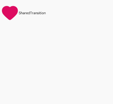
The example shows the transition of a shared element from a page and page B.
@Entry
@Component
struct SharedTransitionExample {
  @State scale: number = 1
  @State opacity: number = 1
  @State active: boolean = false

  build() {
    List() {
      ListItem() {
        Row() {
          Navigator({ target: 'pages/common/Animation/transAnimation/PageB', type: NavigationType.Push }) {
            Image($r('app.media.ic_health_heart')).width(50).height(50)
              .sharedTransition('sharedImage1', { duration: 800, curve: Curve.Linear, delay: 100 })
          }.padding({ left: 10 })
          .onClick(() => {
            this.active = true
          })

          Text('SharedTransition').width(80).height(80).textAlign(TextAlign.Center)
        }
      }
    }
  }
}
// PageB
@Entry
@Component
struct BExample {
  build() {
    Stack() {
      Image($r('app.media.ic_health_heart')).width(150).height(150).sharedTransition('sharedImage1')
    }.width('100%').height(400)
  }
}