Tabs
NOTE This component is supported since API version 7. Updates will be marked with a superscript to indicate their earliest API version.
The <Tabs> component is a container component that allows users to switch between content views through tabs. Each tab page corresponds to a content view.
Required Permissions
None
Child Components
The <Tabs> component can contain TabContent child components.
APIs
Tabs(value: {barPosition?: BarPosition, index?: number, controller?: TabsController})
- Parameters
| Name | Type | Mandatory | Default Value | Description |
|---|---|---|---|---|
| barPosition | BarPosition | No | BarPosition.Start | Tab bar position for creating the <Tabs> container component. |
| index | number | No | 0 | Initial tab index. |
| controller | TabsController | No | - | Tab controller. |
- BarPosition enums
| Name | Description |
|---|---|
| Start | If the vertical attribute is set to true, the tab is on the left of the container. If the vertical attribute is set to false, the tab is on the top of the container. |
| End | If the vertical attribute is set to true, the tab is on the right of the container. If the vertical attribute is set to false, the tab is at the bottom of the container. |
Attributes
Touch target configuration is not supported.
| Name | Type | Default Value | Description |
|---|---|---|---|
| vertical | boolean | false | Whether a tab is a vertical tab. |
| scrollable | boolean | true | Whether page switching can be performed by swiping left or right. |
| barMode | BarMode | - | Tab bar layout mode. |
| barWidth | number | - | Width of the tab bar. If this parameter is not set, the default value in the system theme is used. |
| barHeight | number | - | Height of the tab bar. If this parameter is not set, the default value in the system theme is used. |
| animationDuration | number | 200 | Animation duration of the tab content. |
- BarMode enums
| Name | Description |
|---|---|
| Scrollable | The actual layout width of the tab bar is used. If the actual width exceeds the total length, the tab bar is scrollable. |
| Fixed | The widths of all tab bars are evenly allocated. |
Events
| Name | Description |
|---|---|
| onChange(callback: (index: number) => void) | Event triggered when a tab is switched. |
TabsController
Defines a tab controller, which is used to control switching of tabs.
Objects to Import
controller: TabsController = new TabsController()
changeIndex
changeIndex(value: number): void
Switches to the specified tab.
- Parameters
| Name | Type | Mandatory | Default Value | Description |
|---|---|---|---|---|
| value | number | Yes | - | Index of a tab. The value starts from 0. |
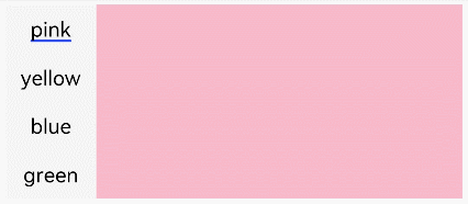
Example
@Entry
@Component
struct TabsExample {
  private controller: TabsController = new TabsController()

  build() {
    Column() {
      Tabs({ barPosition: BarPosition.Start, controller: this.controller }) {
        TabContent() {
          Column().width('100%').height('100%').backgroundColor(Color.Pink)
        }.tabBar('pink')

        TabContent() {
          Column().width('100%').height('100%').backgroundColor(Color.Yellow)
        }.tabBar('yellow')

        TabContent() {
          Column().width('100%').height('100%').backgroundColor(Color.Blue)
        }.tabBar('blue')

        TabContent() {
          Column().width('100%').height('100%').backgroundColor(Color.Green)
        }.tabBar('green')
      }
      .vertical(true).scrollable(true).barMode(BarMode.Fixed)
      .barWidth(70).barHeight(150).animationDuration(400)
      .onChange((index: number) => {
        console.info(index.toString())
      })
      .width('90%').backgroundColor(0xF5F5F5)
    }.width('100%').height(150).margin({ top: 5 })
  }
}