badge
The <badge> component is used to mark new events that require user attention in your application.
Required Permissions
None
Child Components
This component supports only one child component.
 NOTE:
If multiple child components are used, only the first one takes effect by default.
NOTE:
If multiple child components are used, only the first one takes effect by default.
Attributes
In addition to the attributes in Universal Attributes, the following attributes are supported.
Name
|
Type
|
Default Value
|
Mandatory
|
Description
|
|---|
placement
|
string
|
rightTop
|
No
|
Position of a number or dot badge. Available values are as follows:
- right: on the right border of the component.
- rightTop: in the upper right corner of the component border.
- left: on the left border of the component.
|
count
|
number
|
0
|
No
|
Number of notifications displayed via the badge. The default value is 0. If the number of notifications is greater than 0, the badge changes from a dot to the number. If this attribute is not set or the value is less than or equal to 0, the badge is a dot.
NOTE: When the count value is greater than the maxcount value, maxcount+ is displayed.
The largest integer value supported for count is 2147483647.
|
visible
|
boolean
|
false
|
No
|
Whether to display the badge. The value true means that the badge shows up when a new notification is received. To use a number badge, set the count attribute.
|
maxcount
|
number
|
99
|
No
|
Maximum number of notifications. When the number of new notifications exceeds the value of this attribute, maxcount+ is displayed, for example, 99+.
NOTE: The largest integer value supported for maxcount is 2147483647.
|
config
|
BadgeConfig
|
-
|
No
|
Configuration of the badge.
|
label6+
|
string
|
-
|
No
|
Text of the new notification displayed via the badge.
NOTE: When this attribute is set, attributes count and maxcount do not take effect.
|
Table 1 BadgeConfig
Name
|
Type
|
Default Value
|
Mandatory
|
Description
|
|---|
badgeColor
|
<color>
|
#fa2a2d
|
No
|
Background color of the badge
|
textColor
|
<color>
|
#ffffff
|
No
|
Text color of the number badge
|
textSize
|
<length>
|
10px
|
No
|
Text size of the number badge
|
badgeSize
|
<length>
|
6px
|
No
|
Default size of the dot badge
|
Styles
Styles in Universal Styles are supported.
NOTE:
The total size of child components must be smaller than or equal to that of the <badge> component. Otherwise, the child components cannot be displayed.
Events
Events in Universal Events are supported.
Methods
Methods in Universal Methods are supported.
Example
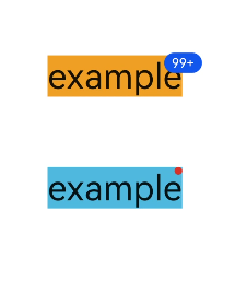
<div class="container">
<badge class="badge" config="{{badgeconfig}}" visible="true" count="100" maxcount="99">
<text class="text1">example</text>
</badge>
<badge class="badge" visible="true" count="0">
<text class="text2">example</text>
</badge>
</div>
.container {
flex-direction: column;
width: 100%;
align-items: center;
}
.badge {
width: 50%;
margin-top: 100px;
}
.text1 {
background-color: #f9a01e;
font-size: 50px;
}
.text2 {
background-color: #46b1e3;
font-size: 50px;
}
export default {
data:{
badgeconfig:{
badgeColor:"#0a59f7",
textColor:"#ffffff",
}
}
}