Text
NOTE This component is supported since API version 7. Updates will be marked with a superscript to indicate their earliest API version.
The <Text> component is used to display a paragraph of textual information.
Required Permissions
None
Child Components
The <Text> component can contain the child component .
APIs
Text(content?: string)
- Parameters
| Name | Type | Mandatory | Default Value | Description |
|---|---|---|---|---|
| content | string | No | '' | Text content, which is the content of the child component <Span>. This parameter does not take effect when the child component <Span> is contained. |
Attributes
| Name | Type | Default Value | Description |
|---|---|---|---|
| textAlign | TextAlign | TextAlign.Start | Text alignment mode of multiple lines of text. |
| textOverflow | {overflow: TextOverflow} | {overflow: TextOverflow.Clip} | Display mode when the text is too long. |
| maxLines | number | Infinity | Maximum number of lines in the text. |
| lineHeight | Length | - | Text line height. If the value is less than or equal to 0, the line height is not limited and the font size is adaptive. If the value of the number type, the unit fp is used. |
| decoration | { type: TextDecorationType, color?: Color } |
{ type: TextDecorationType.None, color: Color.Black } |
Style and color of the text decorative line. |
| baselineOffset | Length | - | Offset of the text baseline. |
| textCase | TextCase | TextCase.Normal | Text case. |
- TextAlign enums
| Name | Description |
|---|---|
| Center | The text is center-aligned. |
| Start | The text is aligned with the direction in which the text is written. |
| End | The text is aligned with the opposite direction in which the text is written. |
- TextOverflow enums
| Name | Description |
|---|---|
| Clip | Extra text is truncated. |
| Ellipsis | The ellipsis (...) is used for extra-long text. |
| None | No truncation or ellipsis is used for extra-long text. |
- TextDecorationType enums
| Name | Description |
|---|---|
| Underline | An underline is used. |
| LineThrough | A strikethrough is used. |
| Overline | An overline is used. |
| None | No decorative line is used. |
- TextCase enums
| Name | Description |
|---|---|
| Normal | The original case of the text is retained. |
| LowerCase | All letters in the text are in lowercase. |
| UpperCase | All letters in the text are in uppercase. |
Example
@Entry
@Component
struct TextExample1 {
build() {
Flex({ direction: FlexDirection.Column, alignItems: ItemAlign.Start, justifyContent: FlexAlign.SpaceBetween }) {
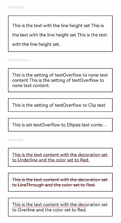
Text('lineHeight').fontSize(9).fontColor(0xCCCCCC)
Text('This is the text with the line height set This is the text with the line height set This is the text with the line height set.')
.lineHeight(25).fontSize(12).border({ width: 1 }).padding(10)
Text('TextOverflow').fontSize(9).fontColor(0xCCCCCC)
Text('This is the setting of textOverflow to none text content This is the setting of textOverflow to none text content.')
.textOverflow({ overflow: TextOverflow.None })
.fontSize(12).border({ width: 1 }).padding(10)
Text('This is the setting of textOverflow to Clip text content This is the setting of textOverflow to Clip text content.')
.textOverflow({ overflow: TextOverflow.Clip })
.maxLines(1).fontSize(12).border({ width: 1 }).padding(10)
Text('This is set textOverflow to Ellipsis text content This is set textOverflow to Ellipsis text content.')
.textOverflow({ overflow: TextOverflow.Ellipsis })
.maxLines(1).fontSize(12).border({ width: 1 }).padding(10)
Text('decoration').fontSize(9).fontColor(0xCCCCCC)
Text('This is the text content with the decoration set to Underline and the color set to Red.')
.decoration({ type: TextDecorationType.Underline, color: Color.Red })
.fontSize(12).border({ width: 1 }).padding(10)
Text('This is the text content with the decoration set to LineThrough and the color set to Red.')
.decoration({ type: TextDecorationType.LineThrough, color: Color.Red })
.fontSize(12).border({ width: 1 }).padding(10)
Text('This is the text content with the decoration set to Overline and the color set to Red.')
.decoration({ type: TextDecorationType.Overline, color: Color.Red })
.fontSize(12).border({ width: 1 }).padding(10)
}.height(600).width(350).padding({ left: 35, right: 35, top: 35 })
}
}
@Entry
@Component
struct TextExample2 {
build() {
Flex({ direction: FlexDirection.Column, alignItems: ItemAlign.Start, justifyContent: FlexAlign.SpaceBetween }) {
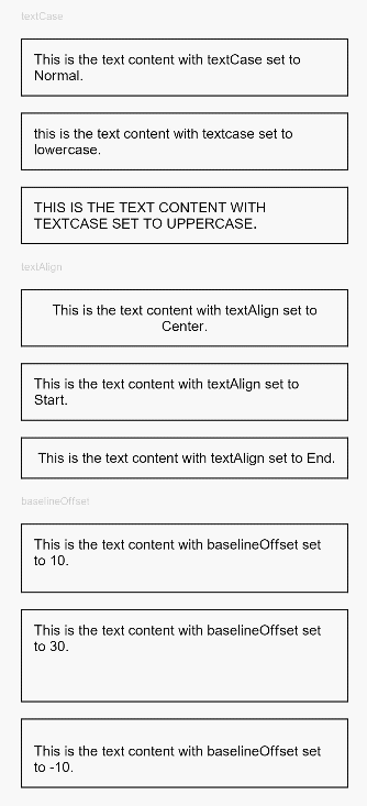
Text('textCase').fontSize(9).fontColor(0xCCCCCC)
Text('This is the text content with textCase set to Normal.')
.textCase(TextCase.Normal)
.fontSize(12).border({ width: 1 }).padding(10).width('100%')
Text('This is the text content with textCase set to LowerCase.')
.textCase(TextCase.LowerCase)
.fontSize(12).border({ width: 1 }).padding(10).width('100%')
Text('This is the text content with textCase set to UpperCase.')
.textCase(TextCase.UpperCase)
.fontSize(12).border({ width: 1 }).padding(10)
Text('textAlign').fontSize(9).fontColor(0xCCCCCC)
Text('This is the text content with textAlign set to Center.')
.textAlign(TextAlign.Center)
.fontSize(12).border({ width: 1 }).padding(10).width('100%')
Text('This is the text content with textAlign set to Start.')
.textAlign(TextAlign.Start)
.fontSize(12).border({ width: 1 }).padding(10).width('100%')
Text('This is the text content with textAlign set to End.')
.textAlign(TextAlign.End)
.fontSize(12).border({ width: 1 }).padding(10).width('100%')
Text('baselineOffset').fontSize(9).fontColor(0xCCCCCC)
Text('This is the text content with baselineOffset set to 10.')
.baselineOffset(10).fontSize(12).border({ width: 1 }).padding(10).width('100%')
Text('This is the text content with baselineOffset set to 30.')
.baselineOffset(30).fontSize(12).border({ width: 1 }).padding(10).width('100%')
Text('This is the text content with baselineOffset set to -10.')
.baselineOffset(-10).fontSize(12).border({ width: 1 }).padding(10).width('100%')
}.height(700).width(350).padding({ left: 35, right: 35, top: 35 })
}
}