input
The <input> component provides an interactive interface to receive user input. It can be a radio button, check box, button, single-line text box, and more.
Required Permissions
None
Child Component
Not supported
Attributes
In addition to the attributes in Universal Attributes, the following attributes are supported.
Type of the input component. Available values include text, email, date, time, number, password, button, checkbox, and radio. The text, email, date, time, number, and password types can be dynamically switched and modified. The button, checkbox, and radio types cannot be dynamically modified. Available values include:
|
||||
Whether the <input> component is selected. This attribute is valid only when type is set to checkbox or radio. |
||||
Value of the input component. When type is radio, this attribute is mandatory and the value must be unique for radio buttons with the same name. |
||||
Content of the hint text. This attribute is available only when the component type is set to text, email, date, time, number, or password. |
||||
Maximum number of characters that can be entered in the input box. If no value is specified, the number of characters is not limited. |
||||
Dynamic modification is not supported.
|
||||
Icon resource path before text input. This icon does not support click events and is unavailable for button, checkbox, and radio types. The supported icon image formats are JPG, PNG, and SVG. |
||||
Whether to display the character counter for an input box. This attribute takes effect only when maxlength is set. |
||||
Array<MenuOption> |
||||
Whether to display the icon at the end of the password text box. The setting is valid only when type is set to password. |
Table 1 MenuOption5+
Styles
In addition to the styles in Universal Styles, the following styles are supported.
Whether the font size changes with the system's font size settings. |
||||
Color of the hint text in the single-line text box. This attribute is available when the component type is set to text, email, date, time, number, or password. |
||||
Font weight of the single-line text box or button. For details, see font-weight of the text component. |
||||
Events
In addition to the events in Universal Events, the following events are supported.
-
When the input component type is set to text, email, date, time, number, or password, the following events are supported.
-
When the input component type is set to checkbox or radio, the following events are supported.
Triggered when the checked status of the checkbox or radio button changes.
Methods
In addition to the methods in Universal Methods, the following events are supported.
Example Code
-
Single-line text box
<!-- xxx.hml -->
<div class="content">
  <input id="input" class="input" type="text" value="" maxlength="20" enterkeytype="send"
    headericon="/common/search.svg" placeholder="Please input text" onchange="change"
    onenterkeyclick="enterkeyClick">
  </input>
  <input class="button" type="button" value="Submit" onclick="buttonClick"></input>
</div>
/* xxx.css */ .content { width: 60%; flex-direction: column; align-items: center; } .input { placeholder-color: gray; } .button { background-color: gray; margin-top: 20px; }// xxx.js import prompt from '@system.prompt' export default { change(e){ prompt.showToast({ message: "value: " + e.value, duration: 3000, }); }, enterkeyClick(e){ prompt.showToast({ message: "enterkey clicked", duration: 3000, }); }, buttonClick(e){ this.$element("input").showError({ error: 'error text' }); }, }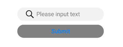
-
Common button
<!-- xxx.hml -->
<div class="div-button">
  <input class="button" type="button" value="Input-Button"></input>
</div>
/* xxx.css */ .div-button { flex-direction: column; align-items: center; } .button { margin-top: 30px; width: 280px; }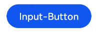
-
Check box
<!-- xxx.hml -->
<div class="content">
  <input onchange="checkboxOnChange" checked="true" type="checkbox"></input>

</div>
/* xxx.css */ .content{ width: 100%; height: 200px; align-items: center; justify-content: center; }// xxx.js import prompt from '@system.prompt' export default { checkboxOnChange(e) { prompt.showToast({ message:'checked: ' + e.checked, duration: 3000, }); } }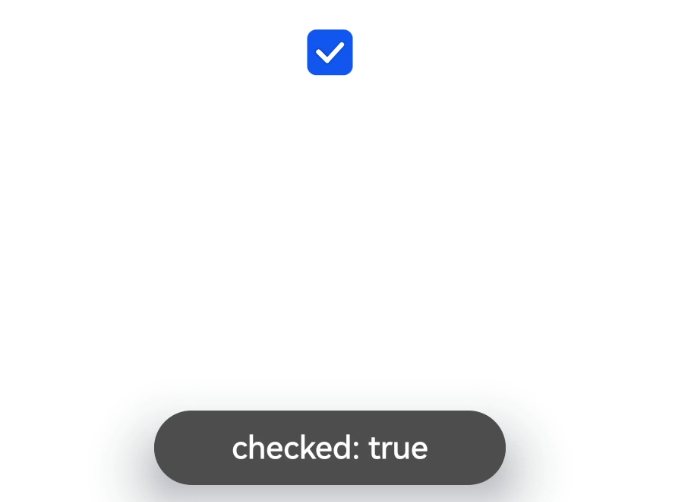
-
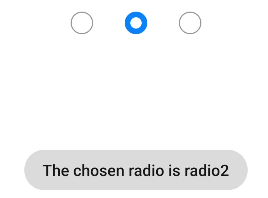
Radio button
<!-- xxx.hml -->
<div class="content">
  <input type="radio" checked='true' name="radioSample" value="radio1" onchange="onRadioChange('radio1')"></input>
  <input type="radio" checked='false' name="radioSample" value="radio2" onchange="onRadioChange('radio2')"></input>
  <input type="radio" checked='false' name="radioSample" value="radio3" onchange="onRadioChange('radio3')"></input>
</div>
/* xxx.css */ .content{ width: 100%; height: 200px; justify-content: center; align-items: center; }// xxx.js import prompt from '@system.prompt' export default { onRadioChange(inputValue, e) { if (inputValue === e.value) { prompt.showToast({ message: 'The chosen radio is ' + e.value, duration: 3000, }); } } }