popup
The <popup> component is used to display a pop-up to offer instructions after a user clicks a bound control.
Required Permissions
None
Child Components
All child components are supported. Each <popup> can have only one child component5+.
Attributes
In addition to the attributes in Universal Attributes, the following attributes are supported.
NOTE:
- The focusable attribute is not supported.
Styles
In addition to the styles in Universal Styles, the following styles are supported.
Color configuration of the mask layer. By default, the mask layer is completely transparent. |
- Position-related styles are not supported.
Events
In addition to the events in Universal Events, the following events are supported.
Methods
Only the following methods are supported.
- Attributes and styles of a <popup> component cannot be dynamically updated.
- Margins of a pop-up take effect depending on its position relative to the target element. For example, if the pop-up is below the target element, only margin-top takes effect; if the pop-up displays on the upper left of the target element, only margin-bottom and margin-right take effect.
- Styles set for the four borders of a pop-up must be the same. If they are different and the border radius is 0, the first configured border style (in the sequence of left, top, right, and bottom) takes effect. Otherwise, the border attribute does not take effect.
- The click event bound to the target element of a pop-up does not take effect.
Example Code
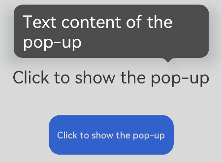
<!-- xxx.hml -->
<div class="container">
  <text id="text">Click to show the pop-up</text>
  <!-- popup supports single child of any type5+ -->
  <popup id="popup" class="popup" target="text" placement="top" keepalive="true" clickable="true"
    arrowoffset="100px" onvisibilitychange="visibilitychange" onclick="hidepopup">
    <text class="text">Text content of the pop-up</text>
  </popup>
  <button class="button" onclick="showpopup">Click to show the pop-up</button>
</div>
/* xxx.css */
.container {
  flex-direction: column;
  align-items: center;
  padding-top: 200px;
}
.popup {
  mask-color: gray;
}
.text {
  color: white;
}
.button {
  width: 220px;
  height: 70px;
  margin-top: 50px;
}
// xxx.js
import prompt from '@system.prompt'
export default {
  visibilitychange(e) {
    prompt.showToast({
      message: 'visibility change visibility: ' + e.visibility,
        duration: 3000,
    });
  },
  showpopup() {
    this.$element("popup").show();
  },
  hidepopup() {
    this.$element("popup").hide();
  },
}