DataPanel
NOTE This component is supported since API version 8. Updates will be marked with a superscript to indicate their earliest API version.
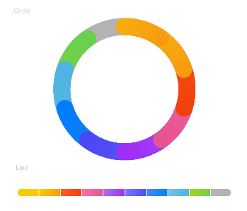
The <DataPanel> component displays proportions in a chart.
Required Permissions
None
Child Components
None
APIs
DataPanel(value:{values: number[], max?: number, type?: DataPanelType})
- Parameters
| Name | Type | Mandatory | Default Value | Description |
|---|---|---|---|---|
| values | number[] | Yes | - | Value list. A maximum of nine values are supported. |
| max | number | No | 100 | - When set to a value greater than 0, this parameter indicates the maximum value in the values list. - When set to a value equal to or smaller than 0, this parameter indicates the sum of values in the values list. The values are displayed in proportion. |
| type8+ | DataPanelType | No | DataPanelType.Circle | Type of the data panel. |
- DataPanelType enums
| Name | Description |
|---|---|
| Line | Line data panel. |
| Circle | Circle data panel. |
Example
@Entry
@Component
struct DataPanelExample {
  public values1: number[] = [10, 10, 10, 10, 10, 10, 10, 10, 10]

  build() {
    Column({ space: 5 }) {
      Text('Circle').fontSize(9).fontColor(0xCCCCCC).margin({ top: 20, right: '80%' })
      DataPanel({ values: this.values1, max: 100, type: DataPanelType.Circle }).width(200).height(200)

      Text('Line').fontSize(9).fontColor(0xCCCCCC).margin({ bottom: 20, right: '80%' })
      DataPanel({ values: this.values1, max: 100, type: DataPanelType.Line }).width(300).height(10)
    }.width('100%').margin({ top: 5 })
  }
}