TimePicker
NOTE This component is supported since API version 8. Updates will be marked with a superscript to indicate their earliest API version.
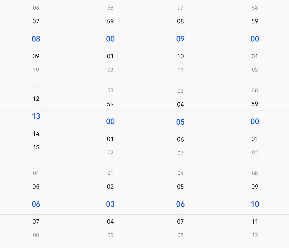
The <TimePicker> component allows users to select a time from the given range.
Required Permissions
No
Child Components
No
APIs
TimePicker(options?: TimePickerOptions)
Creates a time picker whose default time range is from 00:00 to 23:59.
- options parameters
| Name | Type | Mandatory | Default Value | Description |
|---|---|---|---|---|
| selected | Date | No | Current system time | Time of the selected item. |
Attributes
| Name | Type | Default Value | Description |
|---|---|---|---|
| useMilitaryTime | boolean | false | Whether to display time in 24-hour format. The value cannot be modified dynamically. |
Events
| Name | Description |
|---|---|
| onChange(callback: (value: TimePickerResult ) => void) | Triggered when a time is selected. |
TimePickerResult
| Name | Type | Description |
|---|---|---|
| hour | number | Hour portion of the selected time. |
| minute | number | Minute portion of the selected time. |
Example
Time Picker
@Entry
@Component
struct TimePickerExample {
  private selectedTime: Date = new Date('08-00')

  build() {
    Column() {
      TimePicker({
        selected: this.selectedTime,
      })
      .useMilitaryTime(true)
      .onChange((date: TimePickerResult) => {
        console.info('select current date is: ' + JSON.stringify(date))
      })
    }.width('100%')
  }
}
