Touch Target
NOTE This component is supported since API version 8. Updates will be marked with a superscript to indicate their earliest API version.
You can set the touch target for components that support universal click events, touch events, and gestures.
Required Permissions
None
Attributes
| Name | Type | Default Value | Description |
|---|---|---|---|
| responseRegion | Array<Rectangle> | Rectangle | { x: 0, y: 0, width: '100%', height: '100%' } |
One or more touch targets, including their location and size. > NOTE> The percentage is measured relative to the component itself. > > x and y can be set to a positive or negative percentage value. For example, when x is set to '100%', the touch target is offset from the right edge of the component by the component's width. When x is set to '-100%', the touch target is offset from the left edge of the component by the component's width. When y is set to '100%', the touch target is offset from the bottom edge of the component by the component's height. When y is set to '-100%', the touch target is offset from the top edge of the component by the component's height. > > width and height can only be set to positive percentage values. When width is set to '100%', the width of the touch target is equal to that of the component; when height is set to '100%', the height of the touch target is equal to that of the component. |
- Rectangle attributes
| Name | Type | Mandatory | Default Value | Description |
|---|---|---|---|---|
| x | Length | No | 0vp | X coordinate of the touch point relative to the left edge of the component. |
| y | Length | No | 0vp | Y coordinate of the touch point relative to the left edge of the component. |
| width | Length | No | 100% | Width of the touch target. |
| height | Length | No | 100% | Height of the touch target. |
Example
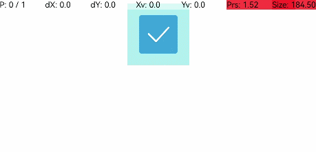
@Entry
@Component
struct ResponseRegionExample {
  build() {
    Column() {
        Toggle({ type: ToggleType.Checkbox, isOn: true })
          .selectedColor(0x39a2db)
          .backgroundColor(0xAFEEEE)
          .responseRegion({ x: 1.0, y: 1.0, width: 400, height: 400 })
          .onChange((isOn: boolean) => {
            console.info('Component status:' + isOn)
          })
    }.width('100%').margin({ top: 5 })
  }
}