slider
The <slider> component is used to quickly adjust settings, such as volume and brightness.
Child Component
Not supported
Attributes
In addition to the attributes in Universal Attributes, the following attributes are supported.
Slider style. Available values are as follows: |
||||
Whether a pop-up is displayed to show the percentage value on the slider. |
Styles
In addition to the styles in Universal Styles, the following styles are supported.
Events
In addition to the events in Universal Events, the following events are supported.
Table 1 ChangeEvent
Whether the dragging operation ends. Available values are as follows: |
||
Type of the change event. Available values are as follows: |
Example
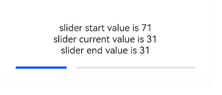
<!-- xxx.hml -->
<div class="container">
  <text>slider start value is {{startValue}}</text>
  <text>slider current value is {{currentValue}}</text>
  <text>slider end value is {{endValue}}</text>
  <slider min="0" max="100" value="{{value}}" onchange="setvalue" ></slider>
</div>
/* xxx.css */
.container {
  flex-direction: column;
  justify-content: center;
  align-items: center;


}
// xxx.js
export default {
  data: {
    value: 0,
    startValue: 0,
    currentValue: 0,
    endValue: 0,
  },
  setvalue(e) {
    if (e.mode == "start") {
      this.value = e.value;
      this.startValue = e.value;
    } else if (e.mode == "move") {
      this.value = e.value;
      this.currentValue = e.value;
    } else if (e.mode == "end") {
      this.value = e.value;
      this.endValue = e.value;
    }
  }
}