Z-order Control
NOTE This attribute is supported since API version 7. Updates will be marked with a superscript to indicate their earliest API version.
Required Permissions
None
Attributes
| Name | Type | Default Value | Description |
|---|---|---|---|
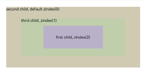
| zIndex | number | 0 | Hierarchy of sibling components in a container. A larger z-order value indicates a higher display level. |
Example
@Entry
@Component
struct ZIndexExample {
  build() {
    Column() {
      Stack() {
        // Components are stacked. By default, the component defined later is on the top.
        Text('first child, zIndex(2)')
          .size({width: '40%', height: '30%'}).backgroundColor(0xbbb2cb)
          .zIndex(2)
        // The default value is 0.
        Text('second child, default zIndex(0)')
          .size({width: '90%', height: '80%'}).backgroundColor(0xd2cab3).align(Alignment.TopStart)
        Text('third child, zIndex(1)')
          .size({width: '70%', height: '50%'}).backgroundColor(0xc1cbac).align(Alignment.TopStart)
          .zIndex(1)
      }
    }.width('100%').height(200)
  }
}