list-item-group
<list-item-group> is a child component of <list> and is used to group items in a list. By default, the width of <list-item-group> is equal to that of <list>.
- To use this component, you must set the columns attribute of the parent component <list> to 1. Otherwise, <list-item-group> is not displayed.
- You can customize the width of each <list-item-group>. However, if you retain the default value stretch of align-items for the parent component <list>, the width of <list-item-group> is equal to that of <list>. You can set align-items to other values rather than stretch to make the customized <list-item-group> width take effect.
Required Permissions
None
Child Components
Only <list-item> are supported.
Attributes
In addition to the attributes in Universal Attributes, the following attributes are supported.
NOTE:
- id in the common attributes is used to identify a group. The input parameters of related functions and event information in the list also use id to uniquely identify a group.
Styles
In addition to the styles in Universal Styles, the following styles are supported.
Events
In addition to the events in Universal Events, the following events are supported.
Methods
Methods in Universal Methods are supported.
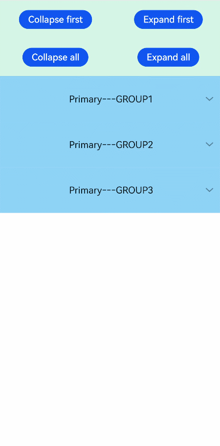
Example
<!-- xxx.hml -->
<div class="doc-page">
  <list style="width: 100%;" id="mylist">
    <list-item class="top-list-item" clickeffect="false">
      <div class="item-div">
        <div class="item-child">
          <button type="capsule" value="Collapse first" onclick="collapseOne"></button>
          <button type="capsule" value="Expand first" onclick="expandOne"></button>
        </div>
        <div class="item-child">
          <button type="capsule" value="Collapse all" onclick="collapseAll"></button>
          <button type="capsule" value="Expand all" onclick="expandAll"></button>
        </div>
      </div>
    </list-item>
    <list-item-group for="listgroup in list" id="{{listgroup.value}}" ongroupcollapse="collapse" ongroupexpand="expand">
      <list-item type="item" style="background-color:#FFF0F5;height:95px;">
        <div class="item-group-child">
          <text>One---{{listgroup.value}}</text>
        </div>
      </list-item>
      <list-item type="item" style="background-color: #87CEFA;height:145px;" primary="true">
        <div class="item-group-child">
          <text>Primary---{{listgroup.value}}</text>
        </div>
      </list-item>
    </list-item-group>
  </list>
</div>
/* xxx.css */
.doc-page {
  flex-direction: column;
}
.top-list-item {
  width:100%;
  background-color:#D4F2E7;
}
.item-div {
  flex-direction:column;
  align-items:center;
  justify-content:space-around;
  height:240px;
}
.item-child {
  width:100%;
  height:60px;
  justify-content:space-around;
  align-items:center;
}
.item-group-child {
  justify-content: center;
  align-items: center;
  width:100%;
}
// xxx.js
import prompt from '@system.prompt';
export default {
  data: {
    direction: 'column',
    list: []
  },
  onInit() {
    this.list = []
    this.listAdd = []
    for (var i = 1; i <= 3; i++) {
      var dataItem = {
        value: 'GROUP' + i,
      };
      this.list.push(dataItem);
    }
  },
  collapseOne(e) {
    this.$element('mylist').collapseGroup({
      groupid: 'GROUP1'
    })
  },
  expandOne(e) {
    this.$element('mylist').expandGroup({
      groupid: 'GROUP1'
    })
  },
  collapseAll(e) {
    this.$element('mylist').collapseGroup()
  },
  expandAll(e) {
    this.$element('mylist').expandGroup()
  },
  collapse(e) {
    prompt.showToast({
      message: 'Close ' + e.groupid
    })
  },
  expand(e) {
    prompt.showToast({
      message: 'Open ' + e.groupid
    })
  }
}