TextInput
说明: 该组件从API Version 7开始支持。后续版本如有新增内容,则采用上角标单独标记该内容的起始版本。
提供单行文本输入组件。
权限列表
无
子组件
无
接口
TextInput(value?:{placeholder?: string controller?: TextInputController})
- 参数
| 参数名 | 参数类型 | 必填 | 默认值 | 参数描述 |
|---|---|---|---|---|
| placeholder | string | 否 | - | 无输入时的提示文本。 |
| controller8+ | TextInputController | 否 | - | 设置TextInput控制器。 |
属性
除支持通用属性外,还支持以下属性:
| 名称 | 参数类型 | 默认值 | 描述 |
|---|---|---|---|
| type | InputType | InputType.Normal | 设置输入框类型。 |
| placeholderColor | Color | - | 设置placeholder颜色。 |
| placeholderFont | { size?: Length, weight?: number|FontWeight, family?: string, style?: FontStyle } |
- | 设置placeholder文本样式: - size: 设置文本尺寸,Length为number类型时,使用fp单位。 - weight: 设置文本的字体粗细,number类型取值[100, 900],取值间隔为100,默认为400,取值越大,字体越粗。 - family: 设置文本的字体列表。使用多个字体,使用','进行分割,优先级按顺序生效。例如:'Arial, sans-serif'。 - style: 设置文本的字体样式。 |
| enterKeyType | EnterKeyType | EnterKeyType.Done | 设置输入法回车键类型。 |
| caretColor | Color | - | 设置输入框光标颜色。 |
| maxLength | number | - | 设置文本的最大输入字符数。 |
| inputFilter8+ | { value: ResourceStr8+, error?: (value: string) } |
- | 正则表达式,满足表达式的输入允许显示,不满足正则表达式的输入被忽略。仅支持单个字符匹配,不支持字符串匹配。例如:^(?=.*\d)(?=.*[a-z])(?=.*[A-Z]).{8,10}$,8到10位的强密码不支持过滤。 - value:设置正则表达式。 - error:正则匹配失败时,返回被忽略的内容。 |
- EnterKeyType枚举说明
| 名称 | 描述 |
|---|---|
| EnterKeyType.Go | 显示Go文本。 |
| EnterKeyType.Search | 显示为搜索样式。 |
| EnterKeyType.Send | 显示为发送样式。 |
| EnterKeyType.Next | 显示为下一个样式。 |
| EnterKeyType.Done | 标准样式。 |
- InputType枚举说明
| 名称 | 描述 |
|---|---|
| InputType.Normal | 基本输入模式。 |
| InputType.Password | 密码输入模式。 |
| InputType.Email | e-mail地址输入模式。 |
| InputType.Number | 纯数字输入模式。 |
事件
| 名称 | 功能描述 |
|---|---|
| onChange(value: string) => void | 输入发生变化时,触发回调。 |
| onSubmit(callback: (enterKey: EnterKeyType) => void) | 回车键或者软键盘回车键触发该回调,参数为当前软键盘回车键类型。 |
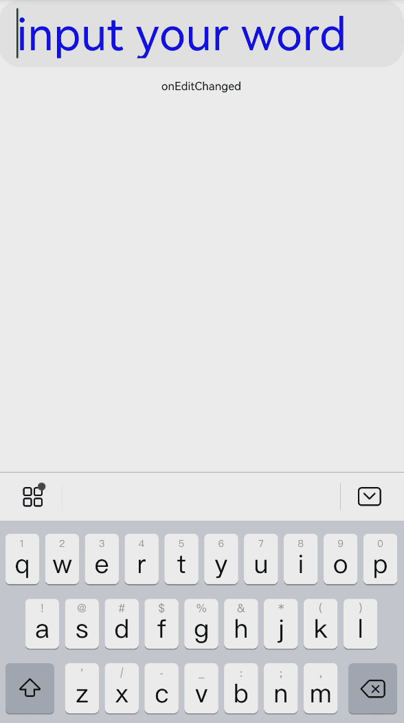
| onEditChanged(callback: (isEditing: boolean) => void)(deprecated) | 输入状态变化时,触发回调。 |
| onEditChange(callback: (isEditing: boolean) => void) 8+ | 输入状态变化时,触发回调。 |
| onCopy8+(callback:(value: string) => void) | 长按输入框内部区域弹出剪贴板后,点击剪切板复制按钮,触发回调。 value:复制的文本内容。 |
| onCut8+(callback:(value: string) => void) | 长按输入框内部区域弹出剪贴板后,点击剪切板剪切按钮,触发回调。 value:剪切的文本内容。 |
| onPaste8+(callback:(value: string) => void) | 长按输入框内部区域弹出剪贴板后,点击剪切板粘贴按钮,触发回调。 value:粘贴的文本内容。 |
TextInputController8+
TextInput组件的控制器。
导入对象
controller: TextInputController = new TextInputController()
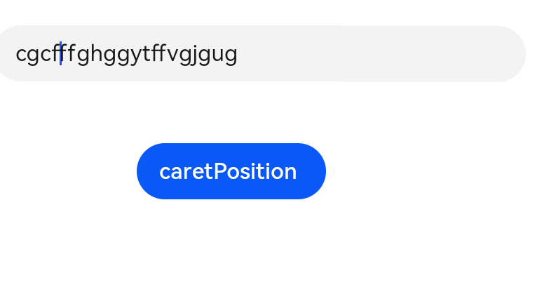
caretPosition
caretPosition(value: number): void
设置光标移动到指定位置。
- 参数
| 参数名 | 参数类型 | 必填 | 默认值 | 参数描述 |
|---|---|---|---|---|
| value | number | 是 | - | 设置输入光标的位置。 value:从字符串开始到光标所在位置的字符长度。 |
示例
单行文本输入
@Entry
@Component
struct TextInputExample1 {
  @State text: string = ''

  build() {
    Column() {
      TextArea({ placeholder: 'input your word' })
        .placeholderColor("rgb(0,0,225)")
        .placeholderFont({ size: 30, weight: 100, family: 'cursive', style: FontStyle.Italic })
        .textAlign(TextAlign.Center)
        .caretColor(Color.Blue)
        .height(50)
        .fontSize(30)
        .fontWeight(FontWeight.Bold)
        .fontFamily("sans-serif")
        .fontStyle(FontStyle.Normal)
        .fontColor(Color.Red)
        .onChange((value: string) => {
          this.text = value
        })
      Text(this.text).width('90%')
    }
  }
}
设置光标
@Entry
@Component
struct TextInputExample2 {
    @State text: string = ''
    controller: TextInputController = new TextInputController()
    build() {
        Column() {
            TextInput({ placeholder: 'Please input your words.', controller:this.controller})
            Button('caretPosition')
                .onClick(() => {
                this.controller.caretPosition(4)
            })
        }
    }
}