stepper
The <stepper> component provides a step navigator. When multiple steps are required to complete a task, you can use the <stepper> component to navigate your users through the whole process.
Required Permissions
None
Child Components
Only the <stepper-item> component is supported.
NOTE: Steps in the <stepper> are sorted according to the sequence of its <stepper-item> child components.
Attributes
In addition to the attributes in Universal Attributes, the following attributes are supported.
Index of the <stepper-item> child component that is currently displayed. |
Styles
Styles in Universal Styles are supported.
Events
In addition to the events in Universal Events, the following events are supported.
Methods
In addition to the methods in Universal Methods, the following events are supported.
Example
<!-- xxx.hml -->
<div class = "container">
<stepper class="stepper" id="mystepper" index="0" onnext="nextclick" onback="backclick">
<stepper-item class ="stepperItem" label="{{label_1}}">
<div class = "stepperItemContent" >
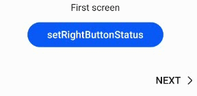
<text class = "text">First screen</text>
</div>
<button type="capsule" class ="button" value="setRightButtonStatus" onclick="setRightButton"></button>
</stepper-item>
<stepper-item class ="stepperItem" label="{{label_2}}">
<div class = "stepperItemContent" >
<text class = "text">Second screen</text>
</div>
<button type="capsule" class ="button" value="setRightButtonStatus" onclick="setRightButton"></button>
</stepper-item>
<stepper-item class ="stepperItem" label="{{label_3}}">
<div class = "stepperItemContent" >
<text class = "text">Third screen</text>
</div>
<button type="capsule" class ="button" value="setRightButtonStatus" onclick="setRightButton"></button>
</stepper-item>
</stepper>
</div>
/* xxx.css */
.container {
  margin-top: 20px;
  flex-direction: column;
  align-items: center;
  height: 300px;
}
.stepperItem {
  flex-direction: column;
  align-items: center;
}
.stepperItemContent {
  color: #0000ff;
  font-size: 50px;
  justify-content: center;
}
.button {
  width: 60%;
  margin-top: 30px;
  justify-content: center;
}
// xxx.js
export default {
  data: {
    label_1:
    {
       prevLabel: 'BACK',
       nextLabel: 'NEXT',
       status: 'normal'
     },
     label_2:
     {
       prevLabel: 'BACK',
       nextLabel: 'NEXT',
       status: 'normal'
     },
     label_3:
     {
        prevLabel: 'BACK',
        nextLabel: 'NEXT',
        status: 'normal'
     },
  },
  setRightButton(e) {
    this.$element('mystepper').setNextButtonStatus({status: 'skip', label: 'SKIP'});
  },
  nextclick(e) {
    var index = {
      pendingIndex: e.pendingIndex
    }
    return index;
  },
  backclick(e) {
    var index = {
        pendingIndex: e.pendingIndex
    }
    return index;
  },
}