创建简单视图
在这一小节中,我们将开始食物详情页的开发,学习如何通过容器组件Stack、Flex和基本组件Image、Text,构建用户自定义组件,完成图文并茂的食物介绍。
构建Stack布局
-
创建食物名称。 删掉工程模板的build方法的代码,创建Stack组件,将Text组件放进Stack组件的花括号中,使其成为Stack组件的子组件。Stack组件为堆叠组件,可以包含一个或多个子组件,其特点是后一个子组件覆盖前一个子组件。
@Entry
@Component
struct MyComponent {
  build() {
    Stack() {
        Text('Tomato')
            .fontSize(26)
            .fontWeight(500)
    }
  }
}
-
食物图片展示。 创建Image组件,指定Image组件的url,Image组件和Text组件都是必选构造参数组件。为了让Text组件在Image组件上方显示,所以要先声明Image组件。图片资源放在resources下的rawfile文件夹内,引用rawfile下资源时使用
$rawfile('filename')的形式,filename为rawfile目录下的文件相对路径。当前$rawfile仅支持Image控件引用图片资源。@Entry @Component struct MyComponent { build() { Stack() { Image($rawfile('Tomato.png')) Text('Tomato') .fontSize(26) .fontWeight(500) } } }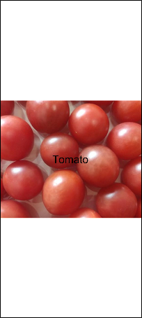
-
通过资源访问图片。 除指定图片路径外,也可以使用引用媒体资源符$r引用资源,需要遵循resources文件夹的资源限定词的规则。右键resources文件夹,点击New>Resource Directory,选择Resource Type为Media(图片资源)。
将Tomato.png放入media文件夹内。就可以通过
$r('app.type.name')的形式引用应用资源,即$r('app.media.Tomato')。@Entry @Component struct MyComponent { build() { Stack() { Image($r('app.media.Tomato')) .objectFit(ImageFit.Contain) .height(357) Text('Tomato') .fontSize(26) .fontWeight(500) } } } -
设置Image宽高,并且将image的objectFit属性设置为ImageFit.Contain,即保持图片长宽比的情况下,使得图片完整地显示在边界内。 如果Image填满了整个屏幕,原因如下:
-
Image没有设置宽高。
-
Image的objectFit默认属性是ImageFit.Cover,即在保持长宽比的情况下放大或缩小,使其填满整个显示边界。
@Entry
@Component
struct MyComponent {
  build() {
    Stack() {
        Image($r('app.media.Tomato'))
            .objectFit(ImageFit.Contain)
            .height(357)
        Text('Tomato')
            .fontSize(26)
            .fontWeight(500)
    }
  }
}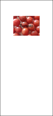
-
-
设置食物图片和名称布局。设置Stack的对齐方式为底部起始端对齐,Stack默认为居中对齐。设置Stack构造参数alignContent为Alignment.BottomStart。其中Alignment和FontWeight一样,都是框架提供的内置枚举类型。
@Entry
@Component
struct MyComponent {
  build() {
    Stack({ alignContent: Alignment.BottomStart }) {
        Image($r('app.media.Tomato'))
            .objectFit(ImageFit.Contain)
            .height(357)
         Text('Tomato')
            .fontSize(26)
            .fontWeight(500)
    }
  }
}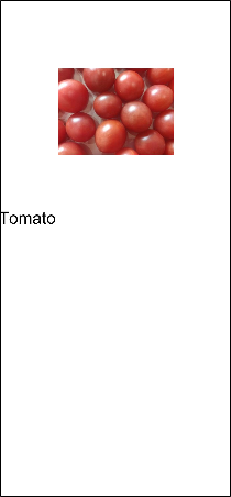
-
通过设置Stack的背景颜色来改变食物图片的背景颜色,设置颜色有两种方式:
- 通过框架提供的Color内置枚举值来设置,比如backgroundColor(Color.Red),即设置背景颜色为红色。
- string类型参数,支持的颜色格式有:rgb、rgba和HEX颜色码。比如backgroundColor('#0000FF'),即设置背景颜色为蓝色,backgroundColor('rgb(255, 255, 255)'),即设置背景颜色为白色。
@Entry
@Component
struct MyComponent {
  build() {
    Stack({ alignContent: Alignment.BottomStart }) {
        Image($r('app.media.Tomato'))
            .objectFit(ImageFit.Contain)
            .height(357)
        Text('Tomato')
            .fontSize(26)
            .fontWeight(500)
    }
    .backgroundColor('#FFedf2f5')
  }
}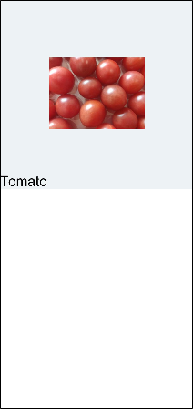
-
调整Text组件的外边距margin,使其距离左侧和底部有一定的距离。margin是简写属性,可以统一指定四个边的外边距,也可以分别指定。具体设置方式如下:
- 参数为Length时,即统一指定四个边的外边距,比如margin(20),即上、右、下、左四个边的外边距都是20。
- 参数为{top?: Length, right?: Length, bottom?: Length, left?:Length},即分别指定四个边的边距,比如margin({ left: 26, bottom: 17.4 }),即左边距为26,下边距为17.4。
@Entry
@Component
struct MyComponent {
  build() {
    Stack({ alignContent: Alignment.BottomStart }) {
        Image($r('app.media.Tomato'))
            .objectFit(ImageFit.Contain)
            .height(357)
        Text('Tomato')
            .fontSize(26)
            .fontWeight(500)
            .margin({left: 26, bottom: 17.4})
    }
     .backgroundColor('#FFedf2f5')
  }
}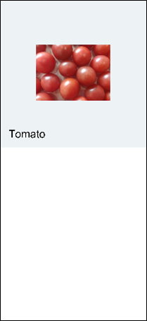
-
调整组件间的结构,语义化组件名称。创建页面入口组件为FoodDetail,在FoodDetail中创建Column,设置水平方向上居中对齐 alignItems(HorizontalAlign.Center)。MyComponent组件名改为FoodImageDisplay,为FoodDetail的子组件。 Column是子组件竖直排列的容器组件,本质为线性布局,所以只能设置交叉轴方向的对齐。
@Component
struct FoodImageDisplay {
  build() {
    Stack({ alignContent: Alignment.BottomStart }) {
      Image($r('app.media.Tomato'))
        .objectFit(ImageFit.Contain)
      Text('Tomato')
        .fontSize(26)
        .fontWeight(500)
        .margin({ left: 26, bottom: 17.4 })
    }
    .height(357)
    .backgroundColor('#FFedf2f5')
  }
}

@Entry
@Component
struct FoodDetail {
  build() {
    Column() {
      FoodImageDisplay()
    }
    .alignItems(HorizontalAlign.Center)
  }
}
构建Flex布局
开发者可以使用Flex弹性布局来构建食物的食物成分表,弹性布局在本场景的优势在于可以免去多余的宽高计算,通过比例来设置不同单元格的大小,更加灵活。
-
创建ContentTable组件,使其成为页面入口组件FoodDetail的子组件。
@Component struct FoodImageDisplay { build() { Stack({ alignContent: Alignment.BottomStart }) { Image($r('app.media.Tomato')) .objectFit(ImageFit.Contain) .height(357) Text('Tomato') .fontSize(26) .fontWeight(500) .margin({ left: 26, bottom: 17.4 }) } .backgroundColor('#FFedf2f5') } } @Component struct ContentTable { build() {} } @Entry @Component struct FoodDetail { build() { Column() { FoodImageDisplay() ContentTable() } .alignItems(HorizontalAlign.Center) } } -
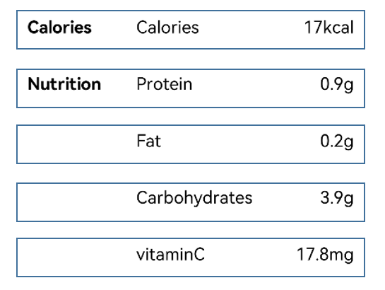
创建Flex组件展示Tomato两类成分。 一类是热量Calories,包含卡路里(Calories);一类是营养成分Nutrition,包含蛋白质(Protein)、脂肪(Fat)、碳水化合物(Carbohydrates)和维生素C(VitaminC)。
先创建热量这一类。创建Flex组件,高度为280,上、右、左内边距为30,包含三个Text子组件分别代表类别名(Calories),含量名称(Calories)和含量数值(17kcal)。Flex组件默认为水平排列方式。
已省略FoodImageDisplay代码,只针对ContentTable进行扩展。
@Component
struct ContentTable {
  build() {
    Flex() {
      Text('Calories')
        .fontSize(17.4)
        .fontWeight(FontWeight.Bold)
      Text('Calories')
        .fontSize(17.4)
      Text('17kcal')
        .fontSize(17.4)
    }
    .height(280)
    .padding({ top: 30, right: 30, left: 30 })
  }
}

@Entry
@Component
struct FoodDetail {
  build() {
    Column() {
      FoodImageDisplay()
      ContentTable()
    }
    .alignItems(HorizontalAlign.Center)
  }
}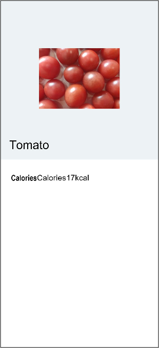
-
调整布局,设置各部分占比。分类名占比(layoutWeight)为1,成分名和成分含量一共占比(layoutWeight)2。成分名和成分含量位于同一个Flex中,成分名占据所有剩余空间flexGrow(1)。
@Component
struct FoodImageDisplay {
  build() {
    Stack({ alignContent: Alignment.BottomStart }) {
      Image($m('Tomato.png'))
        .objectFit(ImageFit.Contain)
        .height(357)
      Text('Tomato')
        .fontSize(26)
        .fontWeight(500)
        .margin({ left: 26, bottom: 17.4 })
    }
    .backgroundColor('#FFedf2f5')
  }
}

@Component
struct ContentTable {
  build() {
    Flex() {
      Text('Calories')
        .fontSize(17.4)
        .fontWeight(FontWeight.Bold)
        .layoutWeight(1)
      Flex() {
        Text('Calories')
          .fontSize(17.4)
          .flexGrow(1)
        Text('17kcal')
          .fontSize(17.4)
      }
      .layoutWeight(2)
    }
    .height(280)
    .padding({ top: 30, right: 30, left: 30 })
  }
}

@Entry
@Component
struct FoodDetail {
  build() {
    Column() {
      FoodImageDisplay()
      ContentTable()
    }
    .alignItems(HorizontalAlign.Center)
  }
}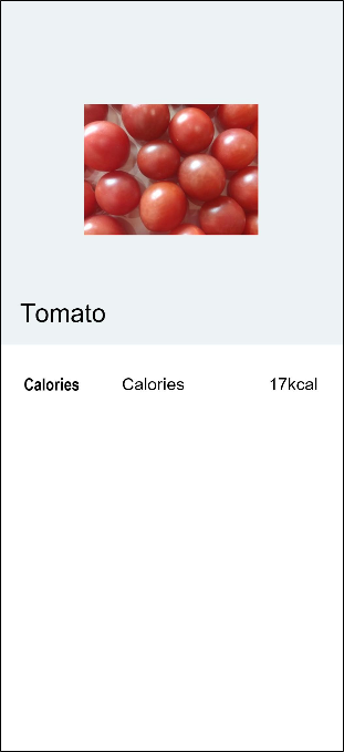
-
仿照热量分类创建营养成分分类。营养成分部分(Nutrition)包含:蛋白质(Protein)、脂肪(Fat)、碳水化合物(Carbohydrates)和维生素C(VitaminC)四个成分,后三个成分在表格中省略分类名,用空格代替。 设置外层Flex为竖直排列FlexDirection.Column, 在主轴方向(竖直方向)上等距排列FlexAlign.SpaceBetween,在交叉轴方向(水平轴方向)上首部对齐排列ItemAlign.Start。
@Component struct ContentTable { build() { Flex({ direction: FlexDirection.Column, justifyContent: FlexAlign.SpaceBetween, alignItems: ItemAlign.Start }) { Flex() { Text('Calories') .fontSize(17.4) .fontWeight(FontWeight.Bold) .layoutWeight(1) Flex() { Text('Calories') .fontSize(17.4) .flexGrow(1) Text('17kcal') .fontSize(17.4) } .layoutWeight(2) } Flex() { Text('Nutrition') .fontSize(17.4) .fontWeight(FontWeight.Bold) .layoutWeight(1) Flex() { Text('Protein') .fontSize(17.4) .flexGrow(1) Text('0.9g') .fontSize(17.4) } .layoutWeight(2) } Flex() { Text(' ') .fontSize(17.4) .fontWeight(FontWeight.Bold) .layoutWeight(1) Flex() { Text('Fat') .fontSize(17.4) .flexGrow(1) Text('0.2g') .fontSize(17.4) } .layoutWeight(2) } Flex() { Text(' ') .fontSize(17.4) .fontWeight(FontWeight.Bold) .layoutWeight(1) Flex() { Text('Carbohydrates') .fontSize(17.4) .flexGrow(1) Text('3.9g') .fontSize(17.4) } .layoutWeight(2) } Flex() { Text(' ') .fontSize(17.4) .fontWeight(FontWeight.Bold) .layoutWeight(1) Flex() { Text('vitaminC') .fontSize(17.4) .flexGrow(1) Text('17.8mg') .fontSize(17.4) } .layoutWeight(2) } } .height(280) .padding({ top: 30, right: 30, left: 30 }) } } @Entry @Component struct FoodDetail { build() { Column() { FoodImageDisplay() ContentTable() } .alignItems(HorizontalAlign.Center) } } -
使用自定义构造函数@Builder简化代码。可以发现,每个成分表中的成分单元其实都是一样的UI结构。
当前对每个成分单元都进行了声明,造成了代码的重复和冗余。可以使用@Builder来构建自定义方法,抽象出相同的UI结构声明。@Builder修饰的方法和Component的build方法都是为了声明一些UI渲染结构,遵循一样的eTS语法。开发者可以定义一个或者多个@Builder修饰的方法,但Component的build方法必须只有一个。
在ContentTable内声明@Builder修饰的IngredientItem方法,用于声明分类名、成分名称和成分含量UI描述。
@Component
struct ContentTable {
  @Builder IngredientItem(title:string, name: string, value: string) {
    Flex() {
      Text(title)
        .fontSize(17.4)
        .fontWeight(FontWeight.Bold)
        .layoutWeight(1)
      Flex({ alignItems: ItemAlign.Center }) {
        Circle({width: 6, height: 6})
          .margin({right: 12})
          .fill(colorValue)
        Text(name)
          .fontSize(17.4)
          .flexGrow(1)
        Text(value)
          .fontSize(17.4)
      }
      .layoutWeight(2)
    }
  }
}
在ContentTable的build方法内调用IngredientItem接口,需要用this去调用该Component作用域内的方法,以此来区分全局的方法调用。
@Component
struct ContentTable {
  ......
  build() {
    Flex({ direction: FlexDirection.Column, justifyContent: FlexAlign.SpaceBetween, alignItems: ItemAlign.Start }) {
      this.IngredientItem('Calories', 'Calories', '17kcal')
      this.IngredientItem('Nutrition', 'Protein', '0.9g')
      this.IngredientItem('', 'Fat', '0.2g')
      this.IngredientItem('', 'Carbohydrates', '3.9g')
      this.IngredientItem('', 'VitaminC', '17.8mg')
    }
    .height(280)
    .padding({ top: 30, right: 30, left: 30 })
  }
}
ContentTable组件整体代码如下。
@Component
struct ContentTable {
  @Builder IngredientItem(title:string, name: string, value: string) {
    Flex() {
      Text(title)
        .fontSize(17.4)
        .fontWeight(FontWeight.Bold)
        .layoutWeight(1)
      Flex() {
        Text(name)
          .fontSize(17.4)
          .flexGrow(1)
        Text(value)
          .fontSize(17.4)
      }
      .layoutWeight(2)
    }
  }

  build() {
    Flex({ direction: FlexDirection.Column, justifyContent: FlexAlign.SpaceBetween, alignItems: ItemAlign.Start }) {
      this.IngredientItem('Calories', 'Calories', '17kcal')
      this.IngredientItem('Nutrition', 'Protein', '0.9g')
      this.IngredientItem('', 'Fat', '0.2g')
      this.IngredientItem('', 'Carbohydrates', '3.9g')
      this.IngredientItem('', 'VitaminC', '17.8mg')
    }
    .height(280)
    .padding({ top: 30, right: 30, left: 30 })
  }
}

@Entry
@Component
struct FoodDetail {
    build() {
        Column() {
            FoodImageDisplay()
            ContentTable()
        }
        .alignItems(HorizontalAlign.Center)
    }
}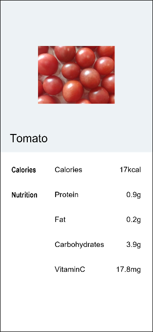
通过学习Stack布局和Flex布局已完成食物的图文展示和营养成分表,构建出第一个普通视图的食物详情页。在下一个章节中,将开发食物分类列表页,并完成食物分类列表页面和食物详情页面的跳转和数据传递,现在我们就进入下一个章节的学习吧。
相关实例
针对创建简单视图,有以下示例工程可供参考:
-
BuildCommonView:创建简单视图(eTS)(API8)本示例为构建了简单页面展示食物番茄的图片和营养信息,主要为了展示简单页面的Stack布局和Flex布局。