Visibility
NOTE This attribute is supported since API version 7. Updates will be marked with a superscript to indicate their earliest API version.
Required Permissions
None
Attributes
| Name | Type | Default Value | Description |
|---|---|---|---|
| visibility | Visibility | Visibility.Visible | Whether the component is shown or hidden. |
- Visibility enums
| Name | Description |
|---|---|
| Hidden | The component is hidden, and a placeholder is used for it in the layout. |
| Visible | The component is shown. |
| None | The component is hidden. It is not involved in the layout, and no placeholder is used for it. |
Example
@Entry
@Component
struct VisibilityExample {
build() {
Column() {
Column() {
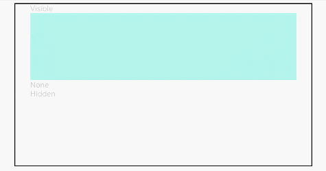
Text('Visible').fontSize(9).width('90%').fontColor(0xCCCCCC)
Row().visibility(Visibility.Visible).width('90%').height(80).backgroundColor(0xAFEEEE)
Text('None').fontSize(9).width('90%').fontColor(0xCCCCCC)
// The component is hidden and no placeholder is used.
Row().visibility(Visibility.None).width('90%').height(80).backgroundColor(0xAFEEEE)
Text('Hidden').fontSize(9).width('90%').fontColor(0xCCCCCC)
// The component is hidden and a placeholder is used.
Row().visibility(Visibility.Hidden).width('90%').height(80).backgroundColor(0xAFEEEE)
}.width('90%').border({ width: 1 })
}.width('100%').margin({ top: 5 })
}
}