Gesture Binding Methods
NOTE This method is supported since API version 7. Updates will be marked with a superscript to indicate their earliest API version.
Required Permissions
None
Binding Gesture Recognition
Use the following attributes to bind gesture recognition to a component. When a gesture is recognized, the event callback is invoked to notify the component.
| Name | Type | Default Value | Description |
|---|---|---|---|
| gesture | gesture: GestureType, mask?: GestureMask |
gesture: -, mask: GestureMask.Normal |
Gesture to recognize. gesture specifies the type of the gesture to bind, and mask specifies the event response setting. |
| priorityGesture | gesture: GestureType, mask?: GestureMask |
gesture: -, mask: GestureMask.Normal |
Gesture to preferentially recognize. gesture specifies the type of the gesture to bind, and mask specifies the event response setting. > NOTE> - By default, the child component takes precedence over the parent component in gesture recognition. When priorityGesture is configured for the parent component, the parent component takes precedence over the child component in gesture recognition. |
| parallelGesture | gesture: GestureType, mask?: GestureMask |
gesture: -, mask: GestureMask.Normal |
Gesture that can be triggered together with the child component gesture. gesture specifies the type of the gesture to bind, and mask specifies the event response setting. > NOTE> - The gesture event is not a bubbling event. When parallelGesture is set for the parent component, gesture events that are the same for the parent component and child components can be triggered, thereby implementing a bubbling effect. |
- GestureMask enums
| Name | Description |
|---|---|
| Normal | The gestures of child components are not masked and are recognized based on the default gesture recognition sequence. |
| IgnoreInternal | The gestures of child components are masked. Only the gestures of the current component are recognized. > NOTE> However, the built-in gestures of the child components are not masked. For example, when the child component is a <List> component, the built-in sliding gestures can still be triggered. |
- Gesture types
| Name | Description |
|---|---|
| TapGesture | Tap gesture, which can be a single-tap or multi-tap gesture. |
| LongPressGesture | Long press gesture. |
| PanGesture | Pan gesture. |
| PinchGesture | Pinch gesture. |
| RotationGesture | Rotation gesture. |
| GestureGroup | A group of gestures. Continuous recognition, parallel recognition, and exclusive recognition are supported. |
Gesture Response Event
The component uses the gesture method to bind the gesture object and uses the events provided in this object to respond to the gesture operation. For example, the onAction event of the TapGesture object can be used to respond to a click event. For details about the event definition, see the section of each gesture object.
- TapGesture events
| Name | Description |
|---|---|
| onAction((event?: GestureEvent) => void) | Callback invoked when a tap gesture is recognized. |
- GestureEvent attributes
| Name | Type | Description |
|---|---|---|
| timestamp | number | Timestamp of the event. |
| target8+ | EventTarget | Object that triggers the gesture event. |
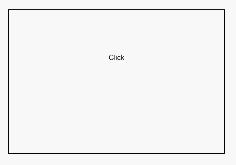
Example
@Entry
@Component
struct GestureSettingsExample {
  @State value: string = ''

  build() {
    Column(){
      Column() {
        Text('Click\n' + this.value)
          .gesture(
          TapGesture()
            .onAction(() => {
              this.value = 'gesture onAction'
            }))
      }.height(200).width(300).padding(60).border({ width: 1 })
    // When priorityGesture is specified, the bound gesture is preferentially recognized and the child component gesture is ignored.
      .priorityGesture(
      TapGesture()
        .onAction((event: GestureEvent) => {
          this.value = 'priorityGesture onAction' + '\ncomponent globalPos:('
          + event.target.area.globalPos.x + ',' + event.target.area.globalPos.y + ')\nwidth:'
          + event.target.area.width + '\nheight:' + event.target.area.height
        }), GestureMask.IgnoreInternal
      )
    }.padding(60)
  }
}