Toggle
NOTE This component is supported since API version 8. Updates will be marked with a superscript to indicate their earliest API version.
Required Permissions
None
Child Components
None
APIs
Toggle(options: { type: ToggleType, isOn?: boolean })
- Parameters
| Name | Type | Mandatory | Default Value | Description |
|---|---|---|---|---|
| type | ToggleType | Yes | - | Type of the toggle. |
| isOn | boolean | No | false | Initial state of the toggle. > NOTE> If isOn is not set during component creation, the selected state can be retained during component reuse. If isOn is set, the selected state needs to be retained during component reuse after the selected state is recorded using an event method. |
- ToggleType enums
| Name | Description |
|---|---|
| Checkbox | A checkbox is provided. The text setting of the child component does not take effect. If the text setting is required, you can place the <Text> component and the current component in the layout component. |
| Button | A button is provided. If the text setting is available, the corresponding text content is displayed inside the button. |
| Switch | A switch is provided. The text setting of the child component does not take effect. If the text setting is required, you can place the <Text> component and the current component in the layout component. |
Attributes
| Name | Type | Default Value | Description |
|---|---|---|---|
| selectedColor | Color | - | Background color of the toggle when it is enabled. |
| switchPointColor | Color | - | Color of the circular slider of the Switch type. > NOTE> This attribute is valid only when type is set to ToggleType.Switch. |
Events
| Name | Description |
|---|---|
| onChange(callback: (isOn: boolean) => void) | Triggered when the switch status changes. |
Example
@Entry
@Component
struct ToggleExample {
build() {
Column({ space: 10 }) {
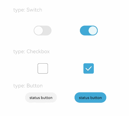
Text('type: Switch').fontSize(12).fontColor(0xcccccc).width('90%')
Flex({ justifyContent: FlexAlign.SpaceEvenly, alignItems: ItemAlign.Center }) {
Toggle({ type: ToggleType.Switch, isOn: false })
.selectedColor(0xed6f21)
.switchPointColor(0xe5ffffff)
.onChange((isOn: boolean) => {
console.info('Component status:' + isOn)
})
Toggle({ type: ToggleType.Switch, isOn: true })
.selectedColor(0x39a2db)
.switchPointColor(0xe5ffffff)
.onChange((isOn: boolean) => {
console.info('Component status:' + isOn)
})
}
Text('type: Checkbox').fontSize(12).fontColor(0xcccccc).width('90%')
Flex({ justifyContent: FlexAlign.SpaceEvenly, alignItems: ItemAlign.Center }) {
Toggle({ type: ToggleType.Checkbox, isOn: false })
.size({ width: 28, height: 28 })
.selectedColor(0xed6f21)
.onChange((isOn: boolean) => {
console.info('Component status:' + isOn)
})
Toggle({ type: ToggleType.Checkbox, isOn: true })
.size({ width: 28, height: 28 })
.selectedColor(0x39a2db)
.onChange((isOn: boolean) => {
console.info('Component status:' + isOn)
})
}
Text('type: Button').fontSize(12).fontColor(0xcccccc).width('90%')
Flex({ justifyContent: FlexAlign.SpaceEvenly, alignItems: ItemAlign.Center }) {
Toggle({ type: ToggleType.Button, isOn: false }) {
Text('status button').padding({ left: 12, right: 12 })
}
.selectedColor(0xed6f21)
.onChange((isOn: boolean) => {
console.info('Component status:' + isOn)
})
Toggle({ type: ToggleType.Button, isOn: true }) {
Text('status button').padding({ left: 12, right: 12 })
}
.selectedColor(0x39a2db)
.onChange((isOn: boolean) => {
console.info('Component status:' + isOn)
})
}
}.width('100%').padding(24)
}
}