image
NOTE
This component is supported since API version 4. Updates will be marked with a superscript to indicate their earliest API version.
The <image> component is used to render and display images.
Child Components
Not supported
Attributes
In addition to the universal attributes, the following attributes are supported.
| Name | Type | Default Value | Mandatory | Description |
|---|---|---|---|---|
| src | string | - | No | Image path, which supports local paths. The supported image formats include PNG, JPG, BMP, SVG, and GIF. - The Base64 string6+ is supported in the following format: data:image/[png | jpeg | bmp | webp];base64, [base64 data], where [base64 data] is a Base64 string. - The path prefix of dataability:// is supported, which allows access to the image path provided by the Data ability.6+ |
| alt | string | - | No | Alternative information for the image, which is displayed during image loading. |
Styles
In addition to the universal styles, the following styles are supported.
| Name | Type | Default Value | Mandatory | Description |
|---|---|---|---|---|
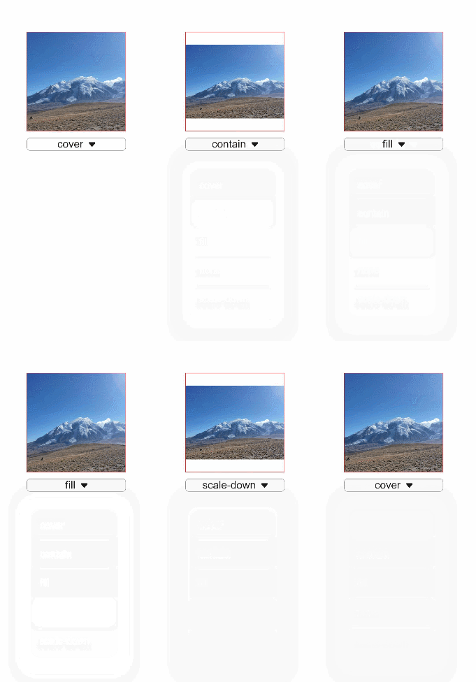
| object-fit | string | cover | No | Image scale type. This style is not supported for SVG images. For details about available values, see object-fit. |
| match-text-direction | boolean | false | No | Whether image orientation changes with the text direction. This style is not supported for SVG images. |
| fit-original-size | boolean | false | No | Whether the <image> component adapts to the image source size when its width and height are not set. If this style is set to true, object-fit will not take effect. This style is not supported for SVG images. |
| object-position7+ | string | 0px 0px | No | Position of the image in the component. The options are as follows: 1. Pixels, in px. For example, 15px 15px indicates the position to move along the x-axis or y-axis. 2. Characters. Optional values are as follows: - left: The image is displayed on the left of the component.< - top: The image is displayed on the top of the component. - right: The image is displayed on the right of the component. - bottom: The image is displayed at the bottom of the component. |
Table 1 object-fit
| Type | Description |
|---|---|
| cover | The image is scaled with its aspect ratio retained for both sides to be greater than or equal to the display boundaries and displayed in the middle. |
| contain | The image is scaled with the aspect ratio retained for the image to be completely displayed within the display boundaries and displayed in the middle. |
| fill | The image is scaled to fill the display area, and its aspect ratio is not retained. |
| none | The image is displayed in the middle with its aspect ratio and size retained. |
| scale-down | The image is displayed in the middle with its aspect ratio retained. The size is equal to or smaller than the original size. |
NOTE
When using an SVG image, note that:
The SVG image will not be drawn if the length or width of the <image> component is infinity.
If the image length and width are not specified in the SVG description, the SVG image fills the <image> component area.
If the image length and width are specified in the SVG description, the following rules are adopted to decide the final display effect:
If the <image> component is too small to afford the SVG image, the SVG image is cropped and only its upper left part is displayed in the component.
If the <image> component is big enough to afford the SVG image, this SVG image is displayed in the upper left corner of the component.
- For SVG images, only the following tags are included in the supported list: svg, rect, circle, ellipse, path, line, polyline, polygon, animate, animateMotion, and animateTransform.
Events
In addition to the universal events, the following events are supported.
| Name | Parameter | Description |
|---|---|---|
| complete | { width: width, height: height } |
Triggered when an image is successfully loaded. The loaded image size is returned. |
| error | { width: width, height: height } |
Triggered when an exception occurs during image loading. In this case, the width and height are 0. |
Methods
The universal methods are supported.
Example
<!-- xxx.hml -->
<div class="container">
  <image src="common/images/example.png" style="width: 300px; height: 300px; object-fit:{{fit}}; object-position: center center; border: 1px solid red;">
  </image>
  <select class="selects" onchange="change_fit"><option for="{{fits}}" value="{{$item}}">{{$item}}</option></select>
</div>
/* xxx.css */
.container {
  justify-content: center;
  align-items: center;
  flex-direction: column;
}
.selects{
  margin-top: 20px;
  width:300px;
  border:1px solid #808080;
  border-radius: 10px;
}
// xxx.js
export default {
  data: {
    fit:"cover",
    fits: ["cover", "contain", "fill", "none", "scale-down"],
  },
  change_fit(e) {
    this.fit = e.newValue;
  },
}
