Select
The <Select> component provides a drop-down list box that allows users to select among multiple options.
NOTE
This component is supported since API version 8. Updates will be marked with a superscript to indicate their earliest API version.
Child Components
Not supported
APIs
Select(options: Array<SelectOption>)
SelectOption
| Name | Type | Mandatory | Description |
|---|---|---|---|
| value | ResourceStr | Yes | Value of an option in the drop-down list box. |
| icon | ResourceStr | No | Icon of an option in the drop-down list box. |
Attributes
In addition to the universal attributes, the following attributes are supported.
| Name | Type | Description |
|---|---|---|
| selected | number | Index of the initial selected option in the drop-down list box. The index of the first option is 0. If this attribute is not set, the default value -1 is used, indicating that no option is selected. |
| value | string | Text of the drop-down button. By default, it will be replaced by the content of the selected option. |
| font | Font | Text font of the drop-down button. Default value: { size: '16fp', weight: FontWeight.Medium } |
| fontColor | ResourceColor | Text color of the drop-down button. Default value: '#E6FFFFFF' |
| selectedOptionBgColor | ResourceColor | Background color of the selected option in the drop-down list box. Default value: '#33007DFF' |
| selectedOptionFont | Font | Text font of the selected option in the drop-down list box. Default value: { size: '16fp', weight: FontWeight.Regular } |
| selectedOptionFontColor | ResourceColor | Text color of the selected option in the drop-down list box. Default value: '#ff007dff' |
| optionBgColor | ResourceColor | Background color of an option in the drop-down list box. Default value: '#ffffffff' |
| optionFont | Font | Text font of an option in the drop-down list box. Default value: { size: '16fp', weight: FontWeight.Regular } |
| optionFontColor | ResourceColor | Text color of an option in the drop-down list box. Default value: '#ff182431' |
Events
| Name | Description |
|---|---|
| onSelect(callback: (index: number, value?: string) => void) | Invoked when an option in the drop-down list box is selected. index: index of the selected option. value: value of the selected option. |
Example
// xxx.ets
@Entry
@Component
struct SelectExample {
build() {
Column() {
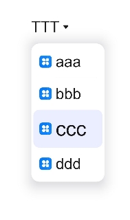
Select([{ value: 'aaa', icon: "/common/public_icon.svg" },
{ value: 'bbb', icon: "/common/public_icon.svg" },
{ value: 'ccc', icon: "/common/public_icon.svg" },
{ value: 'ddd', icon: "/common/public_icon.svg" }])
.selected(2)
.value('TTTTT')
.font({ size: 16, weight: 500 })
.fontColor('#182431')
.selectedOptionFont({ size: 16, weight: 400 })
.optionFont({ size: 16, weight: 400 })
.onSelect((index: number) => {
console.info('Select:' + index)
})
}.width('100%')
}
}