TabContent
The <TabContent> component is used only in the <Tabs> component. It corresponds to the content view of a switched tab page.
NOTE
This component is supported since API version 7. Updates will be marked with a superscript to indicate their earliest API version.
Child Components
This component supports only one child component.
NOTE
Built-in components and custom components are allowed, with support for (if/else, ForEach, and LazyForEach) rendering control.
APIs
TabContent()
Attributes
In addition to the universal attributes, the following attributes are supported.
| Name | Type | Description |
|---|---|---|
| tabBar | string | Resource | { icon?: string | Resource, text?: string | Resource } | CustomBuilder8+ |
Content displayed on the tab bar. CustomBuilder: builder, to which components can be passed (applicable to API version 8 and later versions). NOTE If an icon uses an SVG image, the width and height attributes of the SVG image must be deleted. Otherwise, the icon size will be determined by the width and height attributes of the SVG image. If the content set exceeds the space provided by the tab bar, it will be clipped. |
| tabBar9+ | SubTabBarStyle | BottomTabBarStyle | Content displayed on the tab bar. SubTabBarStyle: subtab style. It takes text as its input parameter. BottomTabBarStyle: bottom and side tab style. It takes text and images as its input parameters. NOTE The bottom tab style does not include an underline. When an icon display error occurs, a gray blank block is displayed. |
NOTE
- The <TabContent> component does not support setting of the common width attribute. By default, its width is the same as that of the parent <Tabs> component.
- The <TabContent> component does not support setting of the common height attribute. Its height is determined by the height of the parent <Tabs> component and the <TabBar> component.
- If the vertical attribute is false, the width and height descriptions are swapped in the preceding two restrictions.
- <TabContent> does not support page scrolling. If page scrolling is required, consider nesting a list.
SubTabBarStyle9+
Implements the subtab style.
constructor9+
constructor(content: string | Resource)
Constructor used to create a SubTabBarStyle instance.
Parameters
| Name | Type | Mandatory | Description |
|---|---|---|---|
| content | string | Resource | Yes | Text for the tab. Since API version 10, the type of content is ResourceStr. |
BottomTabBarStyle9+
Implements the bottom and side tab style.
constructor9+
constructor(icon: string | Resource, text: string | Resource)
A constructor used to create a BottomTabBarStyle instance.
Parameters
| Name | Type | Mandatory | Description |
|---|---|---|---|
| icon | string | Resource | Yes | Image for the tab. Since API version 10, the type of icon is ResourceStr. |
| text | string | Resource | Yes | Text for the tab. Since API version 10, the type of text is ResourceStr. |
Example
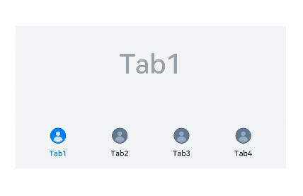
Example 1:
// xxx.ets
@Entry
@Component
struct TabContentExample {
  @State fontColor: string = '#182431'
  @State selectedFontColor: string = '#007DFF'
  @State currentIndex: number = 0
  private controller: TabsController = new TabsController()

  @Builder TabBuilder(index: number) {
    Column() {
      Image(this.currentIndex === index ? '/common/public_icon_on.svg' : '/common/public_icon_off.svg')
        .width(24)
        .height(24)
        .margin({ bottom: 4 })
        .objectFit(ImageFit.Contain)
      Text(`Tab${index + 1}`)
        .fontColor(this.currentIndex === index ? this.selectedFontColor : this.fontColor)
        .fontSize(10)
        .fontWeight(500)
        .lineHeight(14)
    }.width('100%')
  }

  build() {
    Column() {
      Tabs({ barPosition: BarPosition.End, controller: this.controller }) {
        TabContent() {
          Column() {
            Text('Tab1')
              .fontSize(36)
              .fontColor('#182431')
              .fontWeight(500)
              .opacity(0.4)
              .margin({ top: 30, bottom: 56.5 })
            Divider()
              .strokeWidth(0.5)
              .color('#182431')
              .opacity(0.05)
          }.width('100%')
        }.tabBar(this.TabBuilder(0))

        TabContent() {
          Column() {
            Text('Tab2')
              .fontSize(36)
              .fontColor('#182431')
              .fontWeight(500)
              .opacity(0.4)
              .margin({ top: 30, bottom: 56.5 })
            Divider()
              .strokeWidth(0.5)
              .color('#182431')
              .opacity(0.05)
          }.width('100%')
        }.tabBar(this.TabBuilder(1))

        TabContent() {
          Column() {
            Text('Tab3')
              .fontSize(36)
              .fontColor('#182431')
              .fontWeight(500)
              .opacity(0.4)
              .margin({ top: 30, bottom: 56.5 })
            Divider()
              .strokeWidth(0.5)
              .color('#182431')
              .opacity(0.05)
          }.width('100%')
        }.tabBar(this.TabBuilder(2))

        TabContent() {
          Column() {
            Text('Tab4')
              .fontSize(36)
              .fontColor('#182431')
              .fontWeight(500)
              .opacity(0.4)
              .margin({ top: 30, bottom: 56.5 })
            Divider()
              .strokeWidth(0.5)
              .color('#182431')
              .opacity(0.05)
          }.width('100%')
        }.tabBar(this.TabBuilder(3))
      }
      .vertical(false)
      .barHeight(56)
      .onChange((index: number) => {
        this.currentIndex = index
      })
      .width(360)
      .height(190)
      .backgroundColor('#F1F3F5')
      .margin({ top: 38 })
    }.width('100%')
  }
}
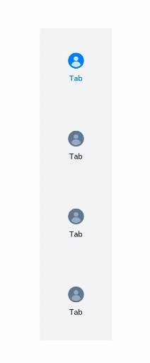
Example 2:
// xxx.ets
@Entry
@Component
struct TabContentExample {
  @State fontColor: string = '#182431'
  @State selectedFontColor: string = '#007DFF'
  @State currentIndex: number = 0
  private controller: TabsController = new TabsController()

  @Builder TabBuilder(index: number) {
    Column() {
      Image(this.currentIndex === index ? '/common/public_icon_on.svg' : '/common/public_icon_off.svg')
        .width(24)
        .height(24)
        .margin({ bottom: 4 })
        .objectFit(ImageFit.Contain)
      Text('Tab')
        .fontColor(this.currentIndex === index ? this.selectedFontColor : this.fontColor)
        .fontSize(10)
        .fontWeight(500)
        .lineHeight(14)
    }.width('100%').height('100%').justifyContent(FlexAlign.Center)
  }

  build() {
    Column() {
      Tabs({ barPosition: BarPosition.Start, controller: this.controller }) {
        TabContent()
          .tabBar(this.TabBuilder(0))
        TabContent()
          .tabBar(this.TabBuilder(1))
        TabContent()
          .tabBar(this.TabBuilder(2))
        TabContent()
          .tabBar(this.TabBuilder(3))
      }
      .vertical(true)
      .barWidth(96)
      .barHeight(414)
      .onChange((index: number) => {
        this.currentIndex = index
      })
      .width(96)
      .height(414)
      .backgroundColor('#F1F3F5')
      .margin({ top: 52 })
    }.width('100%')
  }
}
Example 3:
// xxx.ets
@Entry
@Component
struct TabBarStyleExample {
  build() {
    Column({ space: 5 }) {
      Text ("Subtab Style")
      Column() {
        Tabs({ barPosition: BarPosition.Start }) {
          TabContent() {
            Column().width('100%').height('100%').backgroundColor(Color.Pink)
          }.tabBar(new SubTabBarStyle('Pink'))

          TabContent() {
            Column().width('100%').height('100%').backgroundColor(Color.Yellow)
          }.tabBar(new SubTabBarStyle('Yellow'))

          TabContent() {
            Column().width('100%').height('100%').backgroundColor(Color.Blue)
          }.tabBar(new SubTabBarStyle('Blue'))

          TabContent() {
            Column().width('100%').height('100%').backgroundColor(Color.Green)
          }.tabBar(new SubTabBarStyle('Green'))
        }
        .vertical(false)
        .scrollable(true)
        .barMode(BarMode.Fixed)
        .onChange((index: number) => {
          console.info(index.toString())
        })
        .width('100%')
        .backgroundColor(0xF1F3F5)
      }.width('100%').height(200)
      Text ("Bottom Tab Style")
      Column() {
        Tabs({ barPosition: BarPosition.End }) {
          TabContent() {
            Column().width('100%').height('100%').backgroundColor(Color.Pink)
          }.tabBar(new BottomTabBarStyle($r('sys.media.ohos_app_icon'), 'pink'))

          TabContent() {
            Column().width('100%').height('100%').backgroundColor(Color.Yellow)
          }.tabBar(new BottomTabBarStyle($r('sys.media.ohos_app_icon'), 'Yellow'))

          TabContent() {
            Column().width('100%').height('100%').backgroundColor(Color.Blue)
          }.tabBar(new BottomTabBarStyle($r('sys.media.ohos_app_icon'), 'Blue'))

          TabContent() {
            Column().width('100%').height('100%').backgroundColor(Color.Green)
          }.tabBar(new BottomTabBarStyle($r('sys.media.ohos_app_icon'), 'Green'))
        }
        .vertical(false)
        .scrollable(true)
        .barMode(BarMode.Fixed)
        .onChange((index: number) => {
          console.info(index.toString())
        })
        .width('100%')
        .backgroundColor(0xF1F3F5)
      }.width('100%').height(200)
      Text ("Side Tab Style")
      Column() {
        Tabs({ barPosition: BarPosition.Start }) {
          TabContent() {
            Column().width('100%').height('100%').backgroundColor(Color.Pink)
          }.tabBar(new BottomTabBarStyle($r('sys.media.ohos_app_icon'), 'pink'))

          TabContent() {
            Column().width('100%').height('100%').backgroundColor(Color.Yellow)
          }.tabBar(new BottomTabBarStyle($r('sys.media.ohos_app_icon'), 'Yellow'))

          TabContent() {
            Column().width('100%').height('100%').backgroundColor(Color.Blue)
          }.tabBar(new BottomTabBarStyle($r('sys.media.ohos_app_icon'), 'Blue'))

          TabContent() {
            Column().width('100%').height('100%').backgroundColor(Color.Green)
          }.tabBar(new BottomTabBarStyle($r('sys.media.ohos_app_icon'), 'Green'))
        }
        .vertical(true).scrollable(true).barMode(BarMode.Fixed)
        .onChange((index: number) => {
          console.info(index.toString())
        })
        .width('100%')
        .backgroundColor(0xF1F3F5)
      }.width('100%').height(400)
    }
  }
}
