DatePicker
The <DatePicker> component allows users to select a date from the given range.
NOTE
This component is supported since API version 8. Updates will be marked with a superscript to indicate their earliest API version.
Child Components
Not supported
APIs
DatePicker(options?: {start?: Date, end?: Date, selected?: Date})
Creates a date picker in the given date range.
Parameters
| Name | Type | Mandatory | Description |
|---|---|---|---|
| start | Date | No | Start date of the picker. Default value: Date('1970-1-1') |
| end | Date | No | End date of the picker. Default value: Date('2100-12-31') |
| selected | Date | No | Date of the selected item. Default value: current system date |
Attributes
| Name | Type | Description |
|---|---|---|
| lunar | boolean | Whether to display the lunar calendar. - true: Display the lunar calendar. - false: Do not display the lunar calendar. Default value: false |
Events
| Name | Description |
|---|---|
| onChange(callback: (value: DatePickerResult) => void) | Triggered when a date is selected. |
DatePickerResult
| Name | Type | Description |
|---|---|---|
| year | number | Year of the selected date. |
| month | number | Month of the selected date. The value ranges from 0 to 11. The value 0 indicates January, and 11 indicates December. |
| day | number | Day of the selected date. |
Example
// xxx.ets
@Entry
@Component
struct DatePickerExample {
@State isLunar: boolean = false
private selectedDate: Date = new Date('2021-08-08')
build() {
Column() {
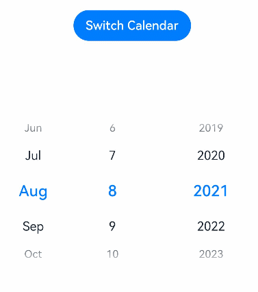
Button('Switch Calendar')
.margin({ top: 30 })
.onClick(() => {
this.isLunar = !this.isLunar
})
DatePicker({
start: new Date('1970-1-1'),
end: new Date('2100-1-1'),
selected: this.selectedDate
})
.lunar(this.isLunar)
.onChange((value: DatePickerResult) => {
this.selectedDate.setFullYear(value.year, value.month, value.day)
console.info('select current date is: ' + JSON.stringify(value))
})
}.width('100%')
}
}