TextPicker
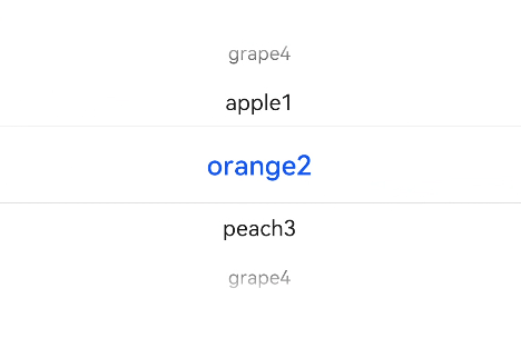
The <TextPicker> component allows users to scroll to select text.
NOTE
This component is supported since API version 8. Updates will be marked with a superscript to indicate their earliest API version.
Child Components
Not supported
APIs
TextPicker(options?: {range: string[]|Resource, selected?: number, value?: string})
Creates a text picker based on the selection range specified by range.
Parameters
| Name | Type | Mandatory | Description |
|---|---|---|---|
| range | string[] | Resource | Yes | Data selection range of the picker. This parameter cannot be set to an empty array. If set to an empty array, it will not be displayed. If it is dynamically changed to an empty array, the current value remains displayed. |
| selected | number | No | Index of the default item in the range. Default value: 0 |
| value | string | No | Value of the default item in the range. The priority of this parameter is lower than that of selected. Default value: value of the first item |
Attributes
In addition to the universal attributes, the following attributes are supported.
| Name | Type | Description |
|---|---|---|
| defaultPickerItemHeight | number | string | Height of each item in the picker. |
Events
In addition to the universal events, the following events are supported.
| Name | Description |
|---|---|
| onChange(callback: (value: string, index: number) => void) | Triggered when an item in the picker is selected. - value: value of the selected item. - index: index of the selected item. |
Example
// xxx.ets
@Entry
@Component
struct TextPickerExample {
  private select: number = 1
  private fruits: string[] = ['apple1', 'orange2', 'peach3', 'grape4']

  build() {
    Column() {
      TextPicker({ range: this.fruits, selected: this.select })
        .onChange((value: string, index: number) => {
          console.info('Picker item changed, value: ' + value + ', index: ' + index)
        })
    }
  }
}
