TextInput
The <TextInput> component provides single-line text input.
NOTE
This component is supported since API version 7. Updates will be marked with a superscript to indicate their earliest API version.
Child Components
Not supported
APIs
TextInput(value?:{placeholder?: ResourceStr, text?: ResourceStr, controller?: TextInputController})
Parameters
| Name | Type | Mandatory | Description |
|---|---|---|---|
| placeholder | ResourceStr | No | Placeholder text displayed when there is no input. |
| text | ResourceStr | No | Current text input. If the component has stateStyles or any other attribute that may trigger updating configured, you are advised to bind the state variable to the text in real time through the onChange event, so as to prevent display errors when the component is updated. |
| controller8+ | TextInputController | No | Text input controller. |
Attributes
In addition to the universal attributes, the following attributes are supported.
| Name | Type | Description |
|---|---|---|
| type | InputType | Input box type. Default value: InputType.Normal |
| placeholderColor | ResourceColor | Placeholder text color. |
| placeholderFont | Font | Placeholder text font. |
| enterKeyType | EnterKeyType | Type of the Enter key. Currently, only the default value is supported. Default value: EnterKeyType.Done |
| caretColor | ResourceColor | Color of the caret in the text box. |
| maxLength | number | Maximum number of characters in the text input. |
| inputFilter8+ | { value: ResourceStr, error?: (value: string) => void } |
Regular expression for input filtering. Only inputs that comply with the regular expression can be displayed. Other inputs are filtered out. The regular expression can match single characters, but not strings. - value: regular expression to set. - error: filtered-out content to return when regular expression matching fails. |
| copyOption9+ | CopyOptions | Whether copy and paste is allowed. If this attribute is set to CopyOptions.None, the paste operation is allowed, but not the copy or cut operation. |
| showPasswordIcon9+ | boolean | Whether to display the show password icon at the end of the password text box. Default value: true |
| style9+ | TextInputStyle | Text input style. Default value: TextInputStyle.Default |
| textAlign9+ | TextAlign | Alignment mode of the text in the text box. Default value: TextAlign.Start |
NOTE
The default value of the universal attribute padding is as follows: { top: 8 vp, right: 16 vp, bottom: 8 vp, left: 16 vp }
EnterKeyType
| Name | Description |
|---|---|
| Go | The Enter key is labeled "Go." |
| Search | The Enter key is labeled "Search." |
| Send | The Enter key is labeled "Send." |
| Next | The Enter key is labeled "Next." |
| Done | The Enter key is labeled "Done." |
InputType
| Name | Description |
|---|---|
| Normal | Normal input mode. The value can contain digits, letters, underscores (_), spaces, and special characters. |
| Password | Password input mode. The value can contain digits, letters, underscores (_), spaces, and special characters. An eye icon is used to show or hide the password, and the password is hidden behind dots by default. |
| Email address input mode. The value can contain digits, letters, underscores (_), and at signs (@). Only one at sign (@) is allowed. | |
| Number | Digit input mode. |
| PhoneNumber9+ | Phone number input mode. The value can contain digits, plus signs (+), hyphens (-), asterisks (*), and number signs (#). The length is not limited. |
TextInputStyle9+
| Name | Description |
|---|---|
| Default | Default style. The caret width is fixed at 1.5 vp, and the caret height is subject to the background height and font size of the selected text. |
| Inline | Inline input style. The background height of the selected text is the same as the height of the text box. |
Events
In addition to the universal events, the following events are supported.
| Name | Description |
|---|---|
| onChange(callback: (value: string) => void) | Triggered when the input changes. value: text content. This event is triggered when any of the following conditions is met: 1. Keyboard input is received. 2. Paste and cut is performed. 3. Ctrl+V is pressed. |
| onSubmit(callback: (enterKey: EnterKeyType) => void) | Triggered when the Enter key on the keyboard is pressed. The return value is the current type of the Enter key. enterKeyType: type of the Enter key. For details, see EnterKeyType. |
| onEditChanged(callback: (isEditing: boolean) => void)(deprecated) | Triggered when the input status changes. Since API version 8, onEditChange is recommended. |
| onEditChange(callback: (isEditing: boolean) => void)8+ | Triggered when the input status changes. When the cursor is placed in the text box, it is in the editing state. Otherwise, it is in the non-editing state. If the value of isEditing is true, text input is in progress. |
| onCopy(callback:(value: string) => void)8+ | Triggered when the copy button on the pasteboard, which displays when the text box is long pressed, is clicked. value: text to be copied. |
| onCut(callback:(value: string) => void)8+ | Triggered when the cut button on the pasteboard, which displays when the text box is long pressed, is clicked. value: text to be cut. |
| onPaste(callback:(value: string) => void)8+ | Triggered when the paste button on the pasteboard, which displays when the text box is long pressed, is clicked. value: text to be pasted. |
TextInputController8+
Implements the controller of the <TextInput> component.
Objects to Import
controller: TextInputController = new TextInputController()
caretPosition
caretPosition(value: number): void
Sets the position of the caret.
Parameters
| Name | Type | Mandatory | Description |
|---|---|---|---|
| value | number | Yes | Length from the start of the string to the position where the caret is located. |
Example
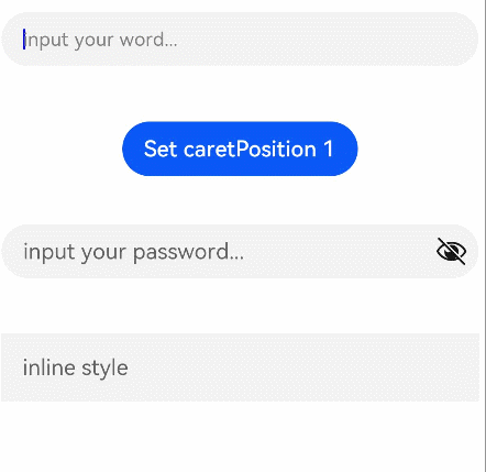
// xxx.ets
@Entry
@Component
struct TextInputExample {
  @State text: string = ''
  controller: TextInputController = new TextInputController()

  build() {
    Column() {
      TextInput({ text: this.text, placeholder: 'input your word...', controller: this.controller })
        .placeholderColor(Color.Grey)
        .placeholderFont({ size: 14, weight: 400 })
        .caretColor(Color.Blue)
        .width(400)
        .height(40)
        .margin(20)
        .fontSize(14)
        .fontColor(Color.Black)
        .inputFilter('[a-z]', (e) => {
          console.log(JSON.stringify(e))
        })
        .onChange((value: string) => {
          this.text = value
        })
      Text(this.text)
      Button('Set caretPosition 1')
        .margin(15)
        .onClick(() => {
          // Move the caret to after the first entered character.
          this.controller.caretPosition(1)
        })
      // Password text box.
      TextInput({ placeholder: 'input your password...' })
        .width(400)
        .height(40)
        .margin(20)
        .type(InputType.Password)
        .maxLength(9)
        .showPasswordIcon(true)
      // Inline-style text box.
      TextInput({ placeholder: 'inline style' })
        .width(400)
        .height(50)
        .margin(20)
        .borderRadius(0)
        .style(TextInputStyle.Inline)
    }.width('100%')
  }
}