rect
NOTE
This component is supported since API version 7. Updates will be marked with a superscript to indicate their earliest API version.
The <rect> component is used to draw rectangles and rounded rectangles.
Required Permissions
None
Child Components
The following are supported: <animate>, <animateMotion>, and <animateTransform>.
Attributes
The universal attributes and the attributes listed below are supported.
| Name | Type | Default Value | Mandatory | Description |
|---|---|---|---|---|
| id | string | - | No | Unique ID of the component. |
| width | <length>|<percentage> | 0 | No | Width of the rectangle. Attribute animations are supported. |
| height | <length>|<percentage> | 0 | No | Height of the rectangle. Attribute animations are supported. |
| x | <length>|<percentage> | 0 | No | X-coordinate of the upper left corner of the rectangle. Attribute animations are supported. |
| y | <length>|<percentage> | 0 | No | Y-coordinate of the upper left corner of the rectangle. Attribute animations are supported. |
| rx | <length>|<percentage> | 0 | No | Radius of the rectangle rounded corner in the x-axis direction. Attribute animations are supported. |
| ry | <length>|<percentage> | 0 | No | Radius of the rectangle rounded corner in the y-axis direction. Attribute animations are supported. |
Example
<!-- xxx.hml -->
<div class="container">
  <svg fill="white" width="400" height="400">
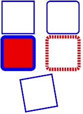
    <rect width="100" height="100" x="10" y="20" stroke-width="4" stroke="blue" id="rectId"></rect>
    <rect width="100" height="100" x="150" y="20" stroke-width="4" stroke="blue" rx="10" ry="10"></rect>
    <rect width="100" height="100" x="10" y="130" stroke-width="10" fill="red" stroke="blue" rx="10" ry="10"></rect>
    <rect width="100" height="100" x="150" y="130" stroke-width="10" stroke="red" rx="10" ry="10" stroke-dasharray="5 3" stroke-dashoffset="3"></rect>
    <rect width="100" height="100" x="20" y="270" stroke-width="4" stroke="blue" transform="rotate(-10)"></rect>
  </svg>
</div>
