textarea
NOTE
This component is supported since API version 4. Updates will be marked with a superscript to indicate their earliest API version.
The <textarea> component provides a text box to receive multi-line text input.
Required Permissions
None
Child Components
Not supported
Attributes
In addition to the universal attributes, the following attributes are supported.
| Name | Type | Default Value | Mandatory | Description |
|---|---|---|---|---|
| placeholder | string | - | No | Content of the hint text. |
| maxlength | number | - | No | Maximum number of characters that can be entered in the multi-line text box. |
| headericon | string | - | No | Icon displayed before text input. This icon does not support click events. The supported icon formats are JPG, PNG, and SVG. |
| extend | boolean | false | No | Whether a text box can be extended. If the value of this attribute is set to true, the height of the text box can adapt to the text. |
| value5+ | string | - | No | Content in a multi-line text box. |
| showcounter5+ | boolean | false | No | Whether to display the character counter for the text box. This attribute takes effect only when maxlength is set. |
| menuoptions5+ | Array<MenuOption> | - | No | Menu options displayed after users click the More button. |
| autofocus6+ | boolean | false | No | Whether to automatically obtain focus. |
| selectedstart6+ | number | -1 | No | Start position for text selection. |
| selectedend6+ | number | -1 | No | End position for text selection. |
| softkeyboardenabled6+ | boolean | true | No | Whether to display the soft keyboard during editing. |
Table 1 MenuOption5+
| Name | Type | Description |
|---|---|---|
| icon | string | Path of the icon for a menu option. |
| content | string | Text content of a menu option. |
Styles
In addition to the universal styles, the following styles are supported.
| Name | Type | Default Value | Mandatory | Description |
|---|---|---|---|---|
| color | <color> | #e6000000 | No | Text color of the multi-line text box. |
| font-size | <length> | 16px | No | Font size of the multi-line text box. |
| allow-scale | boolean | true | No | Whether the font size changes with the system's font size settings. If the config-changes tag of fontSize is configured for abilities in the config.json file, the setting takes effect without application restart. |
| placeholder-color | <color> | #99000000 | No | Color of the hint text in the multi-line text box. This attribute is available when the component type is set to one of the following: text|email|date|time|number|password. |
| font-weight | number | string | normal | No | Font weight. For details, see font-weight of the <text> component. |
| font-family | string | sans-serif | No | Font family, in which fonts are separated by commas (,). Each font is set using a font name or font family name. The first font in the family or the specified custom font is used for the text. |
| caret-color6+ | <color> | - | No | Color of the caret. |
Events
In addition to the universal events, the following events are supported.
| Name | Parameter | Description |
|---|---|---|
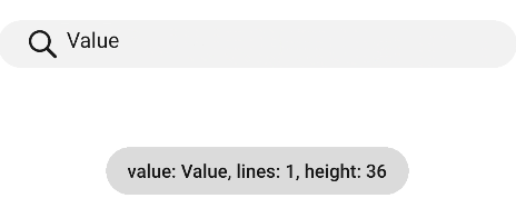
| change | { text: newText, lines: textLines, height: textHeight } | Triggered when the input content changes. The input content, number of rows, and row height are obtained through the parameters. Since API version 5, if you change the value attribute directly, this event will not be triggered. |
| translate5+ | { value: selectedText } | Triggered when users click the translate button in the menu displayed after they select a text segment. The selected text content is returned. |
| share5+ | { value: selectedText } | Triggered when users click the share button in the menu displayed after they select a text segment. The selected text content is returned. |
| search5+ | { value: selectedText } | Triggered when users click the search button in the menu displayed after they select a text segment. The selected text content is returned. |
| optionselect5+ | { index:optionIndex, value: selectedText } | Triggered when users click a menu option in the menu displayed after they select a text segment. This event is valid only when the menuoptions attribute is set. The option index and selected text content are returned. |
| selectchange6+ | { start: number, end: number } | Triggered when the text selection changes. |
Methods
The universal methods are supported.
Example
<!-- xxx.hml -->
<textarea id="textarea" class="textarea" extend="true" maxlength="20"
  headericon="/common/navigation_menu1_icon.svg" placeholder="Please input text"
  onchange="change">
</textarea>
/* xxx.css */
.textarea {
  placeholder-color: gray;
}
// xxx.js
import prompt from '@system.prompt';
export default {
change(e){
  prompt.showToast({
    message: 'value: ' + e.text + ', lines: ' + e.lines + ', height: ' + e.height,
    duration: 3000,
  });
}
}
