SideBarContainer
The <SideBarContainer> component contains a sidebar and content area as its child components. The sidebar is the first child component and can be shown or hidden as needed. The content area is the second child component.
NOTE
This component is supported since API version 8. Updates will be marked with a superscript to indicate their earliest API version.
Child Components
Supported
NOTE
- Built-in components and custom components are allowed, without support for (if/else, ForEach, and LazyForEach) rendering control.
- This component must contain two child components.
- If there are three or more child components, only the first and second child components are displayed. If there is only one child component, the sidebar is displayed, and the content area is blank.
APIs
SideBarContainer( type?: SideBarContainerType )
Parameters
| Name | Type | Mandatory | Description |
|---|---|---|---|
| type | SideBarContainerType | No | Display type of the sidebar. Default value: SideBarContainerType.Embed |
SideBarContainerType
| Name | Description |
|---|---|
| Embed | The sidebar is embedded in the component and displayed side by side with the content area. |
| Overlay | The sidebar is displayed overlaid on the content area. |
Attributes
In addition to the universal attributes, the following attributes are supported.
| Name | Type | Description |
|---|---|---|
| showSideBar | boolean | Whether to display the sidebar. Default value: true |
| controlButton | ButtonStyle | Attributes of the sidebar control button. |
| showControlButton | boolean | Whether to display the sidebar control button. Default value: true |
| sideBarWidth | number | Length9+ | Width of the sidebar. Default value: 200 Unit: vp NOTE A value less than 0 evaluates to the default value. The value must comply with the width constraints. If it is not within the valid range, the value closest to the set one is used. When set, the width of the sidebar takes precedence over that of the sidebar child components. If it is not set, however, the width of the sidebar child component takes precedence. |
| minSideBarWidth | number | Length9+ | Minimum width of the sidebar. Default value: 200, in vp NOTE A value less than 0 evaluates to the default value. The value cannot exceed the width of the sidebar container itself. Otherwise, the width of the sidebar container itself is used. When set, the minimum width of the sidebar takes precedence over that of the sidebar child components. If it is not set, however, the minimum width of the sidebar child component takes precedence. |
| maxSideBarWidth | number | Length9+ | Maximum width of the sidebar. Default value: 280, in vp NOTE A value less than 0 evaluates to the default value. The value cannot exceed the width of the sidebar container itself. Otherwise, the width of the sidebar container itself is used. When set, the maximum width of the sidebar takes precedence over that of the sidebar child components. If it is not set, however, the maximum width of the sidebar child component takes precedence. |
| autoHide9+ | boolean | Whether to automatically hide the sidebar when it is dragged to be smaller than the minimum width. Default value: true NOTE The value is subject to the minSideBarWidth attribute method. If it is not set in minSideBarWidth, the default value is used. Whether the sidebar should be hidden is determined when it is being dragged. When its width is less than the minimum width, the damping effect is required to trigger hiding (a distance out of range). |
| sideBarPosition9+ | SideBarPosition | Position of the sidebar. Default value: SideBarPosition.Start |
ButtonStyle
| Name | Type | Mandatory | Description |
|---|---|---|---|
| left | number | No | Spacing between the sidebar control button and the left of the container. Default value: 16 Unit: vp |
| top | number | No | Spacing between the sidebar control button and the top of the container. Default value: 48 Unit: vp |
| width | number | No | Width of the sidebar control button. Default value: 32 Unit: vp |
| height | number | No | Height of the sidebar control button. Default value: 32 Unit: vp |
| icons | { shown: string | PixelMap | Resource , hidden: string | PixelMap | Resource , switching?: string | PixelMap | Resource } |
No | Icons of the sidebar control button. - shown: icon of the control button when the sidebar is shown. NOTE When an error occurs during resource obtaining, the default icon is used. - hidden: icon of the control button when the sidebar is hidden. - switching: icon of the control button when the sidebar is switching between the shown and hidden states. |
SideBarPosition9+
| Name | Description |
|---|---|
| Start | The sidebar is on the left side of the container. |
| End | The sidebar is on the right side of the container. |
Events
In addition to the universal events, the following events are supported.
| Name | Description |
|---|---|
| onChange(callback: (value: boolean) => void) | Triggered when the status of the sidebar switches between shown and hidden. The value true means that the sidebar is displayed, and false means the opposite. This event is triggered when any of the following conditions is met: 1. The value of showSideBar changes. 2. The showSideBar attribute adapts to behavior changes. 3. The autoHide API is triggered when the divider is dragged. |
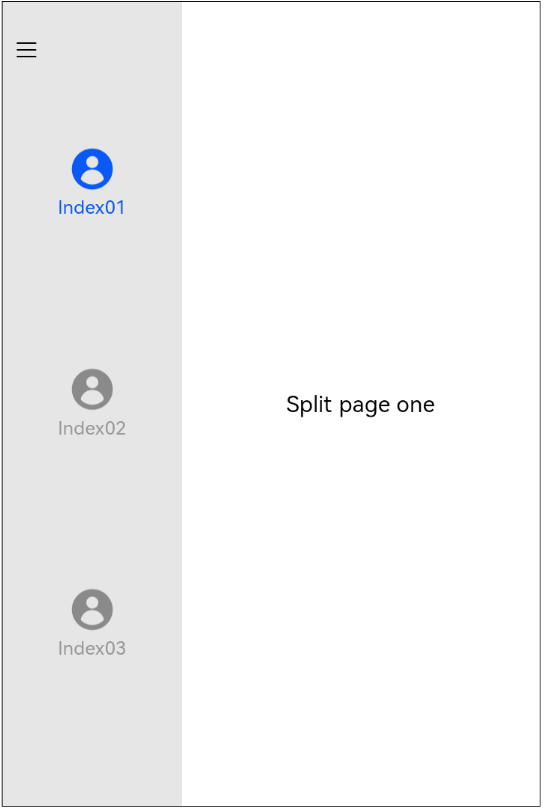
Example
// xxx.ets
@Entry
@Component
struct SideBarContainerExample {
  normalIcon: Resource = $r("app.media.icon")
  selectedIcon: Resource = $r("app.media.icon")
  @State arr: number[] = [1, 2, 3]
  @State current: number = 1

  build() {
    SideBarContainer(SideBarContainerType.Embed) {
      Column() {
        ForEach(this.arr, (item, index) => {
          Column({ space: 5 }) {
            Image(this.current === item ? this.selectedIcon : this.normalIcon).width(64).height(64)
            Text("Index0" + item)
              .fontSize(25)
              .fontColor(this.current === item ? '#0A59F7' : '#999')
              .fontFamily('source-sans-pro,cursive,sans-serif')
          }
          .onClick(() => {
            this.current = item
          })
        }, item => item)
      }.width('100%')
      .justifyContent(FlexAlign.SpaceEvenly)
      .backgroundColor('#19000000')


      Column() {
        Text('SideBarContainer content text1').fontSize(25)
        Text('SideBarContainer content text2').fontSize(25)
      }
      .margin({ top: 50, left: 20, right: 30 })
    }
    .controlButton({
      icons: {
        hidden: $r('app.media.drawer'),
        shown: $r('app.media.drawer'),
        switching: $r('app.media.drawer')
      }
    })
    .sideBarWidth(150)
    .minSideBarWidth(50)
    .maxSideBarWidth(300)
    .onChange((value: boolean) => {
      console.info('status:' + value)
    })
  }
}