Component Transition
Configure the component transition animations for when a component is inserted or deleted. This feature takes effect only when animateTo is used. The animation duration, curve, and delay are the same as those configured in animateTo.
NOTE
The APIs of this module are supported since API version 7. Updates will be marked with a superscript to indicate their earliest API version.
Attributes
| Name | Type | Description |
|---|---|---|
| transition | TransitionOptions | Transition effects when the component is inserted, displayed, deleted, or hidden. If no transition effect is set, an opacity transition from 0 to 1 is applied. Since API version 9, this API is supported in ArkTS widgets. NOTE Transition parameters, which are all optional. For details, see TransitionOptions. |
TransitionOptions
| Name | Type | Mandatory | Description |
|---|---|---|---|
| type | TransitionType | No | Transition type, which includes component addition and deletion by default. Default value: TransitionType.All Since API version 9, this API is supported in ArkTS widgets. NOTE If type is not specified, insertion and deletion use the same transition type. |
| opacity | number | No | Opacity of the component during transition, which is the value of the start point of insertion and the end point of deletion. Default value: 1 Value range: [0, 1] Since API version 9, this API is supported in ArkTS widgets. NOTE A value less than 0 evaluates to the value 0. A value greater than 1 evaluates to the value 1. |
| translate | { x? : number | string, y? : number | string, z? : number | string } |
No | Translation of the component during transition, which is the value of the start point of insertion and the end point of deletion. -x: distance to translate along the x-axis. -y: distance to translate along the y-axis. -z: distance to translate along the z-axis. Since API version 9, this API is supported in ArkTS widgets. |
| scale | { x? : number, y? : number, z? : number, centerX? : number | string, centerY? : number | string } |
No | Scaling of the component during transition, which is the value of the start point of insertion and the end point of deletion. - x: scale factor along the x-axis. - y: scale factor along the y-axis. - z: scale factor along the z-axis. - centerX and centerY: x coordinate and y coordinate of the scale center, respectively. The default values are both "50%". - If the center point is 0, it indicates the upper left corner of the component. Since API version 9, this API is supported in ArkTS widgets. |
| rotate | { x?: number, y?: number, z?: number, angle?: number | string, centerX?: number | string, centerY?: number | string } |
No | Rotation of the component during transition, which is the value of the start point of insertion and the end point of deletion. - x: rotation vector along the x-axis. - y: rotation vector along the y-axis. - z: rotation vector along the z-axis. - centerX and centerY: x coordinate and y coordinate of the rotation center, respectively. The default values are both "50%". - If the center point is (0, 0), it indicates the upper left corner of the component. Since API version 9, this API is supported in ArkTS widgets. |
Example
// xxx.ets
@Entry
@Component
struct TransitionExample {
  @State flag: boolean = true
  @State show: string = 'show'

  build() {
    Column() {
      Button(this.show).width(80).height(30).margin(30)
        .onClick(() => {
          // Click the button to show or hide the image.
          animateTo({ duration: 1000 }, () => {
            if (this.flag) {
              this.show = 'hide'
            } else {
              this.show = 'show'
            }
            this.flag = !this.flag
          })
        })
      if (this.flag) {
        // Apply different transition effects to the showing and hiding of the image.
        Image($r('app.media.testImg')).width(300).height(300)
          .transition({ type: TransitionType.Insert, scale: { x: 0, y: 1.0 } })
          .transition({ type: TransitionType.Delete, rotate: { angle: 180 } })
      }
    }.width('100%')
  }
}
Diagrams:
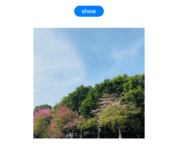
When the image is completely displayed:

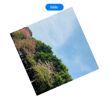
When the transition effect of 180° clockwise rotation is applied to the hiding of the image:

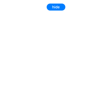
When the image disappears completely:

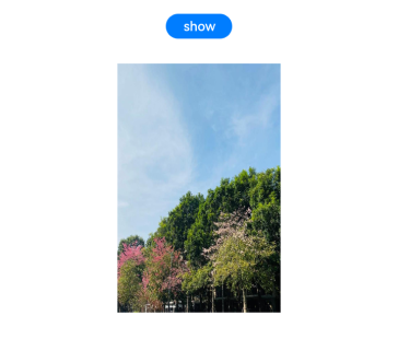
When the transition effect of zooming in twice horizontally is applied to the image displayed:
