stack
NOTE
This component is supported since API version 4. Updates will be marked with a superscript to indicate their earliest API version.
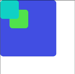
The <Stack> component provides a stack container where child components are successively stacked and the latter one overwrites the previous one.
Required Permissions
None
Child Components
Supported
Attributes
The universal attributes are supported.
Styles
The universal styles are supported.
Events
The universal events are supported.
Methods
The universal methods are supported.
Example
<!-- xxx.hml -->
<stack class="stack-parent">
  <div class="back-child bd-radius"></div>
  <div class="positioned-child bd-radius"></div>
  <div class="front-child bd-radius"></div>
</stack>
/* xxx.css */
.stack-parent {
  width: 400px;
  height: 400px;
  background-color: #ffffff;
  border-width: 1px;
  border-style: solid;
}
.back-child {
  width: 300px;
  height: 300px;
  background-color: #3f56ea;
}
.front-child {
  width: 100px;
  height: 100px;
  background-color: #00bfc9;
}
.positioned-child {
  width: 100px;
  height: 100px;
  left: 50px;
  top: 50px;
  background-color: #47cc47;
}
.bd-radius {
  border-radius: 16px;
}
