SideBarContainer
提供侧边栏可以显示和隐藏的侧边栏容器,通过子组件定义侧边栏和内容区,第一个子组件表示侧边栏,第二个子组件表示内容区。
说明:
该组件从API Version 8开始支持。后续版本如有新增内容,则采用上角标单独标记该内容的起始版本。
子组件
可以包含子组件。
说明:
- 子组件类型:系统组件和自定义组件,不支持渲染控制类型(if/else、ForEach和LazyForEach)。
- 子组件个数:必须且仅包含2个子组件。
- 子组件个数异常时:3个或以上子组件,显示第一个和第二个。1个子组件,显示侧边栏,内容区为空白。
接口
SideBarContainer( type?: SideBarContainerType )
参数:
| 参数名 | 参数类型 | 必填 | 参数描述 |
|---|---|---|---|
| type | SideBarContainerType | 否 | 设置侧边栏的显示类型。 默认值:SideBarContainerType.Embed |
SideBarContainerType枚举说明
| 名称 | 描述 |
|---|---|
| Embed | 侧边栏嵌入到组件内,和内容区并列显示。 |
| Overlay | 侧边栏浮在内容区上面。 |
属性
除支持通用属性外,还支持以下属性:
| 名称 | 参数类型 | 描述 |
|---|---|---|
| showSideBar | boolean | 设置是否显示侧边栏。 默认值:true |
| controlButton | ButtonStyle | 设置侧边栏控制按钮的属性。 |
| showControlButton | boolean | 设置是否显示控制按钮。 默认值:true |
| sideBarWidth | number | Length9+ | 设置侧边栏的宽度。 默认值:200 单位:vp 说明: 设置为小于0的值时按默认值显示。 受最小宽度和最大宽度限制,不在限制区域内取最近的点。 sideBarWidth优先于侧边栏子组件width,sideBarWidth未设置时默认值优先级低于侧边栏子组件width。 |
| minSideBarWidth | number | Length9+ | 设置侧边栏最小宽度。 默认值:200,单位vp 说明: 设置为小于0的值时按默认值显示。 值不能超过侧边栏容器本身宽度,超过使用侧边栏容器本身宽度。 minSideBarWidth优先于侧边栏子组件minWidth,minSideBarWidth未设置时默认值优先级低于侧边栏子组件minWidth。 |
| maxSideBarWidth | number | Length9+ | 设置侧边栏最大宽度。 默认值:280,单位vp 说明: 设置为小于0的值时按默认值显示。 值不能超过侧边栏容器本身宽度,超过使用侧边栏容器本身宽度。 maxSideBarWidth优先于侧边栏子组件maxWidth,maxSideBarWidth未设置时默认值优先级低于侧边栏子组件maxWidth。 |
| autoHide9+ | boolean | 设置当侧边栏拖拽到小于最小宽度后,是否自动隐藏。 默认值:true 说明: 受minSideBarWidth属性方法影响,minSideBarWidth属性方法未设置值使用默认值。 拖拽过程中判断是否要自动隐藏。小于最小宽度时需要阻尼效果触发隐藏(越界一段距离) |
| sideBarPosition9+ | SideBarPosition | 设置侧边栏显示位置。 默认值:SideBarPosition.Start |
ButtonStyle对象说明
| 名称 | 参数类型 | 必填 | 描述 |
|---|---|---|---|
| left | number | 否 | 设置侧边栏控制按钮距离容器左界限的间距。 默认值:16 单位:vp |
| top | number | 否 | 设置侧边栏控制按钮距离容器上界限的间距。 默认值:48 单位:vp |
| width | number | 否 | 设置侧边栏控制按钮的宽度。 默认值:32 单位:vp |
| height | number | 否 | 设置侧边栏控制按钮的高度。 默认值:32 单位:vp |
| icons | { shown: string | PixelMap | Resource , hidden: string | PixelMap | Resource , switching?: string | PixelMap | Resource } |
否 | 设置侧边栏控制按钮的图标: - shown: 设置侧边栏显示时控制按钮的图标。 说明: 资源获取错误时,使用默认图标。 - hidden: 设置侧边栏隐藏时控制按钮的图标。 - switching:设置侧边栏显示和隐藏状态切换时控制按钮的图标。 |
SideBarPosition9+枚举说明
| 名称 | 描述 |
|---|---|
| Start | 侧边栏位于容器左侧。 |
| End | 侧边栏位于容器右侧。 |
事件
除支持通用事件外,还支持以下事件:
| 名称 | 功能描述 |
|---|---|
| onChange(callback: (value: boolean) => void) | 当侧边栏的状态在显示和隐藏之间切换时触发回调。true表示显示,false表示隐藏。 触发该事件的条件: 1、showSideBar属性值变换时; 2、showSideBar属性自适应行为变化时; 3、分割线拖拽触发autoHide时。 |
示例
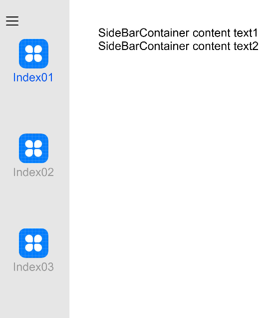
// xxx.ets
@Entry
@Component
struct SideBarContainerExample {
  normalIcon: Resource = $r("app.media.icon")
  selectedIcon: Resource = $r("app.media.icon")
  @State arr: number[] = [1, 2, 3]
  @State current: number = 1

  build() {
    SideBarContainer(SideBarContainerType.Embed) {
      Column() {
        ForEach(this.arr, (item, index) => {
          Column({ space: 5 }) {
            Image(this.current === item ? this.selectedIcon : this.normalIcon).width(64).height(64)
            Text("Index0" + item)
              .fontSize(25)
              .fontColor(this.current === item ? '#0A59F7' : '#999')
              .fontFamily('source-sans-pro,cursive,sans-serif')
          }
          .onClick(() => {
            this.current = item
          })
        }, item => item)
      }.width('100%')
      .justifyContent(FlexAlign.SpaceEvenly)
      .backgroundColor('#19000000')


      Column() {
        Text('SideBarContainer content text1').fontSize(25)
        Text('SideBarContainer content text2').fontSize(25)
      }
      .margin({ top: 50, left: 20, right: 30 })
    }
    .controlButton({
      icons: {
        hidden: $r('app.media.drawer'),
        shown: $r('app.media.drawer'),
        switching: $r('app.media.drawer')
      }
    })
    .sideBarWidth(150)
    .minSideBarWidth(50)
    .maxSideBarWidth(300)
    .onChange((value: boolean) => {
      console.info('status:' + value)
    })
  }
}