DataPanel
数据面板组件,用于将多个数据占比情况使用占比图进行展示。
说明:
该组件从API Version 7开始支持。后续版本如有新增内容,则采用上角标单独标记该内容的起始版本。
子组件
无
接口
DataPanel(options:{values: number[], max?: number, type?: DataPanelType})
从API version 9开始,该接口支持在ArkTS卡片中使用。
参数:
| 参数名 | 参数类型 | 必填 | 参数描述 |
|---|---|---|---|
| values | number[] | 是 | 数据值列表,最多包含9个数据,大于9个数据则取前9个数据。若数据值小于0则置为0。 |
| max | number | 否 | - max大于0,表示数据的最大值。 - max小于等于0,max等于value数组各项的和,按比例显示。 默认值:100 |
| type8+ | DataPanelType | 否 | 数据面板的类型(不支持动态修改)。 默认值:DataPanelType.Circle |
属性
除支持通用属性外,还支持以下属性:
| 名称 | 类型 | 描述 |
|---|---|---|
| closeEffect | boolean | 关闭数据占比图表旋转动效。 默认值:false |
DataPanelType枚举说明
从API version 9开始,该接口支持在ArkTS卡片中使用。
| 名称 | 描述 |
|---|---|
| Line | 线型数据面板。 |
| Circle | 环形数据面板。 |
示例
// xxx.ets
@Entry
@Component
struct DataPanelExample {
public valueArr: number[] = [10, 10, 10, 10, 10, 10, 10, 10, 10]
build() {
Column({ space: 5 }) {
Row() {
Stack() {
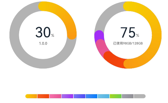
DataPanel({ values: [25], max: 100, type: DataPanelType.Circle }).width(168).height(168)
Column() {
Text('30').fontSize(35).fontColor('#182431')
Text('1.0.0').fontSize(9.33).lineHeight(12.83).fontWeight(500).opacity(0.6)
}
Text('%')
.fontSize(9.33)
.lineHeight(12.83)
.fontWeight(500)
.opacity(0.6)
.position({ x: 104.42, y: 78.17 })
}.margin({ right: 44 })
Stack() {
DataPanel({ values: [50, 12, 8, 5], max: 100, type: DataPanelType.Circle }).width(168).height(168)
Column() {
Text('75').fontSize(35).fontColor('#182431')
Text('已使用98GB/128GB').fontSize(8.17).lineHeight(11.08).fontWeight(500).opacity(0.6)
}
Text('%')
.fontSize(9.33)
.lineHeight(12.83)
.fontWeight(500)
.opacity(0.6)
.position({ x: 104.42, y: 78.17 })
}
}.margin({ bottom: 59 })
DataPanel({ values: this.valueArr, max: 100, type: DataPanelType.Line }).width(300).height(10)
}.width('100%').margin({ top: 5 })
}
}