图片边框设置
设置容器组件的图片边框样式。
说明:
从API Version 9开始支持。后续版本如有新增内容,则采用上角标单独标记该内容的起始版本。
属性
| 名称 | 参数类型 | 描述 |
|---|---|---|
| borderImage | BorderImageOption | 图片边框或者渐变色边框设置接口。 该接口支持在ArkTS卡片中使用。 |
BorderImageOption对象说明
该接口支持在ArkTS卡片中使用。
| 名称 | 类型 | 描述 |
|---|---|---|
| source | string | Resource | linearGradient | 边框图源或者渐变色设置。 说明: 边框图源仅适用于容器组件,如Row、Column、Flex,在非容器组件上使用会失效。 |
| slice | Length | EdgeWidths | 设置图片边框切割宽度。 默认值:0 |
| width | Length | EdgeWidths | 设置图片边框宽度。 默认值:0 |
| outset | Length | EdgeWidths | 设置边框图片向外延伸距离。 默认值:0 |
| repeat | RepeatMode | 设置边框图片的重复方式。 默认值:RepeatMode.Stretch |
| fill | boolean | 设置边框图片中心填充。 默认值:false |
RepeatMode枚举说明
该接口支持在ArkTS卡片中使用。
| 名称 | 描述 |
|---|---|
| Repeat | 被切割图片重复铺平在图片边框上,超出的部分会被剪裁。 |
| Stretch | 被切割图片以拉伸填充的方式铺满图片边框。 |
| Round | 被切割图片以整数次平铺在图片边框上,无法以整数次平铺时压缩被切割图片。 |
| Space | 被切割图片以整数次平铺在图片边框上,无法以整数次平铺时以空白填充。 |
示例
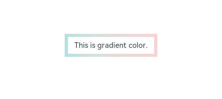
示例1
// xxx.ets
@Entry
@Component
struct Index {
  build() {
    Row() {
      Column() {
        Text('This is gradient color.').textAlign(TextAlign.Center).height(50).width(200)
          .borderImage({
            source: {
              angle: 90,
              direction: GradientDirection.Left,
              colors: [[0xAEE1E1, 0.0], [0xD3E0DC, 0.3], [0xFCD1D1, 1.0]]
            },
            slice: { top: 10, bottom: 10, left: 10, right: 10 },
            width: { top: "10px", bottom: "10px", left: "10px", right: "10px" },
            repeat: RepeatMode.Stretch,
            fill: false
          })
      }
      .width('100%')
    }
    .height('100%')
  }
}
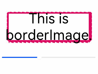
示例2
// xxx.ets
@Entry
@Component
struct Index {
  @State outSetValue: number = 40

  build() {
    Row() {
      Column() {
        Row() {
          Text('This is borderImage.').textAlign(TextAlign.Center).fontSize(50)
        }
        .borderImage({
          source: $r('app.media.icon'),
          slice: `${this.outSetValue}%`,
          width: `${this.outSetValue}px`,
          outset: '5px',
          repeat: RepeatMode.Repeat,
          fill: false
        })

        Slider({
          value: this.outSetValue,
          min: 0,
          max: 100,
          style: SliderStyle.OutSet
        })
          .margin({ top: 30 })
          .onChange((value: number, mode: SliderChangeMode) => {
            this.outSetValue = value
            console.info('value:' + value + 'mode:' + mode.toString())
          })
      }
      .width('100%')
    }
    .height('100%')
  }
}