ListItemGroup
The <ListItemGroup> component is used to display list item groups. It must be used with the <List> component and, if not otherwise specified, takes up the entire width of the <List>.
NOTE
This component is supported since API version 9. Updates will be marked with a superscript to indicate their earliest API version.
Usage Guidelines
If the listDirection attribute of the parent <List> component is set to Axis.Vertical, the height attribute of the <ListItemGroup> component cannot be set. The height of a <ListItemGroup> component is the sum of its header height, footer height, and total height of the list items. If the listDirection attribute of the parent <List> component is set to Axis.Horizontal, the width attribute of the <ListItemGroup> component cannot be set. The width of a <ListItemGroup> component is the sum of its header width, footer width, and total width of the list items.
The list items in the <ListItemGroup> component cannot be edited, selected, or dragged. That is, the editable and selectable attributes of these list items do not take effect.
Child Components
This component supports the <ListItem> child component.
APIs
ListItemGroup(options?: {header?: CustomBuilder, footer?: CustomBuilder, space?: number | string})
Parameters
| Name | Type | Mandatory | Description |
|---|---|---|---|
| header | CustomBuilder | No | Header of the <ListItemGroup> component. |
| footer | CustomBuilder | No | Footer of the <ListItemGroup> component. |
| space | number | string | No | Spacing between list items. This parameter is valid only between list items, but not between a header and list item or between a footer and list item. |
Attributes
| Name | Type | Description |
|---|---|---|
| divider | { strokeWidth: Length, color?: ResourceColor, startMargin?: Length, endMargin?: Length } | null |
Style of the divider for the list items. By default, there is no divider. - strokeWidth: stroke width of the divider. - color: color of the divider. - startMargin: distance between the divider and the start of the list. - endMargin: distance between the divider and the end of the list. |
NOTE
The <ListItemGroup> component does not support the universal attribute aspectRatio.
If the main axis of <ListItemGroup> runs in the vertical direction, the height setting does not take effect.
If the main axis of <ListItemGroup> runs in the horizontal direction, the width setting does not take effect.
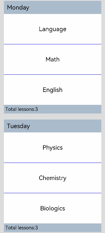
Example
// xxx.ets
@Entry
@Component
struct ListItemGroupExample {
  private timetable: any = [
    {
      title: 'Monday',
      projects: ['Language', 'Math', 'English']
    },
    {
      title: 'Tuesday',
      projects: ['Physics', 'Chemistry', 'Biologics']
    },
    {
      title: 'Wednesday',
      projects: ['History', 'Geography', 'Politics']
    },
    {
      title: 'Thursday',
      projects: ['Art', 'Music', 'Sports']
    }
  ]

  @Builder itemHead(text:string) {
    Text(text)
      .fontSize(20)
      .backgroundColor(0xAABBCC)
      .width("100%")
      .padding(10)
  }

  @Builder itemFoot(num:number) {
    Text(''Total lessons:'+ num")
      .fontSize(16)
      .backgroundColor(0xAABBCC)
      .width("100%")
      .padding(5)
  }

  build() {
    Column() {
      List({ space: 20 }) {
        ForEach(this.timetable, (item) => {
          ListItemGroup({ header:this.itemHead(item.title), footer:this.itemFoot(item.projects.length) }) {
            ForEach(item.projects, (project) => {
              ListItem() {
                Text(project)
                  .width("100%").height(100).fontSize(20)
                  .textAlign(TextAlign.Center).backgroundColor(0xFFFFFF)
              }
            }, item => item)
          }
          .borderRadius(20)
          .divider ({ strokeWidth: 1,color:Color.Blue }) // Divider between lines
        })
      }
      .width('90%')
      .sticky(StickyStyle.Header|StickyStyle.Footer)
    }.width('100%').height('100%').backgroundColor(0xDCDCDC).padding({ top: 5 })
  }
}