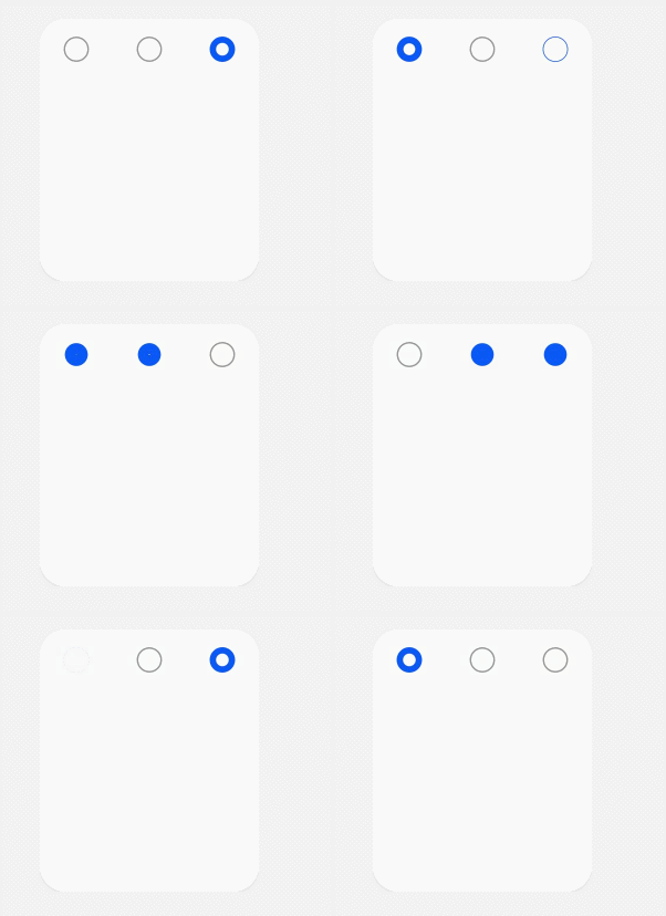
input
The <input> component provides a radio button to receive user input.
NOTE
The APIs of this module are supported since API version 8. Updates will be marked with a superscript to indicate their earliest API version.
Attributes
In addition to the universal attributes, the following attributes are supported.
| Name | Type | Default Value | Mandatory | Description |
|---|---|---|---|---|
| type | string | radio | Yes | Type of the <input> component. Currently, only the radio button is supported. - radio: a radio button that allows users to select one from multiple others with the same name. |
| checked | boolean | false | No | Whether the component is checked or not. |
| name | string | - | No | Name of the <input> component. |
| value | string | - | No | Value of the component. When type is radio, this attribute is mandatory and the value must be unique for radio buttons with the same name. |
Styles
The universal styles are supported.
Events
| Name | Parameter | Description |
|---|---|---|
| change | $event.checkedItem | Triggered when the checked status of a radio button changes. This event returns the value of the selected <input> component. |
| click | - | Triggered when the component is clicked. |
Example
<!-- xxx.hml -->
<div class="content">
  <input type="radio" checked='true' name="radioSample" value="radio1" onchange="onRadioChange"></input>
  <input type="radio" checked='false' name="radioSample" value="radio2" onchange="onRadioChange"></input>
  <input type="radio" checked='false' name="radioSample" value="radio3" onchange="onRadioChange"></input>
</div>
/* xxx.css */
.content{
  width: 100%;
  height: 200px;
  justify-content: center;
  align-items: center;
}
{
  "actions": {
    "onRadioChange":{
      "action": "message",
      "params": {
        "checkedRadio": "$event.checkedItem"
      }
    }
  }
}
4 x 4 widget
