refresh
NOTE
This component is supported since API version 4. Updates will be marked with a superscript to indicate their earliest API version.
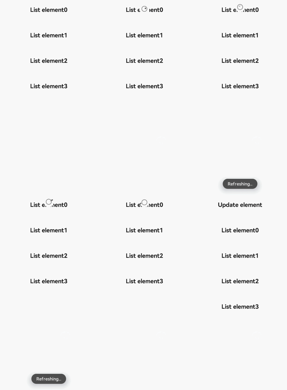
The <refresh> component is used to refresh a page through a pull-down gesture.
Required Permissions
None
Child Components
Supported
Attributes
In addition to the universal attributes, the following attributes are supported.
| Name | Type | Default Value | Mandatory | Description |
|---|---|---|---|---|
| offset | <length> | - | No | Distance to the top of the parent component from the <refresh> component that comes to rest after a successful pull-down gesture. |
| refreshing | boolean | false | No | Whether the <refresh> component is being used for refreshing. |
| type | string | auto | No | Dynamic effect when the component is refreshed. Two options are available and cannot be modified dynamically. - auto: default effect. When the list is pulled to the top, the list does not move. When the list is pulled to the bottom, a circle is displayed. - pulldown: When the list is pulled to the top, users can continue to pull down to trigger a refresh. The rebound effect will appear after the refresh. If the child component contains a list, set scrolleffect of the list to no to prevent drop-down effect conflicts. |
| lasttime | boolean | false | No | Whether to display the last update time. The character string format is last update time: XXXX, where XXXX is displayed based on the certain time and date formats and cannot be dynamically modified. (It is recommended that this attribute be used when type is set to pulldown. The fixed distance is at the bottom of the content drop-down area. Pay attention to the offset attribute setting to prevent overlapping.) |
| timeoffset6+ | <length> | - | No | Distance between the update time and the top of the parent component. |
| friction | number | 42 | No | Pull-down friction coefficient. The value ranges from 0 to 100. A larger value indicates a more responsive component. For example, if a user pulls the component down 100 px, it will actually move 100 * friction% px. |
Styles
In addition to the universal styles, the following styles are supported.
| Name | Type | Default Value | Mandatory | Description |
|---|---|---|---|---|
| background-color | <color> | white |
No | Background color of the <refresh> component. |
| progress-color | <color> | black |
No | Color of the loading icon of the <refresh> component. |
Events
The following events are supported.
| Name | Parameter | Description |
|---|---|---|
| refresh | { refreshing: refreshingValue } | Triggered when the <refresh> component is pulled down and the refresh status changes. Available values are as follows: - false: The <refresh> component is being pulled down. - true: The <refresh> component is not being pulled down. |
| pulldown | { state: string } | Triggered when a user starts or stops pulling down the <refresh> component. Available values are as follows: - start: The pull-down starts. - end: The pull-down ends. |
Methods
The universal methods are not supported.
Example
<!-- xxx.hml -->
<div class="container">
  <refresh refreshing="{{fresh}}" onrefresh="refresh">
    <list class="list" scrolleffect="no">
      <list-item class="listitem" for="list">
        <div class="content">
          <text class="text">{{$item}}</text>
        </div>
      </list-item>
    </list>
  </refresh>
</div>
/* xxx.css */
.container {
  flex-direction: column;
  align-items: center;
  width: 100%;
  height: 100%;
}

.list {
  width: 100%;
  height: 100%;
}

.listitem {
  width: 100%;
  height: 150px;
}

.content {
  width: 100%;
  height: 100%;
  flex-direction: column;
  align-items: center;
  justify-content: center;
}

.text {
  font-size: 35px;
  font-weight: bold;
}
// xxx.js
import promptAction from '@ohos.promptAction';
export default {
  data: {
    list:[],
    fresh:false
  },
  onInit() {
    this.list = [];
    for (var i = 0; i <= 3; i++) {
            var item ='List element' + i;
      this.list.push(item);
    }
  },
  refresh: function (e) {
    promptAction.showToast({
      message: 'Refreshing...'
    })
    var that = this;
    that.fresh = e.refreshing;
    setTimeout(function () {
      that.fresh = false;
      var addItem ='Refresh element';
      that.list.unshift(addItem);
      promptAction.showToast({
        message: 'Refreshed.'
      })
    }, 2000)
  }
}
