Size
The size attributes set the width, height, and margin of a component.
NOTE
The APIs of this module are supported since API version 7. Updates will be marked with a superscript to indicate their earliest API version.
Attributes
| Name | Type | Description |
|---|---|---|
| width | Length | Width of the component. By default, the width required to fully hold the component content is used. If the width of the component is greater than that of the parent container, the range of the parent container is drawn. Since API version 9, this API is supported in ArkTS widgets. |
| height | Length | Height of the component. By default, the height required to fully hold the component content is used. If the height of the component is greater than that of the parent container, the range of the parent container is drawn. Since API version 9, this API is supported in ArkTS widgets. |
| size | { width?: Length, height?: Length } |
Size of the component. Since API version 9, this API is supported in ArkTS widgets. |
| padding | Padding | Length | Padding of the component. When the parameter is of the Length type, the four paddings take effect. Default value: 0 When padding is set to a percentage, the width of the parent container is used as the basic value. Since API version 9, this API is supported in ArkTS widgets. |
| margin | Margin | Length | Margin of the component. When the parameter is of the Length type, the four margins take effect. Default value: 0 When margin is set to a percentage, the width of the parent container is used as the basic value. Since API version 9, this API is supported in ArkTS widgets. |
| constraintSize | { minWidth?: Length, maxWidth?: Length, minHeight?: Length, maxHeight?: Length } |
Constraint size of the component, which is used to limit the size range during component layout. constraintSize takes precedence over width and height. If the value of minWidth is greater than that of maxWidth, only the value of minWidth takes effect. The same rule applies to minHeight and maxHeight. Default value: { minWidth: 0, maxWidth: Infinity, minHeight: 0, maxHeight: Infinity } Since API version 9, this API is supported in ArkTS widgets. |
| layoutWeight | number | string | Weight of the component during layout. When the container size is determined, the container space is allocated along the main axis among the component and sibling components based on the layout weight, and the component size setting is ignored. Default value: 0 Since API version 9, this API is supported in ArkTS widgets. NOTE This attribute is valid only for the <Row>, <Column>, and <Flex> layouts. The value can be a number greater than or equal to 0 or a string that can be converted to a number. |
Example
// xxx.ets
@Entry
@Component
struct SizeExample {
build() {
Column({ space: 10 }) {
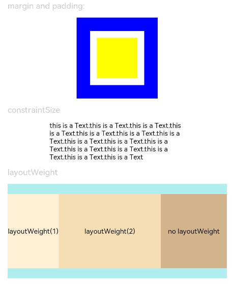
Text('margin and padding:').fontSize(12).fontColor(0xCCCCCC).width('90%')
Row() {
// Width: 80; height: 80; margin: 20 (blue area); padding: 10 (white area)
Row() {
Row().size({ width: '100%', height: '100%' }).backgroundColor(Color.Yellow)
}
.width(80)
.height(80)
.padding(10)
.margin(20)
.backgroundColor(Color.White)
}.backgroundColor(Color.Blue)
Text('constraintSize').fontSize(12).fontColor(0xCCCCCC).width('90%')
Text('this is a Text.this is a Text.this is a Text.this is a Text.this is a Text.this is a Text.this is a Text.this is a Text.this is a Text.this is a Text.this is a Text.this is a Text.this is a Text.this is a Text.this is a Text')
.width('90%')
.constraintSize({ maxWidth: 200 })
Text('layoutWeight').fontSize(12).fontColor(0xCCCCCC).width('90%')
// When the container size is determined, the component occupies the space along the main axis based on the layout weight, and the component size setting is ignored.
Row() {
// Weight 1: The component occupies 1/3 of the remaining space along the main axis.
Text('layoutWeight(1)')
.size({ width: '30%', height: 110 }).backgroundColor(0xFFEFD5).textAlign(TextAlign.Center)
.layoutWeight(1)
// Weight 2: The component occupies 2/3 of the remaining space along the main axis.
Text('layoutWeight(2)')
.size({ width: '30%', height: 110 }).backgroundColor(0xF5DEB3).textAlign(TextAlign.Center)
.layoutWeight(2)
// If layoutWeight is not set, the component is rendered based on its own size setting.
Text('no layoutWeight')
.size({ width: '30%', height: 110 }).backgroundColor(0xD2B48C).textAlign(TextAlign.Center)
}.size({ width: '90%', height: 140 }).backgroundColor(0xAFEEEE)
}.width('100%').margin({ top: 5 })
}
}