Progress
进度条组件,用于显示内容加载或操作处理等进度。
说明:
该组件从API version7开始支持。后续版本如有新增内容,则采用上角标单独标记该内容的起始版本。
子组件
无
接口
Progress(options: {value: number, total?: number, type?: ProgressType})
创建进度组件,用于显示内容加载或操作处理进度。
从API version 9开始,该接口支持在ArkTS卡片中使用。
参数:
| 参数名 | 参数类型 | 必填 | 参数描述 |
|---|---|---|---|
| value | number | 是 | 指定当前进度值。设置小于0的数值时置为0,设置大于total的数值时置为total。 从API version 9开始,该接口支持在ArkTS卡片中使用。 |
| total | number | 否 | 指定进度总长。 默认值:100 从API version 9开始,该接口支持在ArkTS卡片中使用。 |
| type8+ | ProgressType | 否 | 指定进度条类型。 默认值:ProgressType.Linear 从API version 9开始,该接口支持在ArkTS卡片中使用。 |
| styledeprecated | ProgressStyle | 否 | 指定进度条样式。 该参数从API version8开始废弃,建议使用type替代。 默认值:ProgressStyle.Linear |
ProgressType枚举说明
从API version 9开始,该接口支持在ArkTS卡片中使用。
| 名称 | 描述 |
|---|---|
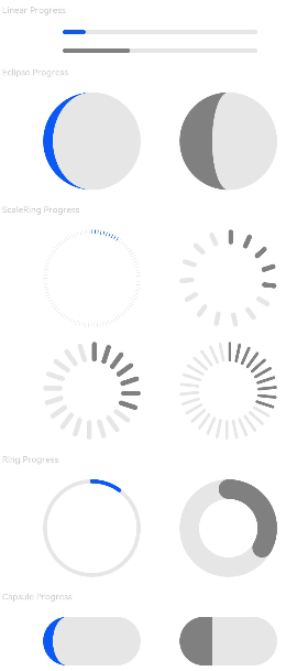
| Linear | 线性样式。从API version9开始,高度大于宽度的时候自适应垂直显示。 |
| Ring8+ | 环形无刻度样式,环形圆环逐渐显示至完全填充效果。 |
| Eclipse8+ | 圆形样式,显示类似月圆月缺的进度展示效果,从月牙逐渐变化至满月。 |
| ScaleRing8+ | 环形有刻度样式,显示类似时钟刻度形式的进度展示效果。从API version9开始,刻度外圈出现重叠的时候自动转换为环形无刻度进度条。 |
| Capsule8+ | 胶囊样式,头尾两端圆弧处的进度展示效果与Eclipse相同;中段处的进度展示效果与Linear相同。高度大于宽度的时候自适应垂直显示。 |
ProgressStyle枚举说明
从API version 9开始,该接口支持在ArkTS卡片中使用。
| 名称 | 描述 |
|---|---|
| Linear | 线性样式。 |
| Ring | 环形无刻度样式,环形圆环逐渐显示至完全填充效果。 |
| Eclipse | 圆形样式,显示类似月圆月缺的进度展示效果,从月牙逐渐变化至满月。 |
| ScaleRing | 环形有刻度样式,显示类似时钟刻度形式的进度展示效果。 |
| Capsule | 胶囊样式,头尾两端圆弧处的进度展示效果与Eclipse相同;中段处的进度展示效果与Linear相同。高度大于宽度的时候自适应垂直显示。 |
属性
| 名称 | 参数类型 | 描述 |
|---|---|---|
| value | number | 设置当前进度值。设置小于0的数值时置为0,设置大于total的数值时置为total。非法数值不生效。 从API version 9开始,该接口支持在ArkTS卡片中使用。 |
| color | ResourceColor | 设置进度条前景色。 默认值:'#ff007dff' 从API version 9开始,该接口支持在ArkTS卡片中使用。 |
| backgroundColor | ResourceColor | 设置进度条底色。 默认值:'#19182431' 从API version 9开始,该接口支持在ArkTS卡片中使用。 |
| style8+ | { strokeWidth?: Length, scaleCount?: number, scaleWidth?: Length } |
定义组件的样式。 - strokeWidth: 设置进度条宽度(不支持百分比设置)。从API version9开始,环形进度条设置宽度大于等于半径时,默认修改宽度至半径值的二分之一。 默认值:4.0Vp - scaleCount: 设置环形进度条总刻度数。 默认值:120 - scaleWidth: 设置环形进度条刻度粗细(不支持百分比设置),刻度粗细大于进度条宽度时,为系统默认粗细。 默认值:2.0Vp 从API version 9开始,该接口支持在ArkTS卡片中使用。 |
事件
支持通用事件。
示例
// xxx.ets
@Entry
@Component
struct ProgressExample {
  build() {
    Column({ space: 15 }) {
      Text('Linear Progress').fontSize(9).fontColor(0xCCCCCC).width('90%')
      Progress({ value: 10, type: ProgressType.Linear }).width(200)
      Progress({ value: 20, total: 150, type: ProgressType.Linear }).color(Color.Grey).value(50).width(200)


      Text('Eclipse Progress').fontSize(9).fontColor(0xCCCCCC).width('90%')
      Row({ space: 40 }) {
        Progress({ value: 10, type: ProgressType.Eclipse }).width(100)
        Progress({ value: 20, total: 150, type: ProgressType.Eclipse }).color(Color.Grey).value(50).width(100)
      }

      Text('ScaleRing Progress').fontSize(9).fontColor(0xCCCCCC).width('90%')
      Row({ space: 40 }) {
        Progress({ value: 10, type: ProgressType.ScaleRing }).width(100)
        Progress({ value: 20, total: 150, type: ProgressType.ScaleRing })
          .color(Color.Grey).value(50).width(100)
          .style({ strokeWidth: 15, scaleCount: 15, scaleWidth: 5 })
      }

      // scaleCount和scaleWidth效果对比
      Row({ space: 40 }) {
        Progress({ value: 20, total: 150, type: ProgressType.ScaleRing })
          .color(Color.Grey).value(50).width(100)
          .style({ strokeWidth: 20, scaleCount: 20, scaleWidth: 5 })
        Progress({ value: 20, total: 150, type: ProgressType.ScaleRing })
          .color(Color.Grey).value(50).width(100)
          .style({ strokeWidth: 20, scaleCount: 30, scaleWidth: 3 })
      }

      Text('Ring Progress').fontSize(9).fontColor(0xCCCCCC).width('90%')
      Row({ space: 40 }) {
        Progress({ value: 10, type: ProgressType.Ring }).width(100)
        Progress({ value: 20, total: 150, type: ProgressType.Ring })
          .color(Color.Grey).value(50).width(100)
          .style({ strokeWidth: 20, scaleCount: 30, scaleWidth: 20 })
      }

      Text('Capsule Progress').fontSize(9).fontColor(0xCCCCCC).width('90%')
      Row({ space: 40 }) {
        Progress({ value: 10, type: ProgressType.Capsule }).width(100).height(50)
        Progress({ value: 20, total: 150, type: ProgressType.Capsule })
          .color(Color.Grey)
          .value(50)
          .width(100)
          .height(50)
      }
    }.width('100%').margin({ top: 30 })
  }
}