Overlay
You can set overlay text for a component.
NOTE
The APIs of this module are supported since API version 7. Updates will be marked with a superscript to indicate their earliest API version.
Attributes
| Name | Type | Default Value | Description |
|---|---|---|---|
| overlay | value: string, options?: { align?: Alignment, offset?: {x?: number, y?: number} } |
{ align: Alignment.Center, offset: {0, 0} } |
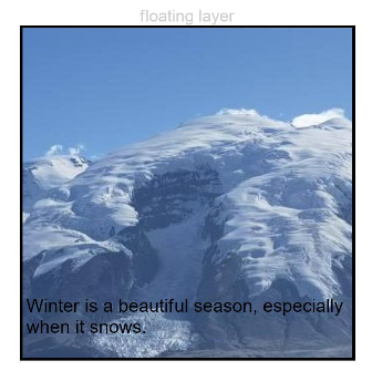
Overlay added to the component. value: mask text. options: text positioning. align indicates the location of the text relative to the component. offset indicates the offset of the text relative to the upper left corner of itself. By default, the text is in the upper left corner of the component. If both align and offset are set, the text is first positioned relative to the component, and then offset relative to the upper left corner of itself. Since API version 9, this API is supported in ArkTS widgets. |
Example
// xxx.ets
@Entry
@Component
struct OverlayExample {
  build() {
    Column() {
      Column() {
        Text('floating layer')
          .fontSize(12).fontColor(0xCCCCCC).maxLines(1)
        Column() {
          Image($r('app.media.img'))
            .width(240).height(240)
            .overlay("Winter is a beautiful season, especially when it snows.", {
              align: Alignment.Bottom,
              offset: { x: 0, y: -15 }
            })
        }.border({ color: Color.Black, width: 2 })
      }.width('100%')
    }.padding({ top: 20 })
  }
}
