Search
The <Search> component provides an area for users to enter search queries.
NOTE
This component is supported since API version 8. Updates will be marked with a superscript to indicate their earliest API version.
Child Components
Not supported
APIs
Search(options?: { value?: string; placeholder?: string; icon?: string; controller?: SearchController })
Parameters
| Name | Type | Mandatory | Description |
|---|---|---|---|
| value | string | No | Text input in the search text box. Since API version 10, this parameter supports two-way binding through $$. |
| icon | string | No | Path to the search icon. By default, the system search icon is used. For details about the supported image types, see Image. |
| controller | SearchController | No | Controller of the <Search> component. |
Attributes
In addition to the universal attributes, the following attributes are supported.
| Name | Type | Description |
|---|---|---|
| searchButton | string | Text on the search button located next to the search text box. By default, there is no search button. |
| placeholderColor | ResourceColor | Placeholder text color. |
| placeholderFont | Font | Placeholder text style, including the font size, font width, font family, and font style. Currently, only the default font family is supported. |
| textFont | Font | Style of the text entered in the search box, including the font size, font width, font family, and font style. Currently, only the default font family is supported. |
| textAlign | TextAlign | Text alignment mode in the search text box. Default value: TextAlign.Start |
| copyOption9+ | CopyOptions | Whether copy and paste is allowed. |
Events
In addition to the universal events, the following events are supported.
| Name | Description |
|---|---|
| onSubmit(callback: (value: string) => void) | Invoked when users click the search icon or the search button, or touch the search button on a soft keyboard. - value: current text input. |
| onChange(callback: (value: string) => void) | Invoked when the input in the text box changes. - value: current text input. |
| onCopy(callback: (value: string) => void) | Invoked when data is copied to the pasteboard, which is displayed when the search text box is long pressed. - value: text copied. |
| onCut(callback: (value: string) => void) | Invoked when data is cut from the pasteboard, which is displayed when the search text box is long pressed. - value: text cut. |
| onPaste(callback: (value: string) => void) | Invoked when data is pasted from the pasteboard, which is displayed when the search text box is long pressed. -value: text pasted. |
SearchController
Implements the controller of the <Search> component. Currently, the controller can be used to control the caret position.
Objects to Import
controller: SearchController = new SearchController()
caretPosition
caretPosition(value: number): void
Sets the position of the caret.
Parameters
| Name | Type | Mandatory | Description |
|---|---|---|---|
| value | number | Yes | Length from the start of the character string to the position where the caret is located. |
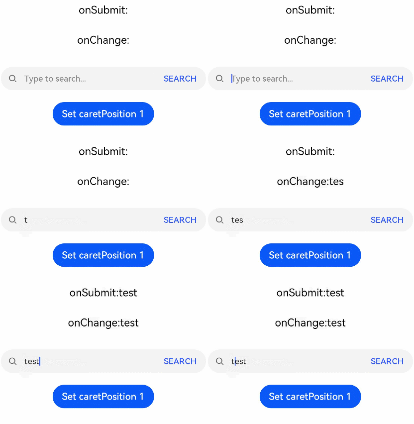
Example
// xxx.ets
@Entry
@Component
struct SearchExample {
  @State changeValue: string = ''
  @State submitValue: string = ''
  controller: SearchController = new SearchController()

  build() {
    Column() {
      Text('onSubmit:' + this.submitValue).fontSize(18).margin(15)
      Text('onChange:' + this.changeValue).fontSize(18).margin(15)
      Search({ value: this.changeValue, placeholder: 'Type to search...', controller: this.controller })
        .searchButton('SEARCH')
        .width(400)
        .height(40)
        .backgroundColor('#F5F5F5')
        .placeholderColor(Color.Grey)
        .placeholderFont({ size: 14, weight: 400 })
        .textFont({ size: 14, weight: 400 })
        .onSubmit((value: string) => {
          this.submitValue = value
        })
        .onChange((value: string) => {
          this.changeValue = value
        })
        .margin(20)
      Button('Set caretPosition 1')
        .onClick(() => {
          // Move the caret to after the first entered character.
          this.controller.caretPosition(1)
        })
    }.width('100%')
  }
}
