Drawing Geometric Shapes
The drawing components are used to draw graphs on the page. The <Shape> component is the parent component of the drawing components. The attributes of <Shape> are universal attributes supported by all the drawing components. For details, see Shape.
Creating a Drawing Component
A drawing component can be created in either of the following ways:
-
Drawing components use <Shape> as their parent to implement the effect similar to SVG. The API is called in the following format:
Shape(value?: PixelMap)Create a drawing component with a parent component. The value parameter is used to set the drawing target. You can draw a graph in the specified PixelMap object. If the value parameter is not set, the graph is drawn in the current drawing target.
Shape() { Rect().width(300).height(50) } -
The <Shape> component is used independently to draw a specific shape. Seven shapes are supported: Circle, Ellipse, Line, Polyine, Polygon, Path, and Rect. The following uses the Circle API as an example:
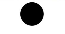
Circle(options?: {width?: string | number, height?: string | number}Draws a circle on a page. The width parameter indicates the width of the circle, and the height parameter indicates the height of the circle. The diameter of the circle is determined by the minimum width and height.
Circle({ width: 150, height: 150 })
Viewport
viewPort{ x?: number | string, y?: number | string, width?: number | string, height?: number | string }
Creates a viewport, which is a rectangle in the user space that maps to the view boundary established for the associated SVG element. The value of the viewport attribute contains four optional parameters: x, y, width, and height. x and y indicate the coordinates of the upper left corner of the viewport, and width and height indicate the size of the viewport.
The following three examples describe how to use the viewport:
-
Zoom in or zoom out a graph through the shape viewport.
// Draw a circle whose width and height are both 150.
Text ('Original Size Circle')
Circle({width: 75, height: 75}).fill('#E87361')

Row({space:10}) {
  Column() {
    // Create a shape component whose width and height are both 150, the background color is yellow, and a viewport whose width and height are both 75. Fill the viewport with a blue rectangle and draw a circle with a diameter of 75 in the viewport.
    // The drawing is complete. The viewport is zoomed in twice based on the width and height of the component.
    Text ('Enlarged Circle')
    Shape() {
      Rect().width('100%').height('100%').fill('#0097D4')
      Circle({width: 75, height: 75}).fill('#E87361')
    }
    .viewPort({x: 0, y: 0, width: 75, height: 75})
    .width(150)
    .height(150)
    .backgroundColor('#F5DC62')
  }
  Column() {
    // Create a shape component whose width and height are both 150, the background color is yellow, and a viewport whose width and height are both 300. Fill the viewport with a green rectangle and draw a circle with a diameter of 75 in the viewport.
    // After the drawing is complete, the viewport is zoomed out by twice based on the width and height of the component.
    Text ('Shrunk Circle')
    Shape() {
      Rect().width('100%').height('100%').fill('#BDDB69')
      Circle({width: 75, height: 75}).fill('#E87361')
    }
    .viewPort({x: 0, y: 0, width: 300, height: 300})
    .width(150)
    .height(150)
    .backgroundColor('#F5DC62')
  }
}
-
Create a shape component whose width and height are both 300, with a yellow background and a viewport whose width and height are both 300. Fill the viewport with a blue rectangle and draw a circle with a radius of 75 in the viewport.
Shape() { Rect().width("100%").height("100%").fill("#0097D4") Circle({ width: 150, height: 150 }).fill("#E87361") } .viewPort({ x: 0, y: 0, width: 300, height: 300 }) .width(300) .height(300) .backgroundColor("#F5DC62") .jpg)
-
Create a shape component whose width and height are both 300, with a yellow background and a viewport whose width and height are both 300. Fill the viewport with a blue rectangle, draw a circle with a radius of 75 in the viewport, and move the viewport 150 to the right and below respectively.
Shape() { Rect().width("100%").height("100%").fill("#0097D4") Circle({ width: 150, height: 150 }).fill("#E87361") } .viewPort({ x: -150, y: -150, width: 300, height: 300 }) .width(300) .height(300) .backgroundColor("#F5DC62") .jpg)
Setting Styles
The drawing component allows you to change the component style through various attributes.
-
You can use fill to set the color of the filling area of the component.
Path() .width(100) .height(100) .commands('M150 0 L300 300 L0 300 Z') .fill("#E87361").jpg)
-
You can use stroke to set the stroke color of a component.
Path()
  .width(100)
  .height(100)
  .fillOpacity(0)
  .commands('M150 0 L300 300 L0 300 Z')
  .stroke(Color.Red)
-
You can use strokeOpacity to set the stroke opacity.
Path()
  .width(100)
  .height(100)
  .fillOpacity(0)
  .commands('M150 0 L300 300 L0 300 Z')
  .stroke(Color.Red)
  .strokeWidth(10)
  .strokeOpacity(0.2)
-
You can use strokeLineJoin to set the join style of the stroke. Options include Bevel, Miter, and Round.
Polyline()
  .width(100)
  .height(100)
  .fillOpacity(0)
  .stroke(Color.Red)
  .strokeWidth(8)
  .points([[20, 0], [0, 100], [100, 90]])
   // Set the join style of the stroke to Round.
  .strokeLineJoin(LineJoinStyle.Round)
-
strokeMiterLimit places a limit on the ratio of the miter length to the value of strokeWidth used to draw a miter join. The miter length indicates the distance from the outer tip to the inner corner of the miter. This attribute must be set to a value greater than or equal to 1 and takes effect when strokeLineJoin is set to LineJoinStyle.Miter.
Polyline()
  .width(100)
  .height(100)
  .fillOpacity(0)
  .stroke(Color.Red)
  .strokeWidth(10)
  .points([[20, 0], [20, 100], [100, 100]])
  // Set the join style of the stroke to Miter.
  .strokeLineJoin(LineJoinStyle.Miter)
  // Set the limit on the ratio of the miter length to the value of strokeWidth used to draw a miter join.
  .strokeMiterLimit(1/Math.sin(45))
Polyline()
  .width(100)
  .height(100)
  .fillOpacity(0)
  .stroke(Color.Red)
  .strokeWidth(10)
  .points([[20, 0], [20, 100], [100, 100]])
  .strokeLineJoin(LineJoinStyle.Miter)
  .strokeMiterLimit(1.42)
-
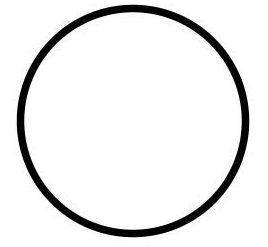
Use the antiAlias attribute to set whether to enable anti-aliasing. The default value is true, indicating that anti-aliasing is enabled.
// Enable anti-aliasing.
Circle()
  .width(150)
  .height(200)
  .fillOpacity(0)
  .strokeWidth(5)
  .stroke(Color.Black)
// Disable anti-aliasing.
Circle()
  .width(150)
  .height(200)
  .fillOpacity(0)
  .strokeWidth(5)
  .stroke(Color.Black)
  .antiAlias(false)
Example Scenario
-
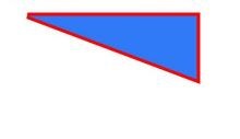
Draw a closed path at (-80, -5). The fill color is 0x317AF7, the stroke width is 10, the stroke color is red, and the Join style of the stroke is miter (default value).
@Entry
@Component
struct ShapeExample {
  build() {
    Column({ space: 10 }) {
      Shape() {
        Path().width(200).height(60).commands('M0 0 L400 0 L400 150 Z')
      }
      .viewPort({ x: -80, y: -5, width: 500, height: 300 })
      .fill(0x317AF7)
      .stroke(Color.Red)
      .strokeWidth(3)
      .strokeLineJoin(LineJoinStyle.Miter)
      .strokeMiterLimit(5)
    }.width('100%').margin({ top: 15 })
  }
}
-
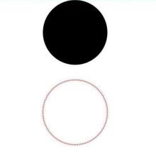
Draw a circle with a diameter of 150 mm and a ring with a diameter of 150 mm and a red dotted line (use the shorter side as the diameter if the width and height are different).
@Entry
@Component
struct CircleExample {
  build() {
    Column({ space: 10 }) {
      // Draw a circle whose diameter is 150.
      Circle({ width: 150, height: 150 })
      // Draw a ring with a diameter of 150 mm and a red dotted line.
      Circle()
        .width(150)
        .height(200)
        .fillOpacity(0)
        .strokeWidth(3)
        .stroke(Color.Red)
        .strokeDashArray([1, 2])
    }.width('100%')
  }
}