Layout Constraints
Layout constraints refer to constraints on the aspect ratio and display priority of components.
NOTE
The APIs of this module are supported since API version 7. Updates will be marked with a superscript to indicate their earliest API version.
Attributes
| Name | Type | Description |
|---|---|---|
| aspectRatio | number | Aspect ratio of the component, which can be obtained using the following formula: Width/Height. Since API version 9, this API is supported in ArkTS widgets. |
| displayPriority | number | Display priority for the component in the layout container. When the space of the parent container is insufficient, the component with a lower priority is hidden. The digits after the decimal point are not counted in determining the display priority. That is, numbers in the [x, x + 1) range are considered to represent the same priority. For example, 1.0 and 1.9 represent the same priority. Since API version 9, this API is supported in ArkTS widgets. NOTE This attribute is valid only for the <Row>, <Column>, and <Flex> (single-row) container components. |
Example
// xxx.ets
@Entry
@Component
struct AspectRatioExample {
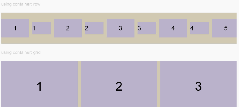
private children: string[] = ['1', '2', '3', '4', '5', '6']
build() {
Column({ space: 20 }) {
Text('using container: row').fontSize(14).fontColor(0xCCCCCC).width('100%')
Row({ space: 10 }) {
ForEach(this.children, (item) => {
// Component width = Component height x 1.5 = 90
Text(item)
.backgroundColor(0xbbb2cb)
.fontSize(20)
.aspectRatio(1.5)
.height(60)
// Component height = Component width/1.5 = 60/1.5 = 40
Text(item)
.backgroundColor(0xbbb2cb)
.fontSize(20)
.aspectRatio(1.5)
.width(60)
}, item => item)
}
.size({ width: "100%", height: 100 })
.backgroundColor(0xd2cab3)
.clip(true)
// Grid child component width/height = 3/2
Text('using container: grid').fontSize(14).fontColor(0xCCCCCC).width('100%')
Grid() {
ForEach(this.children, (item) => {
GridItem() {
Text(item)
.backgroundColor(0xbbb2cb)
.fontSize(40)
.height(160)
.aspectRatio(1.5)
}
}, item => item)
}
.columnsTemplate('1fr 1fr 1fr')
.columnsGap(10)
.rowsGap(10)
.size({ width: "100%", height: 165 })
.backgroundColor(0xd2cab3)
}.padding(10)
}
}
Figure 1 Portrait display
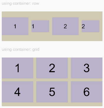
Figure 2 Landscape display
class ContainerInfo {
label: string = '';
size: string = '';
}
class ChildInfo {
text: string = '';
priority: number = 0;
}
@Entry
@Component
struct DisplayPriorityExample {
// Display the container size.
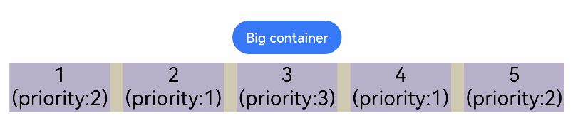
private container: ContainerInfo[] = [
{ label: 'Big container', size: '90%' },
{ label: 'Middle container', size: '50%' },
{ label: 'Small container', size: '30%' }
]
private children: ChildInfo[] = [
{ text: '1\n(priority:2)', priority: 2 },
{ text: '2\n(priority:1)', priority: 1 },
{ text: '3\n(priority:3)', priority: 3 },
{ text: '4\n(priority:1)', priority: 1 },
{ text: '5\n(priority:2)', priority: 2 }
]
@State currentIndex: number = 0;
build() {
Column({ space: 10 }) {
// Switch the size of the parent container.
Button(this.container[this.currentIndex].label).backgroundColor(0x317aff)
.onClick(() => {
this.currentIndex = (this.currentIndex + 1) % this.container.length;
})
// Set the width for the parent flex container through variables.
Flex({ justifyContent: FlexAlign.SpaceBetween }) {
ForEach(this.children, (item) => {
// Bind the display priority to the child component through displayPriority.
Text(item.text)
.width(120)
.height(60)
.fontSize(24)
.textAlign(TextAlign.Center)
.backgroundColor(0xbbb2cb)
.displayPriority(item.priority)
}, item => item.text)
}
.width(this.container[this.currentIndex].size)
.backgroundColor(0xd2cab3)
}.width("100%").margin({ top: 50 })
}
}