ListItem
The <ListItem> component displays specific items in the list. It must be used together with <List>.
NOTE
This component is supported since API version 7. Updates will be marked with a superscript to indicate their earliest API version.
Child Components
This component can contain a single child component.
APIs
ListItem(value?: string)
Since API version 9, this API is supported in ArkTS widgets.
Attributes
In addition to the universal attributes, the following attributes are supported.
| Name | Type | Description |
|---|---|---|
| sticky(deprecated) | Sticky | Sticky effect of the list item. Default value: Sticky.None This API is deprecated since API version 9. You are advised to use sticky of the <List> component. |
| editable(deprecated) | boolean | EditMode | Whether to enter editing mode, where the list item can be deleted or moved. This API is deprecated since API version 9. Default value: false |
| selectable8+ | boolean | Whether the current list item is selectable by mouse drag. NOTE This attribute takes effect only when mouse frame selection is enabled for the parent <List> container. Default value: true |
| swipeAction9+ | { start?: CustomBuilder, end?:CustomBuilder, edgeEffect?: SwipeEdgeEffect, } |
Component displayed when the list item is swiped out from the screen edge. - start: component on the left of the list item when the item is swiped to the right (in vertical list layout) or component above the list item when the item is swiped down (in horizontal list layout). - end: component on the right of the list item when the item is swiped to the left (in vertical list layout) or component below the list item when the item is swiped up (in horizontal list layout). - edgeEffect: scroll effect. NOTE The top level of the @builder function corresponding to start and end must be a single component and cannot be an if/else, ForEach, or LazyForEach statement. |
Sticky(deprecated)
This API is deprecated since API version 9. You are advised to use stickyStyle of the <List> component.
| Name | Description |
|---|---|
| None | The list item is not sticky. |
| Normal | The list item is sticky with no special effects. |
| Opacity | The list item is sticky with opacity changes. |
EditMode
| Name | Description |
|---|---|
| None | The editing operation is not restricted. |
| Deletable | The list item can be deleted. |
| Movable | The list item can be moved. |
SwipeEdgeEffect9+
| Name | Description |
|---|---|
| Spring | When the list item scrolls to the edge of the list, it can continue to scroll for a distance and rebound after being released. |
| None | The list item cannot scroll beyond the edge of the list |
Events
| Name | Description |
|---|---|
| onSelect(event: (isSelected: boolean) => void)8+ | Triggered when the selected state of the <ListItem> changes. isSelected: Returns true if the <ListItem> is selected by mouse drag; returns false otherwise. |
Example
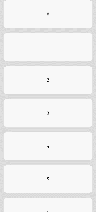
// xxx.ets
@Entry
@Component
struct ListItemExample {
  private arr: number[] = [0, 1, 2, 3, 4, 5, 6, 7, 8, 9]

  build() {
    Column() {
      List({ space: 20, initialIndex: 0 }) {
        ForEach(this.arr, (item) => {
          ListItem() {
            Text('' + item)
              .width('100%').height(100).fontSize(16)
              .textAlign(TextAlign.Center).borderRadius(10).backgroundColor(0xFFFFFF)
          }
        }, item => item)
      }.width('90%')
    }.width('100%').height('100%').backgroundColor(0xDCDCDC).padding({ top: 5 })
  }
}
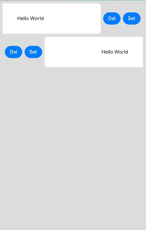
// xxx.ets
@Entry
@Component
struct ListItemExample2 {
  @State message: string = 'Hello World'

  @Builder itemEnd() {
    Row () {
      Button("Del").margin("4vp")
      Button("Set").margin("4vp")
    }.padding("4vp").justifyContent(FlexAlign.SpaceEvenly)
  }

  build() {
    Column() {
      List({space:10}) {
        ListItem() {
          Text(this.message)
          .width('100%')
          .height(100)
          .fontSize(16)
          .textAlign(TextAlign.Center)
          .borderRadius(10)
          .backgroundColor(0xFFFFFF)
        }
        .swipeAction({ end:this.itemEnd})

        ListItem() {
          Text(this.message)
          .width('100%')
          .height(100)
          .fontSize(16)
          .textAlign(TextAlign.Center)
          .borderRadius(10)
          .backgroundColor(0xFFFFFF)
        }
        .swipeAction({ start:this.itemEnd})
      }
    }
    .padding(10)
    .backgroundColor(0xDCDCDC)
    .width('100%')
    .height('100%')
  }
}