ColumnSplit
The <ColumnSplit> component lays out child components vertically and inserts a horizontal divider between components.
NOTE
This component is supported since API version 7. Updates will be marked with a superscript to indicate their earliest API version.
Child Components
Supported
APIs
ColumnSplit()
Attributes
| Name | Type | Description |
|---|---|---|
| resizeable | boolean | Whether the divider can be dragged. Default value: false |
NOTE
Similar to <RowSplit>, the divider of <ColumnSplit> can be dragged to a position that just fully holds a component.
Dragging is not supported in the Previewer. Check the drag effect on a real device.
The universal attributes clip and margin are not supported.
Example
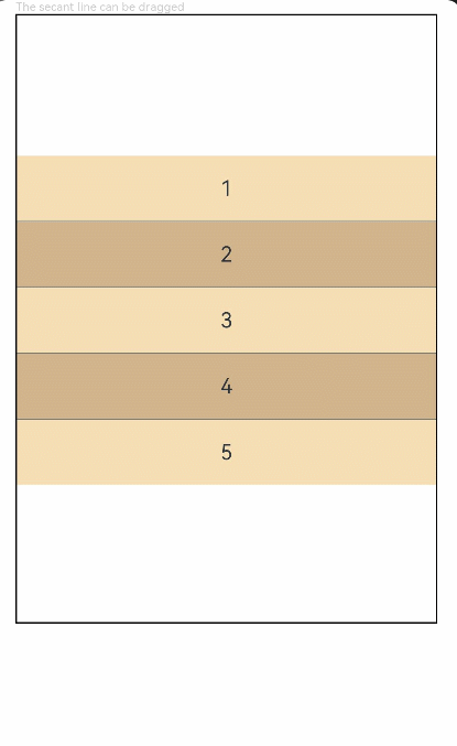
// xxx.ets
@Entry
@Component
struct ColumnSplitExample {
  build() {
    Column(){
      Text('The secant line can be dragged').fontSize(9).fontColor(0xCCCCCC).width('90%')
      ColumnSplit() {
        Text('1').width('100%').height(50).backgroundColor(0xF5DEB3).textAlign(TextAlign.Center)
        Text('2').width('100%').height(50).backgroundColor(0xD2B48C).textAlign(TextAlign.Center)
        Text('3').width('100%').height(50).backgroundColor(0xF5DEB3).textAlign(TextAlign.Center)
        Text('4').width('100%').height(50).backgroundColor(0xD2B48C).textAlign(TextAlign.Center)
        Text('5').width('100%').height(50).backgroundColor(0xF5DEB3).textAlign(TextAlign.Center)
      }
      .borderWidth(1)
      .resizeable(true) // The divider can be dragged.
      .width('90%').height('60%')
    }.width('100%')
  }
}