Grid
The <Grid> component consists of cells formed by rows and columns. You can specify the cells where items are located to form various layouts.
NOTE
This component is supported since API version 7. Updates will be marked with a superscript to indicate their earliest API version.
Child Components
The <Grid> component accepts only <GridItem> as its child components.
NOTE
Below are the rules for calculating the indexes of the child components of <Grid>:
The index increases in ascending order of child components.
In the if/else statement, only the child components in the branch where the condition is met participate in the index calculation.
In the ForEach or LazyForEach statement, the indexes of all expanded subnodes are calculated.
If the values of if/else, ForEach, and LazyForEach change, the indexes of subnodes are updated.
Child components of <Grid> whose visibility attribute is set to Hidden or None are included in the index calculation.
Child components of <Grid> whose visibility attribute is set to None are not displayed, but still take up the corresponding cells.
APIs
Grid(scroller?: Scroller)
Parameters
| Name | Type | Mandatory | Description |
|---|---|---|---|
| scroller | Scroller | No | Controller, which can be bound to scrollable components. NOTE The scroller cannot be bound to other scrollable components. |
Attributes
In addition to the universal attributes, the following attributes are supported.
| Name | Type | Description |
|---|---|---|
| columnsTemplate | string | Number of columns in the current grid layout. If this attribute is not set, one column is used by default. For example, '1fr 1fr 2fr' indicates three columns, with the first column taking up 1/4 of the parent component's full width, the second column 1/4, and the third column 2/4. NOTE If this attribute is set to '0fr', the column width is 0, and grid item in the column is not displayed. If this attribute is set to any other invalid value, the grid item is displayed as one column. |
| rowsTemplate | string | Number of rows in the current grid layout. If this attribute is not set, one row is used by default. For example, '1fr 1fr 2fr' indicates three rows, with the first row taking up 1/4 of the parent component's full height, the second row 1/4, and the third row 2/4. NOTE If this attribute is set to '0fr', the row width is 0, and grid item in the row is not displayed. If this attribute is set to any other invalid value, the grid item is displayed as one row. |
| columnsGap | Length | Gap between columns. Default value: 0 NOTE A value less than 0 evaluates to the default value. |
| rowsGap | Length | Gap between rows. Default value: 0 NOTE A value less than 0 evaluates to the default value. |
| scrollBar | BarState | Scrollbar status. Default value: BarState.Off |
| scrollBarColor | string | number | Color | Color of the scrollbar. |
| scrollBarWidth | string | number | Width of the scrollbar. After the width is set, the scrollbar is displayed with the set width in normal state and pressed state. Default value: 4 Unit: vp |
| cachedCount | number | Number of grid items to be preloaded (cached). It works only in LazyForEach. For details, see Minimizing White Blocks During Swiping. Default value: 1 NOTE The number of the grid items to be cached before and after the currently displayed one equals the value of cachedCount multiplied by the number of columns. Grid items that exceed the display and cache range are released. A value less than 0 evaluates to the default value. |
| editMode 8+ | boolean | Whether to enter editing mode. In editing mode, the user can drag the <GridItem> in the <Grid> component. Default value: false |
| layoutDirection8+ | GridDirection | Main axis direction of the grid. Default value: GridDirection.Row |
| maxCount8+ | number | When layoutDirection is Row or RowReverse: maximum number of columns that can be displayed. When layoutDirection is Column or ColumnReverse: maximum number of rows that can be displayed. Default value: Infinity NOTE If the value of maxCount is smaller than that of minCount, the default values of maxCount and minCount are used. A value less than 0 evaluates to the default value. |
| minCount8+ | number | When layoutDirection is Row or RowReverse: minimum number of columns that can be displayed. When layoutDirection is Column or ColumnReverse: minimum number of rows that can be displayed. Default value: 1 NOTE A value less than 0 evaluates to the default value. |
| cellLength8+ | number | When layoutDirection is Row or RowReverse: fixed height per row. When layoutDirection is Column or ColumnReverse: fixed width per column. Default value: size of the first element |
| multiSelectable8+ | boolean | Whether to enable mouse frame selection. Default value: false - false: The mouse frame selection is disabled. - true: The mouse frame selection is enabled. |
| supportAnimation8+ | boolean | Whether to enable animation. Currently, the grid item drag animation is supported. Default value: false |
Depending on the settings of the rowsTemplate and columnsTemplate attributes, the <Grid> component supports the following layout modes:
- rowsTemplate and columnsTemplate are both set
- The <Grid> component displays only elements in a fixed number of rows and columns and cannot be scrolled.
- In this mode, the following attributes do not take effect: layoutDirection, maxCount, minCount, and cellLength.
- If the width and height of a grid are not set, the grid adapts to the size of its parent component by default.
- The size of the grid rows and columns is the size of the grid content area minus the gap between rows and columns. It is allocated based on the proportion of each row and column.
- By default, the grid items fill the entire grid.
- In this mode, if a grid item has both rowStart and columnStart set, it is placed in the position based on the settings. If a grid item already exists in this position, overlapping occurs.
- If a grid item has only rowStart or columnStart set, the system traverses the previous grid item layout to search for an idle position that meets the settings. If no idle position meets the requirements, the grid item is not laid out.
- If a grid item has neither rowStart nor columnStart set, the system traverses the previous grid item layout to search for an idle position. If no idle position is available, the grid item is not laid out.
- If a grid item has rowEnd set but not rowStart, rowStart is considered as set to the same value as rowEnd. If a grid item has columnEnd set but not columnStart, columnStart is considered as set to the same value as columnEnd.
- Either rowsTemplate or columnsTemplate is set
- The <Grid> component arranges elements in the specified direction and allows for scrolling to display excess elements.
- If columnsTemplate is set, the component scrolls vertically, the main axis runs vertically, and the cross axis runs horizontally.
- If rowsTemplate is set, the component scrolls horizontally, the main axis runs horizontally, and the cross axis runs vertically.
- In this mode, the following attributes do not take effect: layoutDirection, maxCount, minCount, and cellLength.
- The cross axis size of the grid is the cross axis size of the grid content area minus the gaps along the cross axis. It is allocated based on the proportion of each row and column.
- The main axis size of the grid is the maximum height of all grid items in the cross axis direction of the current grid.
- In this mode, if a grid item has both rowStart and columnStart set, it is placed in the position based on the settings. If a grid item already exists in this position, overlapping occurs.
- If a grid item has only rowStart or columnStart set, the system traverses the previous grid item layout to search for an idle position that meets the settings.
- If a grid item has neither rowStart nor columnStart set, the system traverses the previous grid item layout to search for an idle position.
- If a grid item has rowEnd set but not rowStart, rowStart is considered as set to the same value as rowEnd. If a grid item has columnEnd set but not columnStart, columnStart is considered as set to the same value as columnEnd.
- Neither rowsTemplate nor columnsTemplate is set
- The <Grid> component arranges elements in the direction specified by layoutDirection. The number of columns is jointly determined by the grid width, width of the first element, minCount, maxCount, and columnsGap.
- The number of rows is jointly determined by the grid height, height of the first element, cellLength, and rowsGap. Elements outside the determined range of rows and columns are not displayed and cannot be viewed through scrolling.
- In this mode, only the following attributes take effect: layoutDirection, maxCount, minCount, cellLength, editMode, columnsGap, and rowsGap.
- When layoutDirection is set to Row, elements are arranged from left to right. When a row is full, a new row will be added. If the remaining height is insufficient, no more elements will be laid out, and the top of the content is centered.
- When layoutDirection is set to Column, elements are arranged from top to bottom. When a column is full, a new column will be added. If the remaining height is insufficient, no more elements will be laid out, and the top of the content is centered.
- In this mode, rowStart and columnStart of the grid item do not take effect.
GridDirection8+
| Name | Description |
|---|---|
| Row | Horizontal layout, where the child components are arranged from left to right as the main axis runs along the rows. |
| Column | Vertical layout, where the child components are arranged from top to bottom as the main axis runs down the columns. |
| RowReverse | Reverse horizontal layout, where the child components are arranged from right to left as the main axis runs along the rows. |
| ColumnReverse | Reverse vertical layout, where the child components are arranged from bottom up as the main axis runs down the columns. |
NOTE
The default value of the universal attribute clip is true for the <Grid> component.
Events
In addition to the universal events, the following events are supported.
| Name | Description |
|---|---|
| onScrollIndex(event: (first: number) => void) | Triggered when the start item of the grid changes. It is triggered once when the grid is initialized. - first: index of the start item of the grid. If it changes, this event will be triggered. |
| onItemDragStart(event: (event: ItemDragInfo, itemIndex: number) => (() => any) | void) | Triggered when a grid item starts to be dragged. - event: See ItemDragInfo. - itemIndex: index of the dragged element. NOTE If void is returned, the drag operation cannot be performed. This event is triggered when the user long presses a grid item. |
| onItemDragEnter(event: (event: ItemDragInfo) => void) | Triggered when the dragged item enters the drop target of the grid. - event: See ItemDragInfo. |
| onItemDragMove(event: (event: ItemDragInfo, itemIndex: number, insertIndex: number) => void) | Triggered when the dragged item moves over the drop target of the grid. - event: See ItemDragInfo. - itemIndex: initial position of the dragged item. - insertIndex: index of the position to which the dragged item will be dropped. |
| onItemDragLeave(event: (event: ItemDragInfo, itemIndex: number) => void) | Triggered when the dragged item exits the drop target of the grid. - event: See ItemDragInfo. - itemIndex: index of the dragged item. |
| onItemDrop(event: (event: ItemDragInfo, itemIndex: number, insertIndex: number, isSuccess: boolean) => void) | Triggered when the dragged item is dropped on the drop target of the grid. - event: See ItemDragInfo. - itemIndex: initial position of the dragged item. - insertIndex: index of the position to which the dragged item will be dropped. - isSuccess: whether the dragged item is successfully dropped. |
ItemDragInfo
| Name | Type | Description |
|---|---|---|
| x | number | X coordinate of the dragged item. |
| y | number | Y coordinate of the dragged item. |
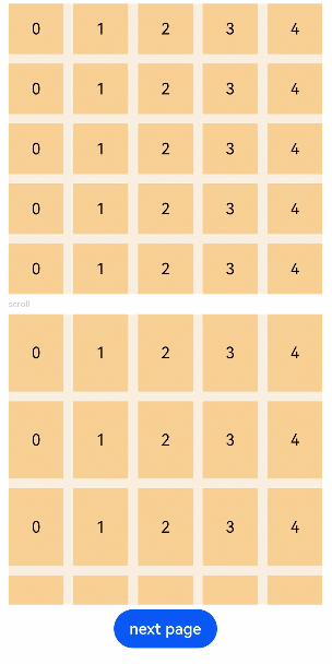
Example
// xxx.ets
@Entry
@Component
struct GridExample {
  @State Number: String[] = ['0', '1', '2', '3', '4']
  scroller: Scroller = new Scroller()

  build() {
    Column({ space: 5 }) {
      Grid() {
        ForEach(this.Number, (day: string) => {
          ForEach(this.Number, (day: string) => {
            GridItem() {
              Text(day)
                .fontSize(16)
                .backgroundColor(0xF9CF93)
                .width('100%')
                .height('100%')
                .textAlign(TextAlign.Center)
            }
          }, day => day)
        }, day => day)
      }
      .columnsTemplate('1fr 1fr 1fr 1fr 1fr')
      .rowsTemplate('1fr 1fr 1fr 1fr 1fr')
      .columnsGap(10)
      .rowsGap(10)
      .width('90%')
      .backgroundColor(0xFAEEE0)
      .height(300)

      Text('scroll').fontColor(0xCCCCCC).fontSize(9).width('90%')
      Grid(this.scroller) {
        ForEach(this.Number, (day: string) => {
          ForEach(this.Number, (day: string) => {
            GridItem() {
              Text(day)
                .fontSize(16)
                .backgroundColor(0xF9CF93)
                .width('100%')
                .height(80)
                .textAlign(TextAlign.Center)
            }
          }, day => day)
        }, day => day)
      }
      .columnsTemplate('1fr 1fr 1fr 1fr 1fr')
      .columnsGap(10)
      .rowsGap(10)
      .onScrollIndex((first: number) => {
        console.info(first.toString())
      })
      .width('90%')
      .backgroundColor(0xFAEEE0)
      .height(300)
      Button('next page')
        .onClick(() => {// Click to go to the next page.
          this.scroller.scrollPage({ next: true })
        })
    }.width('100%').margin({ top: 5 })
  }
}