Column
The <Column> component lays out child components vertically.
NOTE
This component is supported since API version 7. Updates will be marked with a superscript to indicate their earliest API version.
Child Components
Supported
APIs
Column(value?: {space?: string | number})
Since API version 9, this API is supported in ArkTS widgets.
Parameters
| Name | Type | Mandatory | Description |
|---|---|---|---|
| space | string | number | No | Vertical spacing between two adjacent child components. Since API version 9, this parameter does not take effect when it is set to a negative number or justifyContent is set to FlexAlign.SpaceBetween, FlexAlign.SpaceAround or FlexAlign.SpaceEvenly. Default value: 0 NOTE The value can be a number greater than or equal to 0 or a string that can be converted to a number. |
Attributes
In addition to the universal attributes, the following attributes are supported.
| Name | Type | Description |
|---|---|---|
| alignItems | HorizontalAlign | Alignment mode of the child components in the horizontal direction. Default value: HorizontalAlign.Center Since API version 9, this API is supported in ArkTS widgets. |
| justifyContent8+ | FlexAlign | Alignment mode of the child components in the vertical direction. Default value: FlexAlign.Start Since API version 9, this API is supported in ArkTS widgets. |
Example
// xxx.ets
@Entry
@Component
struct ColumnExample {
build() {
Column() {
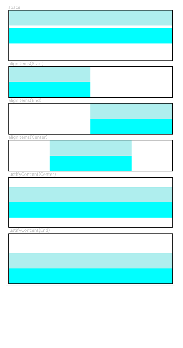
// Set the vertical spacing between two adjacent child components to 5.
Text('space').fontSize(9).fontColor(0xCCCCCC).width('90%')
Column({ space: 5 }) {
Column().width('100%').height(30).backgroundColor(0xAFEEEE)
Column().width('100%').height(30).backgroundColor(0x00FFFF)
}.width('90%').height(100).border({ width: 1 })
// Set the alignment mode of the child components in the horizontal direction.
Text('alignItems(Start)').fontSize(9).fontColor(0xCCCCCC).width('90%')
Column() {
Column().width('50%').height(30).backgroundColor(0xAFEEEE)
Column().width('50%').height(30).backgroundColor(0x00FFFF)
}.alignItems(HorizontalAlign.Start).width('90%').border({ width: 1 })
Text('alignItems(End)').fontSize(9).fontColor(0xCCCCCC).width('90%')
Column() {
Column().width('50%').height(30).backgroundColor(0xAFEEEE)
Column().width('50%').height(30).backgroundColor(0x00FFFF)
}.alignItems(HorizontalAlign.End).width('90%').border({ width: 1 })
Text('alignItems(Center)').fontSize(9).fontColor(0xCCCCCC).width('90%')
Column() {
Column().width('50%').height(30).backgroundColor(0xAFEEEE)
Column().width('50%').height(30).backgroundColor(0x00FFFF)
}.alignItems(HorizontalAlign.Center).width('90%').border({ width: 1 })
// Set the alignment mode of the child components in the vertical direction.
Text('justifyContent(Center)').fontSize(9).fontColor(0xCCCCCC).width('90%')
Column() {
Column().width('90%').height(30).backgroundColor(0xAFEEEE)
Column().width('90%').height(30).backgroundColor(0x00FFFF)
}.height(100).border({ width: 1 }).justifyContent(FlexAlign.Center)
Text('justifyContent(End)').fontSize(9).fontColor(0xCCCCCC).width('90%')
Column() {
Column().width('90%').height(30).backgroundColor(0xAFEEEE)
Column().width('90%').height(30).backgroundColor(0x00FFFF)
}.height(100).border({ width: 1 }).justifyContent(FlexAlign.End)
}.width('100%').padding({ top: 5 })
}
}